- 25,632
- 15,962
Could you give the original image? I can remove the left texts bubbles

Follow along with the video below to see how to install our site as a web app on your home screen.
Note: This feature may not be available in some browsers.
Could you give the original image? I can remove the left texts bubbles

Yap agreed. Hence, I am paying it legally for almost 5 years. Better, and it shows support to the company.Photoshop is extremely expensive, and just as extremely risky to download via bittorrent without having one's computer infected by malware.
This ok?
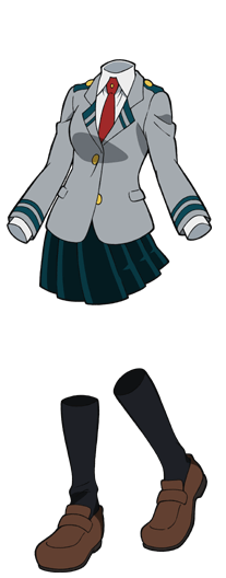
This ok?

Toru Hagakure (Invisible Girl)
Toru Hagakure (葉隠透 Hagakure Tōru), also known as the Stealth Hero: Invisible Girl, is a student in Class 1-A at U.A. High School, training to become a Pro Hero. She is a bubbly, cheery, and easygoing girl that does most things with an upbeat, positive attitude, even if she's been manipulated by...vsbattles.fandom.com

I added itwe gonna add the image to her profile?

Toru Hagakure (Invisible Girl)
Toru Hagakure (葉隠透 Hagakure Tōru), also known as the Stealth Hero: Invisible Girl, is a student in Class 1-A at U.A. High School, training to become a Pro Hero. She is a bubbly, cheery, and easygoing girl that does most things with an upbeat, positive attitude, even if she's been manipulated by...vsbattles.fandom.com
ThanksI added it
DoneI have unlocked the page for you now. Tell us here when you aredone.
Changed to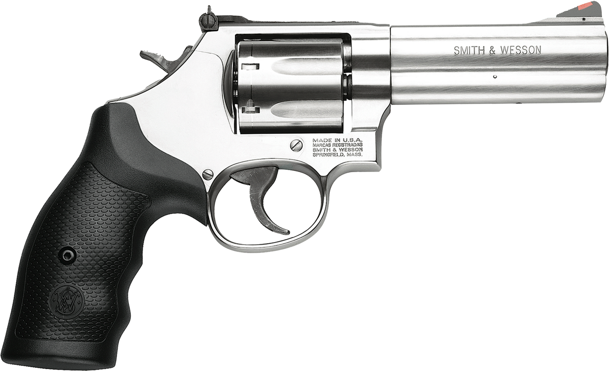
Smith & Wesson Model 686
The Smith & Wesson Model 686 is a six- or seven-shot double-action revolver manufactured by Smith & Wesson and chambered for the .357 Magnum cartridge. It will chamber and fire .38 Special cartridges, as the .357 Magnum was developed from the .38 Special. The Magnum case is slightly longer to...vsbattles.fandom.com
Changed to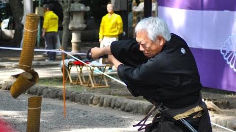
Katana (Real Life)
The Katana is a type of single-edged longsword indigenous to Japan. It first saw use during the Muramachi period of Japan's history, just prior to the rise of Oda Nobunaga. Since then, its decidedly impressive design and former status as a symbol of nobility has ingrained it into pop culture...vsbattles.fandom.com
Changed to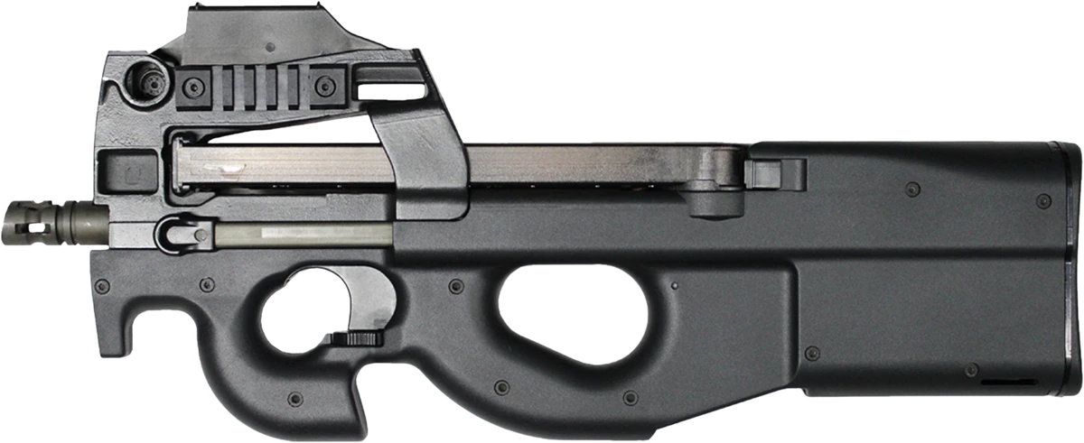
FN P90
The FN P90, also known as the FN Project 1990, is a compact personal defense weapon (PDW) designed and manufactured by FN Herstal in Belgium. Created in response to NATO requests for a replacement for 9×19mm Parabellum firearms, the P90 was designed as a compact but powerful firearm for vehicle...vsbattles.fandom.com
Changed to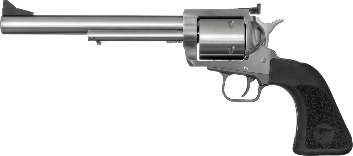
Magnum Research BFR
The Magnum Research BFR is a single-action revolver manufactured by Magnum Research. It is made from stainless steel and is manufactured in a variety of heavy calibers, such as .500 S&W Magnum, including some traditional rifle cartridges, such as the .30-30 and .45-70/.450 Marlin. The name "BFR"...vsbattles.fandom.com
Changed to
Steyr AUG
The Steyr AUG (Armee-Universal-Gewehr — "universal army rifle") is an Austrian 5.56×45mm NATO bullpup assault rifle, designed in the 1960s by Steyr-Daimler-Puch and now manufactured by Steyr Mannlicher GmbH & Co KG. It was adopted by the Austrian Army as the StG 77 (Sturmgewehr 77) in 1978...vsbattles.fandom.com
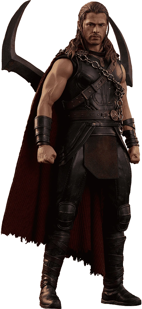
Glad to hear that you like the changes but the profile is locked, could you unlock it so I could add it?I think that they look good enough to add, yes. Thank you for helping out.

Just added the changes now so it can be locked again, thanks for the helpOkay. Tell me here when you are done.
Imo the new one of the Hot Toys figure fits in with the other renders better and looks less cartoonyBy the way, I think that the current final suit image looks better than your new one, so that should preferably remain at least.
Here's some alternate poses if you would want to use any of these over the one I proposedPossibly, but it is aesthetically uglier in my view.
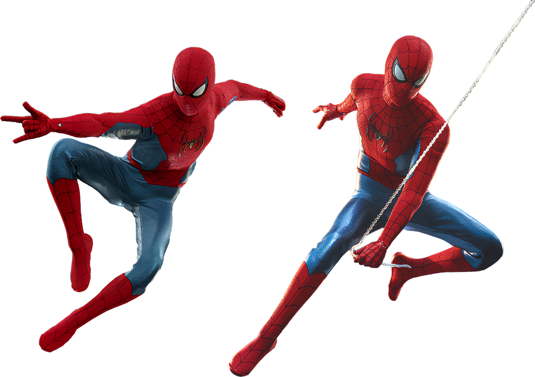

I'm fine with the old black and gold image being used but if it helps I just uploaded a higher quality version of it that can be used, also I know you like the concept art version of the final suit more than the hot toys figure but in my opinion the figure is more accurate and true to how the suit looks at the end of NWH, so I uploaded another potential render that could be used but I understand if you still like the current one more, that's just my thoughts on it.My apologies, but no.
Anyway, I also restored the old black and gold suit image. It doesn't look as good, but fits much better into the page, due to being considerably more vertical in layout.
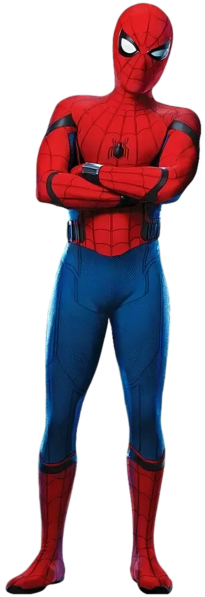

Thanks again Ant and sorry for the troubleI added both of them.
Handled.our current doomguy render for DOOM 1-2 is the Doom eternal skin for doomslayer.
it should be changed it to his sprite from Doom 1
Thanks.
Thanks.
But she's kinda big, what about 300px instead?
Perfection. Thanks!Is cos she's small
I fixed it, should be fine now.
I am not sure. It looks better, but will likely be harder to fit into his page in terms of size proportions.
I tried it, it looks fine for me.I am not sure. It looks better, but will likely be harder to fit into his page in terms of size proportions.
While it's not a clear full body render, it's from a one piece game and much more accurate representation of what hybrid kaido actually looks like, the current one is fan artI am not sure. It looks better, but will likely be harder to fit into his page in terms of size proportions.