- 11,737
- 20,645
Current one seems fine IMO, tho i would appreciate more input.Can someone replace Rune King Thor's current image with this one?
Follow along with the video below to see how to install our site as a web app on your home screen.
Note: This feature may not be available in some browsers.
Current one seems fine IMO, tho i would appreciate more input.Can someone replace Rune King Thor's current image with this one?
Current one isn't exactly Rune King Thor. It's really just Thor with his eyes ripped outCurrent one seems fine IMO, tho i would appreciate more input.
Well, that being the case i've replaced it.Current one isn't exactly Rune King Thor. It's really just Thor with his eyes ripped out
Sure i can.It isn't a problem. Is somebody willing to add replace the header images for those pages then please?
Excuse me, can I request to add picture to this profile?
And please make them like tabber as well (One for Avatar Key and One for True Form Key).
Avatar Picture
True Form
I don't know how to make tabber for profile picture, so can anyone help?
Thanks in advance.
Thank you.


Handled.
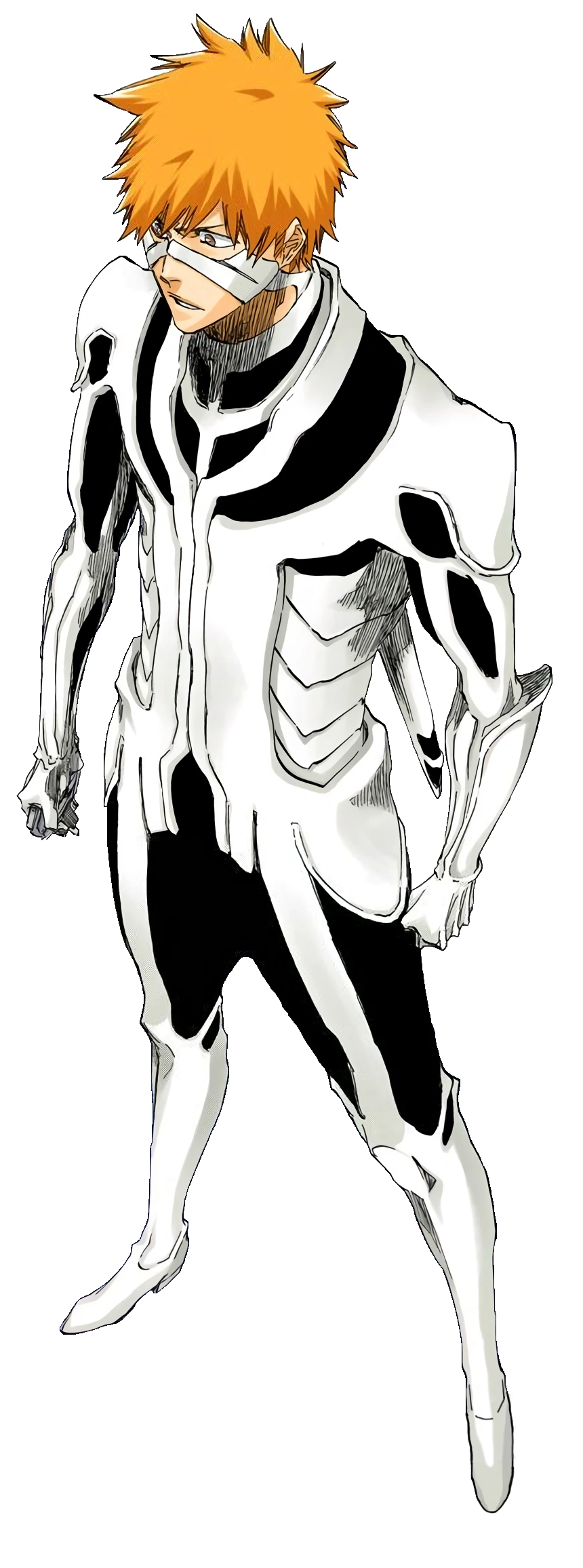
Ichigo Kurosaki (Post-Timeskip)
Ichigo Kurosaki (黒崎くろさき 一いち護ご, Kurosaki Ichigo?) is the son of Masaki Kurosaki and Isshin Kurosaki, a Quincy with the powers of a Shinigami. Years after the death of his mother, Ichigo uses his innate spiritual awareness to help local ghosts, and unlocks his potential as a Shinigami when Rukia...vsbattles.fandom.com
Replace his Shikai image in the Fullbring Zanpakuto section with this: https://vsbattles.fandom.com/wiki/File:FB_Shikai_Ichigo_(Bleach)_Render.png

Rukia Kuchiki
Rukia Kuchiki (朽くち木き ルキア, Kuchiki Rukia?) is the current Captain of the 13th Division. She formerly served as lieutenant of the 13th Division under Captain Jūshirō Ukitake. Rukia is the adoptive younger sister of Byakuya Kuchiki and a friend of Ichigo Kurosaki. Tier: At most 7-B, likely at least...vsbattles.fandom.com
Replace her Post-Timeskip image with this: https://vsbattles.fandom.com/wiki/File:Rukia_Kuchiki_(Bleach)_Render.png
Handled.I redrew some of Ugly Naugus' debut image to create a proper render for his page. The page is locked so I can't add it myself.
That image is so tall, you should probably crop it to remove the unused space.
If I am being honest, her current Render is taller and takes a lot of unused space, Is it not better to align her to right?That image is so tall, you should probably crop it to remove the unused space.
The current one doesn't have unused space, all four sides of the image are just right outside her pixels, unlike the picture I mentioned where there are a lot of unused spaces vertically. Also, I have no opinion regarding the alignment or which image should be used because I was simply just pointing the details out.If I am being honest, her current Render is taller and takes a lot of unused space, Is it not better to align her to right?
Did you try to align the rendered image to the right? Mind screenshotting it, since I am the one who rendered the "rendered-image".The current one doesn't have unused space, all four sides of the image are just right outside her pixels, unlike the picture I mentioned where there are a lot of unused spaces vertically. Also, I have no opinion regarding the alignment or which image should be used because I was simply just pointing the details out.
That image is so tall, you should probably crop it to remove the unused space.

I was talking about it vertically, not the alignment, compare what mister gentleman monkey sent and the originally proposed image.Did you try to align the rendered image to the right? Mind screenshotting it, since I am the one who rendered the "rendered-image".
Ahm, honestly, my first sentence was talking about alignment. But alright. Thanks in advance.I was talking about it vertically, not the alignment, compare what mister gentleman monkey sent and the originally proposed image.
Also, thank you for the demonstration, sir monkey.
Then I have no idea how it went to that because I was mainly pointing out the unused spaces, we had a misunderstanding there for sure, and for that I'm sorry.Ahm, honestly, my first sentence was talking about alignment. But alright. Thanks in advance.
I apologize for the misunderstanding as well. Sorry as well.Then I have no idea how it went to that because I was mainly pointing out the unused spaces, we had a misunderstanding there for sure, and for that I'm sorry.
Handled.Requesting replacement for the following pages:
-High Arbiter Alastor's for this render.
-Gargos (Modern)'s first, second and third bodies for these three: first, second and third.
-Zeke Dunbar's for these render: first & second(why even bothering with two pictures when he seems essentially the same)
I handled it.If I am being honest, her current Render is taller and takes a lot of unused space, Is it not better to align her to right?
Thank you for helping out.
VS Battles Wiki
The VS Battles Wiki is the world's most comprehensive and popular index of statistics and powers for characters and items from all of popular fiction.vsbattles.fandom.com
Thank you for helping out.Post-Flashpoint's base Batman render is the Rebirth one, and while that's not incorrect I think we should have the N52 design in the tabber.
Professor Hulk render for Hulk, there might be no key but the Professor Hulk era and incarnation is just as important as the others.
That is fair. I completely forgot Jenkins had come up with the name, I thought David was the first to have the Merged Hulk refer to himself as "the Professor".I think that calling him the Merged Hulk is more respectful to his creator, Peter David, who loathes the "Professor Hulk" name that Paul Jenkins came up with later.
I think it's good, but for a potentially better and shorter quote, I'm thinking this bit against Ajax.Anyway, is the quote that I added acceptable? I personally think that it is good, distinctive, defining, and characteristic, but it is also a rather long conversation rather than just a single expression from the Hulk himself.
I am very open for better suggestions.
Fair enough, others could be...Thank you, but that is just combat quipping. It doesn't get to the heart of his personality.