Navigation
Install the app
How to install the app on iOS
Follow along with the video below to see how to install our site as a web app on your home screen.
Note: This feature may not be available in some browsers.
More options
-
This forum is strictly intended to be used by members of the VS Battles wiki. Please only register if you have an autoconfirmed account there, as otherwise your registration will be rejected. If you have already registered once, do not do so again, and contact Antvasima if you encounter any problems.
For instructions regarding the exact procedure to sign up to this forum, please click here. -
We need Patreon donations for this forum to have all of its running costs financially secured.
Community members who help us out will receive badges that give them several different benefits, including the removal of all advertisements in this forum, but donations from non-members are also extremely appreciated.
Please click here for further information, or here to directly visit our Patreon donations page. -
Please click here for information about a large petition to help children in need.
You are using an out of date browser. It may not display this or other websites correctly.
You should upgrade or use an alternative browser.
You should upgrade or use an alternative browser.
Profile image additions or replacements requests (New forum)
- Thread starter Antvasima
- Start date
- Status
- Not open for further replies.
- 18,922
- 13,942
That's true but that image is the main Canon and is more detailed but I can understand wanting a full body image insteadI am neutral but I think we have the perspective that a full-body image in a neutral position is a better type of image.
- 18,922
- 13,942
Oh... Didn't realize you agreed in the beginning... But I meant when you say sorry when you think the current image is betterI apologised for messing up.
The images that we use currently look better in my view. My apologies.
The current image looks much better, yes. Sorry.
- 3,193
- 2,694
Made a new render for Fleischer Superman. The one we have now ain't bad but it's from a production/promotional cel and not 100% consistent with the model they use in the shorts (you can see the model sheets and the intro on the character's gallery, to see how mine is closer to what actually appears in the shorts).
- 18,922
- 13,942
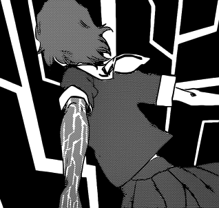
Bleach
For detailed information about this franchise, visit the Bleach Wiki. BLEACH is a popular shonen created by Tite Kubo in 2001 which has spawned a media franchise including a long-running anime adaptation, the return of the series onto the screen a decade later by the name 'Bleach: Thousand Year...
- 18,922
- 13,942
Changed to
Bleach
For detailed information about this franchise, visit the Bleach Wiki. BLEACH is a popular shonen created by Tite Kubo in 2001 which has spawned a media franchise including a long-running anime adaptation, the return of the series onto the screen a decade later by the name 'Bleach: Thousand Year...vsbattles.fandom.com
AddedThat seems fine to me. Thanks.
- 3,029
- 2,664
New Render for Modern Base Thanos, his current one is still in need of a better image as it originates from Marvel: Avengers Alliance, not the comics. This one seemingly originates from the Comics (Granted I'm no Marvel expert, and do not know which comic it is from)
- 3,193
- 2,694
The Avengers Alliance fits Thanos during that time period in the 2000s-2010s where his outfit was more techy, that's why it looks the way it does, because they based it off Thanos' appearance in the comics at the time (I think he's back to looking more classic, though). The render you're proposing makes him look pretty derpy, too...
- 3,193
- 2,694
- 18,922
- 13,942
Yee... The image itself is good but on a profile it doesn't really make sense  I doubt the creator want to represent him like that or even anyone but that's what I think
But good job with the render tho (if you made it or found it)
But good job with the render tho (if you made it or found it)
Last edited:
- 3,193
- 2,694
Here's an End of Series render for Omni-Man, could the page be unlocked so I can add it?
- 18,922
- 13,942
Could you possibly remove that white dot? (I can if you want)Here's an End of Series render for Omni-Man, could the page be unlocked so I can add it?
- 3,193
- 2,694
Feel free to do thatCould you possibly remove that white dot? (I can if you want)
- 18,922
- 13,942
Feel free to do that
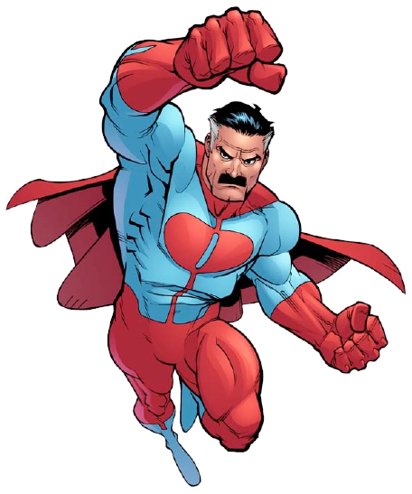
Omni-Man (Image Comics)
Omni-Man (Nolan Grayson) is a fictional character in the Image Comics Universe. Omni-Man is the father of Invincible and a member of Viltrumite race, born on the planet Viltrum. His father, Argall, was the Viltrumites' leader. When he was very young, his father was killed by a turncoat, who no...
- 9,266
- 3,411
potential new render for 616 base spiderman?


- 3,193
- 2,694
I do personally like that one a little better. The red is more vibrant and the blue is more clear, it's colorful as Spider-Man should be.
Though the edges you've rendered out (assuming you made the render) stick out a bit.
Though the edges you've rendered out (assuming you made the render) stick out a bit.
- 18,922
- 13,942
It's also dark in the middle, which should be transparented
- 3,193
- 2,694
Yup, didn't even notice that xD
- 18,922
- 13,942

KingTempest16/Sandbox11

VS Battles Wiki
The VS Battles Wiki is the world's most comprehensive and popular index of statistics and powers for characters and items from all of popular fiction.
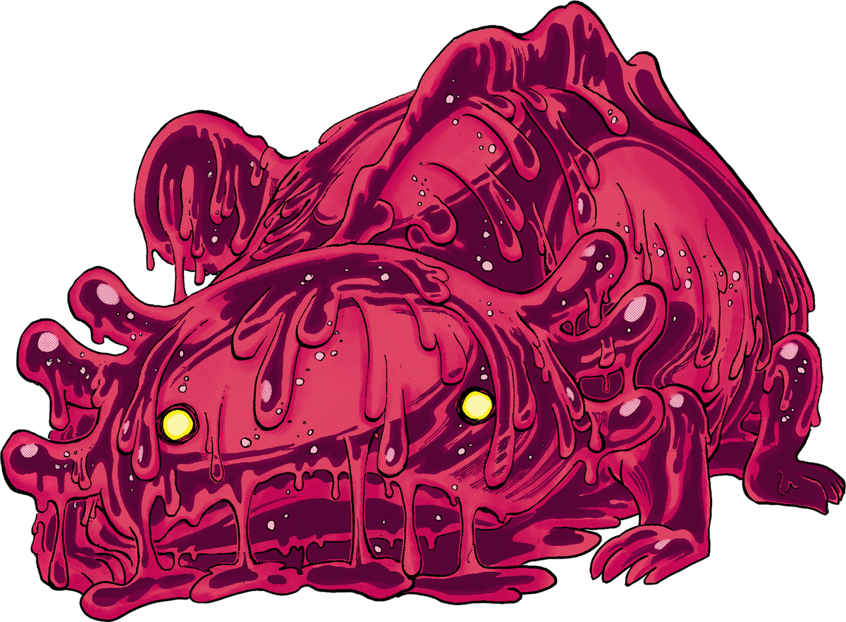
Smiley (One Piece)
Smiley was Caesar Clown's pet and the weapon he used to destroy Punk Hazard four years ago. Caesar created it by giving a Zoan Devil Fruit to the H2S gas. Smiley died after getting free from Punk Hazard's shelter by Caesar's command. It ate a massive candy that produced a chemical reaction in...

VS Battles Wiki
The VS Battles Wiki is the world's most comprehensive and popular index of statistics and powers for characters and items from all of popular fiction.
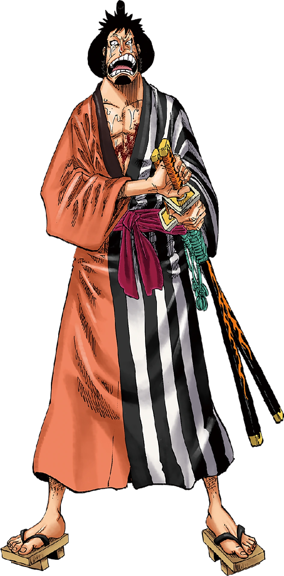
Kin'emon
Kin'emon is a samurai from the Wano Country and the leader of the Nine Red Scabbards, a group of powerful warriors at the disposal of Kozuki Oden. During the invasion that Kaido did in Wano, Kin'emon and a group of other samurais were sent into the future by the powers of Kozuki Toki's Devil...

VS Battles Wiki
The VS Battles Wiki is the world's most comprehensive and popular index of statistics and powers for characters and items from all of popular fiction.
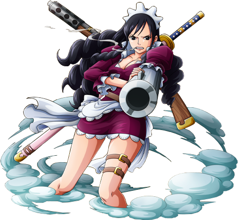
Baby Five
Baby Five is the alias of a member of the Happo Navy who is engaged to Sai, the Happo Navy's 13th leader. She is a former servant and assassin of the Donquixote Pirates, serving as an executive in the Pica Army. Her real name has not been revealed. Befitting her occupation as the crew's...
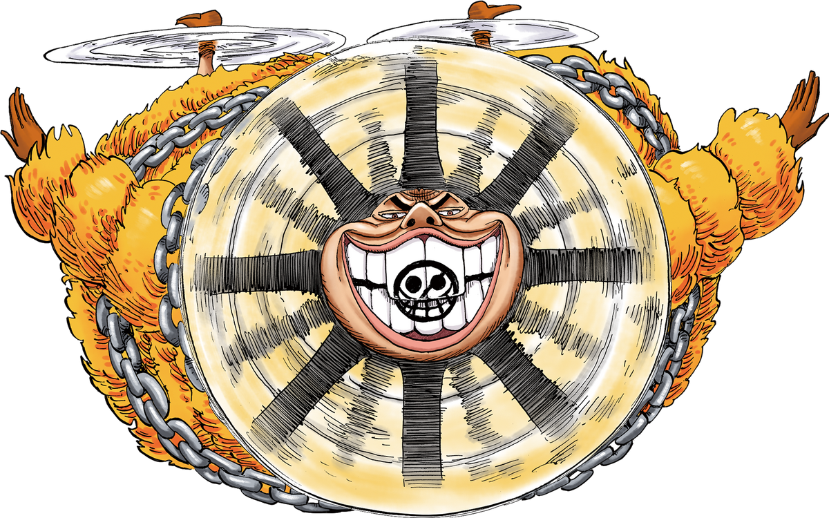
Buffalo (One Piece)
Buffalo is the alias of a combatant of the Donquixote Pirates and an officer of the Pica Army. His real name has yet to be revealed. As a combatant of a former Shichibukai's crew, it stands to reason that Buffalo is a powerful fighter. He has been partnered with Baby 5, and the two of them use...

VS Battles Wiki
The VS Battles Wiki is the world's most comprehensive and popular index of statistics and powers for characters and items from all of popular fiction.

Issho (Fujitora)
Real name Issho, Fujitora is one of the new admirals who replaced Kuzan and Akainu after the timeskip, and is the first new admiral to be introduced after the timeskip. He follows "Humane Justice". He has eaten the Stomp-Stomp Fruit (Zushi Zushi no Mi), which is a Devil Fruit that allows him to...
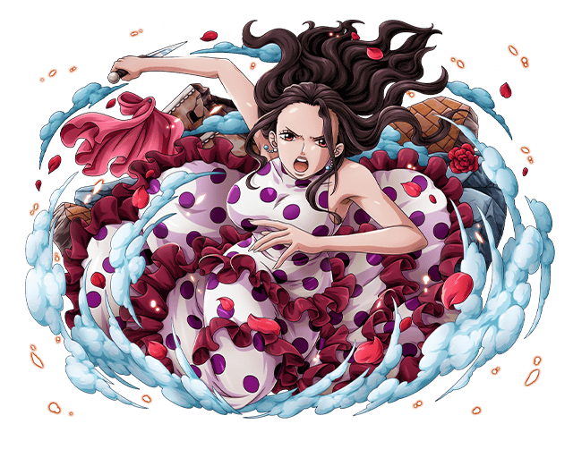
Viola (One Piece)
Viola, also known as Violet, is a former assassin and officer in the Trebol's Army division of the Donquixote Pirates, the younger sister of the late Scarlett, and Rebecca's maternal aunt. She is also King Riku Dold III's second daughter, making her the crown princess of Dressrosa and current...

VS Battles Wiki
The VS Battles Wiki is the world's most comprehensive and popular index of statistics and powers for characters and items from all of popular fiction.
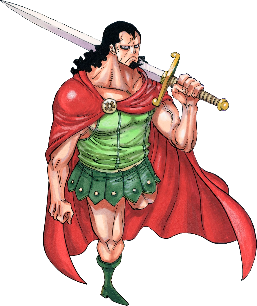
Kyros
Kyros is a legendary gladiator, who fought at the Corrida Coliseum until 20 years ago. A great bronze statue of him is held at the Corrida Colosseum. When he was turned into a toy , everyone forgot his existence. After his transformation, he became a One-Legged Soldier (片足の兵隊, Kata-ashi no...

Kyros
Kyros is a legendary gladiator, who fought at the Corrida Coliseum until 20 years ago. A great bronze statue of him is held at the Corrida Colosseum. When he was turned into a toy , everyone forgot his existence. After his transformation, he became a One-Legged Soldier (片足の兵隊, Kata-ashi no...
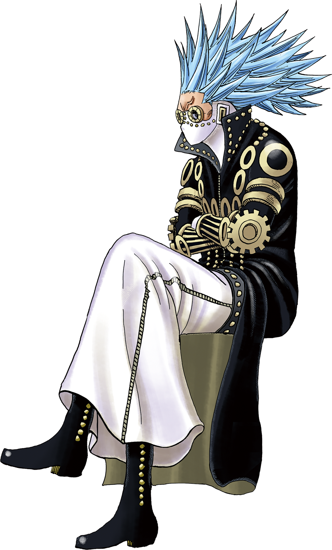
Gladius
As a Donquixote Family Executive, Gladius resided close by to his master Donquixote Doflamingo, who was the king of Dressrosa. Being very loyal to Doflamingo, Gladius would quickly harm close friends like Baby 5 and Viola in order to protect him. He did not hesitate to shoot Baby 5 when she was...

VS Battles Wiki
The VS Battles Wiki is the world's most comprehensive and popular index of statistics and powers for characters and items from all of popular fiction.
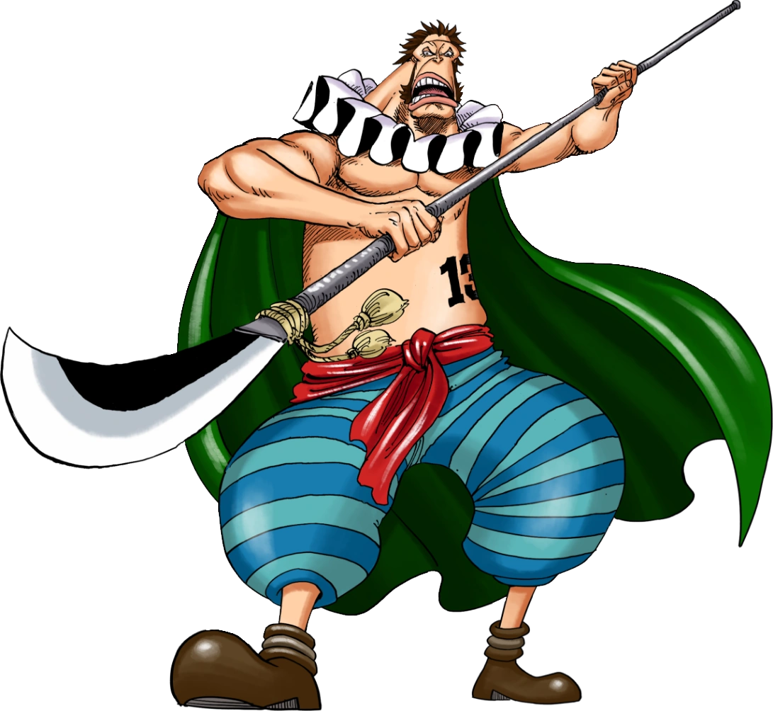
Sai (One Piece)
Sai, also known as Don Sai, is a member of the Chinjao Family and the 13th leader of the Happo Navy. He is also a martial artist who joined as a gladiator at the Corrida Colosseum to compete for the Mera Mera no Mi. He is the 3rd division commander of the Straw Hat Grand Fleet. Tier: 6-C, higher...
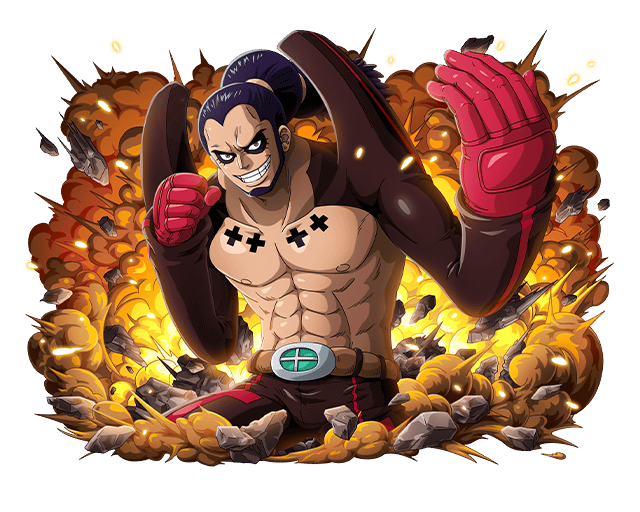
Ideo
"Destruction Cannon" Ideo is a XXX rank boxer who joined as a gladiator at the Corrida Colosseum to compete for the Mera Mera no Mi. He is a member of the Longarm Tribe. He formed the XXX Gym Martial Arts Alliance along with three other gladiators from the Colosseum and acts as their...

Ideo
"Destruction Cannon" Ideo is a XXX rank boxer who joined as a gladiator at the Corrida Colosseum to compete for the Mera Mera no Mi. He is a member of the Longarm Tribe. He formed the XXX Gym Martial Arts Alliance along with three other gladiators from the Colosseum and acts as their...
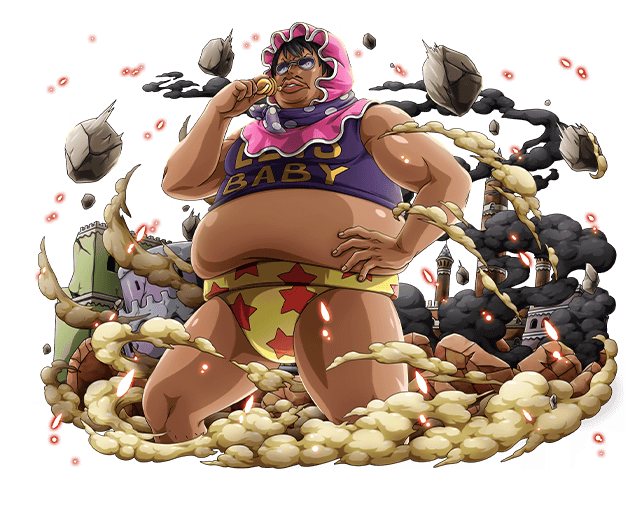
Senor Pink
Senor Pink is an officer of the Donquixote Pirates' Diamante Army. He was also the husband of Russian and is the father of the late Gimlet. Pink's battle with Franky then turned into a test of will. After he willingly took a direct hit from Franky's Strong Hammer, he performed another suplex...
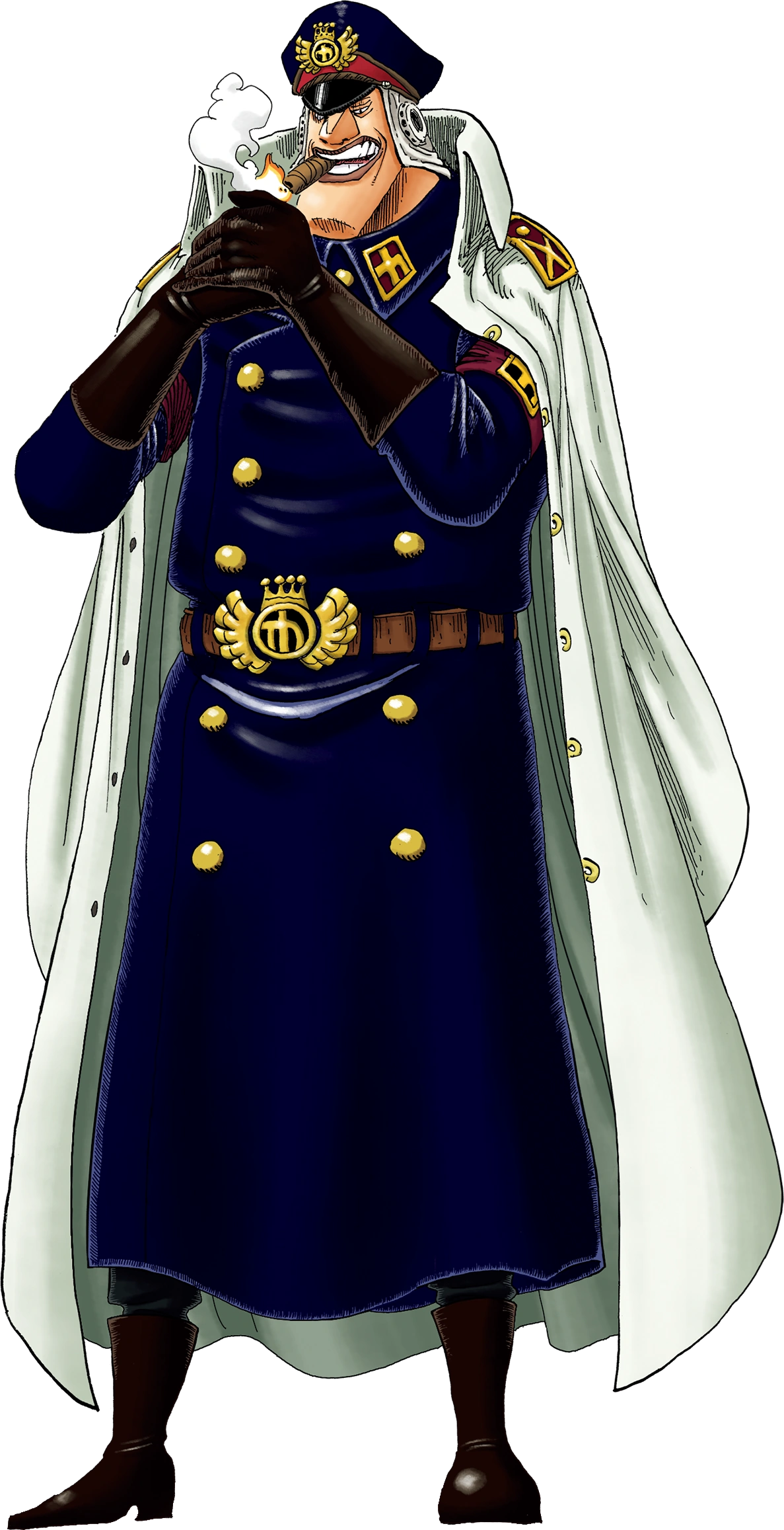
Shiryu
Shiryu of the Rain is Captain of the Second Ship of the Blackbeard Pirates, one of the Ten Titanic Captains. He used to be Head Jailer of Impel Down before getting imprisoned by Magellan due to his excessive cruelty. Before the Marineford War, he betrayed Magellan after being released to handle...

VS Battles Wiki
The VS Battles Wiki is the world's most comprehensive and popular index of statistics and powers for characters and items from all of popular fiction.
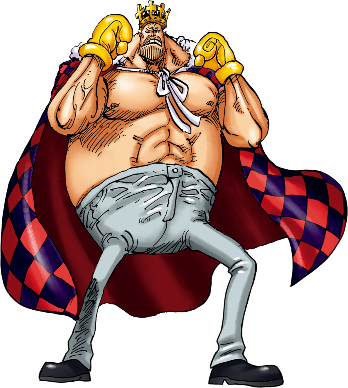
Elizabello II
King Elizabello II was introduced in Fighting Block B within the Corrida Colosseum. He is known as "The Fighting King" and to wield a powerful attack said to be capable of defeating a Yonko]. Honorable, he assisted the Riku family and Straw-hats in taking down the Donquixote family during the...

VS Battles Wiki
The VS Battles Wiki is the world's most comprehensive and popular index of statistics and powers for characters and items from all of popular fiction.
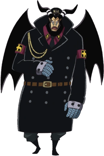
Magellan
Magellan (マゼラン, Mazeran) is the vice warden of Impel Down. He was formerly the chief warden, but after his failure to stop the jail's one and only mass-breakout, he was replaced by Hannyabal and demoted to vice warden. He was the main antagonist during the Impel Down Arc. Tier: Unknown Name...

VS Battles Wiki
The VS Battles Wiki is the world's most comprehensive and popular index of statistics and powers for characters and items from all of popular fiction.
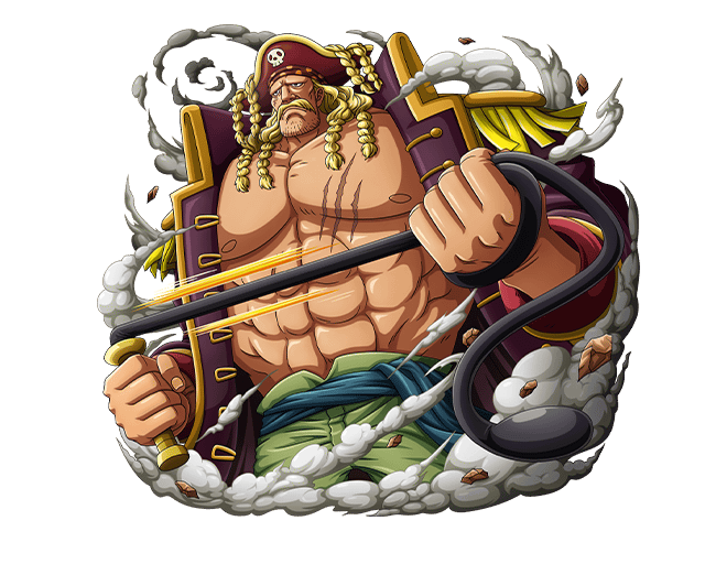
Orlumbus
"Massacre Ruler" Orlumbus is an adventurer who joined as a gladiator at the Corrida Colosseum to compete for the Mera Mera no Mi. He is captain of the Yonta Maria Grand Fleet and commander of the 7th division of the Straw Hat Grand Fleet. Tier: Unknown Name: Orlumbus Origin: One Piece Gender...
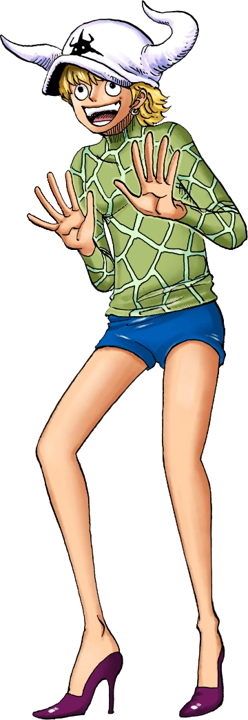
Dellinger
Dellinger is one of the Donquixote family executives who resided in the country of Dressrosa. He was first introduced when he was sent to assassinate Bellamy for his failure regarding his competence in attempting to achieve victory in the Corrida Coliseum B block and for failing to assassinate...
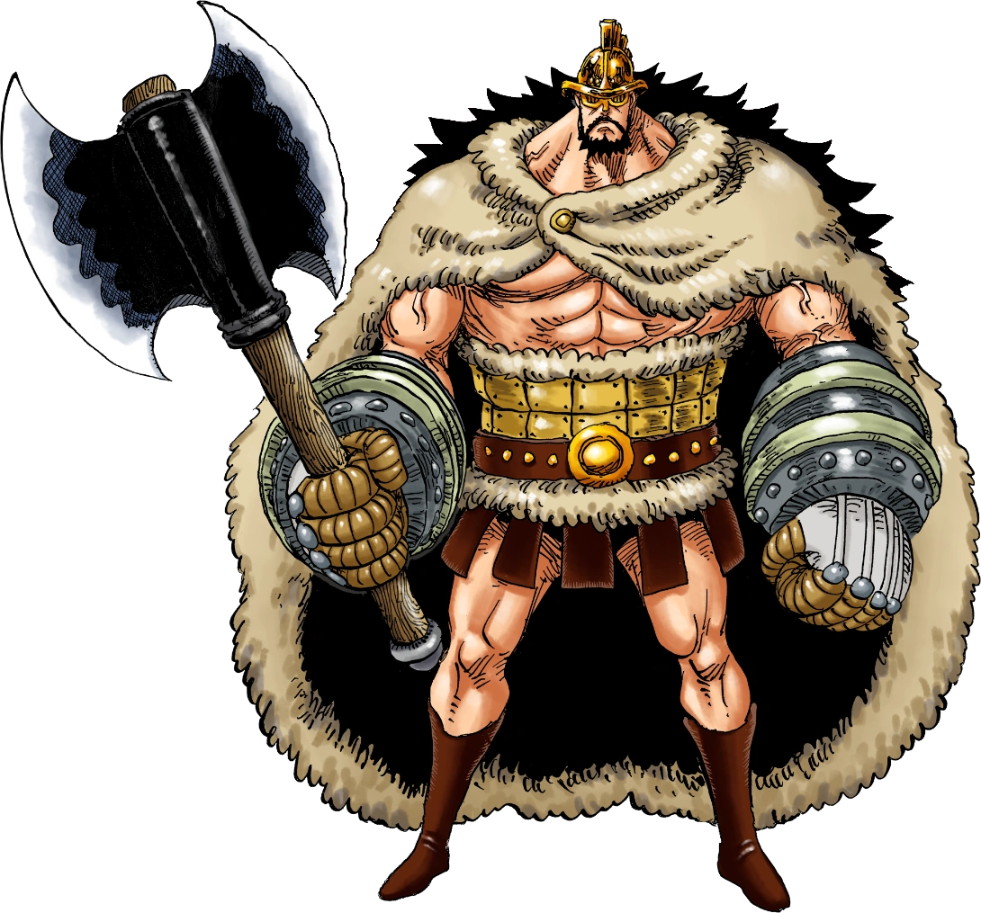
Hajrudin
"Pirate Mercenary" Hajrudin is a giant warrior described as the "new generation" from Elbaf and joined as a gladiator at the Corrida Colosseum to compete for the Mera Mera no Mi. He was first mentioned by a Marine officer who was speaking to Vice Admiral Maynard. He is the sixth division leader...
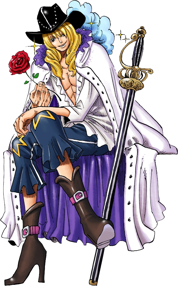
Cavendish (One Piece)
Cavendish, also known as the "Pirate Prince" is a Super Rookie, the captain of the Beautiful Pirates, and the prince of Bourgeois Kingdom. He made a name for himself after he made it to the New World but after the events of the Battle of Marineford and being overshadowed by the rookies of the...

Shirahoshi
Shirahoshi is the present Mermaid Princess of Fishman Island. She is the daughter of King Neptune and deceased Queen Otohime. As the Current Poseidon, she can communicate with Sea Kings. Tier: Unknown Name: Shirahoshi Origin: One Piece Gender: Female Age: 16 Classification: Mermaid Princess...
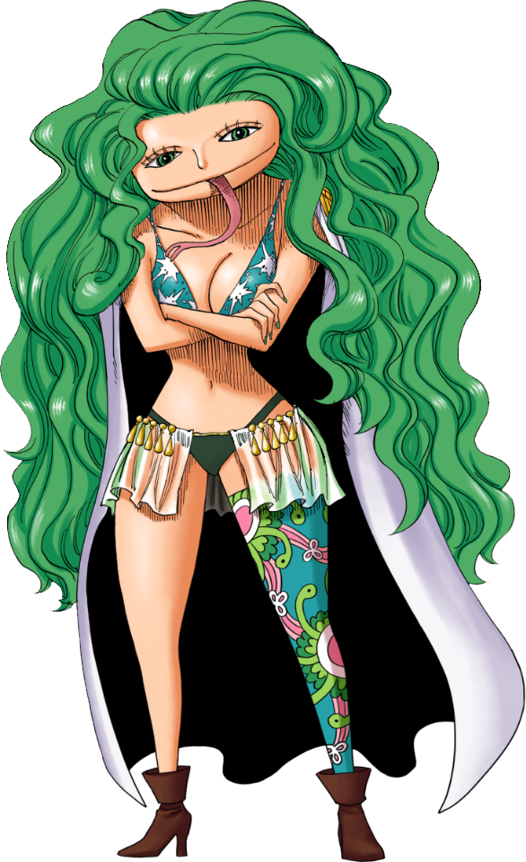
Boa Sandersonia
One of Boa Hancock's younger sisters, Boa Sandersonia is one of the key members of the Kuja Pirates. Along with Hancock and Boa Marigold, Sandersonia was kidnapped by slave traders at a young age and sold to the Celestial Dragons, where she endured traumatizing experiences up until Fisher Tiger...

VS Battles Wiki
The VS Battles Wiki is a site that aims to index the statistics, powers and abilities of characters and weapons from a wide variety of fictional franchises. Feel free to visit or help out!
- 9,266
- 3,411
Nah a friend did I just wanted to post it here cuz why not also I’ll try to iron out the edges laterI do personally like that one a little better. The red is more vibrant and the blue is more clear, it's colorful as Spider-Man should be.
Though the edges you've rendered out (assuming you made the render) stick out a bit.
- 18,922
- 13,942
I could... If I get the image link 
- 168,523
- 77,264
- Thread starter
- #1,314
All of the replacement images seem fine to use to me.Changed to
KingTempest16/Sandbox11
vsbattles.fandom.com

VS Battles Wiki
The VS Battles Wiki is the world's most comprehensive and popular index of statistics and powers for characters and items from all of popular fiction.vsbattles.fandom.com
Changed to
Smiley (One Piece)
Smiley was Caesar Clown's pet and the weapon he used to destroy Punk Hazard four years ago. Caesar created it by giving a Zoan Devil Fruit to the H2S gas. Smiley died after getting free from Punk Hazard's shelter by Caesar's command. It ate a massive candy that produced a chemical reaction in...vsbattles.fandom.com

VS Battles Wiki
The VS Battles Wiki is the world's most comprehensive and popular index of statistics and powers for characters and items from all of popular fiction.vsbattles.fandom.com
Changed to
Kin'emon
Kin'emon is a samurai from the Wano Country and the leader of the Nine Red Scabbards, a group of powerful warriors at the disposal of Kozuki Oden. During the invasion that Kaido did in Wano, Kin'emon and a group of other samurais were sent into the future by the powers of Kozuki Toki's Devil...vsbattles.fandom.com

VS Battles Wiki
The VS Battles Wiki is the world's most comprehensive and popular index of statistics and powers for characters and items from all of popular fiction.vsbattles.fandom.com
Changed to
Baby Five
Baby Five is the alias of a member of the Happo Navy who is engaged to Sai, the Happo Navy's 13th leader. She is a former servant and assassin of the Donquixote Pirates, serving as an executive in the Pica Army. Her real name has not been revealed. Befitting her occupation as the crew's...vsbattles.fandom.com
Changed to
Buffalo (One Piece)
Buffalo is the alias of a combatant of the Donquixote Pirates and an officer of the Pica Army. His real name has yet to be revealed. As a combatant of a former Shichibukai's crew, it stands to reason that Buffalo is a powerful fighter. He has been partnered with Baby 5, and the two of them use...vsbattles.fandom.com

VS Battles Wiki
The VS Battles Wiki is the world's most comprehensive and popular index of statistics and powers for characters and items from all of popular fiction.vsbattles.fandom.com
Changed to
Issho (Fujitora)
Real name Issho, Fujitora is one of the new admirals who replaced Kuzan and Akainu after the timeskip, and is the first new admiral to be introduced after the timeskip. He follows "Humane Justice". He has eaten the Stomp-Stomp Fruit (Zushi Zushi no Mi), which is a Devil Fruit that allows him to...vsbattles.fandom.com
Changed to
Viola (One Piece)
Viola, also known as Violet, is a former assassin and officer in the Trebol's Army division of the Donquixote Pirates, the younger sister of the late Scarlett, and Rebecca's maternal aunt. She is also King Riku Dold III's second daughter, making her the crown princess of Dressrosa and current...vsbattles.fandom.com

VS Battles Wiki
The VS Battles Wiki is the world's most comprehensive and popular index of statistics and powers for characters and items from all of popular fiction.vsbattles.fandom.com
Changed to
Kyros
Kyros is a legendary gladiator, who fought at the Corrida Coliseum until 20 years ago. A great bronze statue of him is held at the Corrida Colosseum. When he was turned into a toy , everyone forgot his existence. After his transformation, he became a One-Legged Soldier (片足の兵隊, Kata-ashi no...vsbattles.fandom.com
Changed to
Gladius
As a Donquixote Family Executive, Gladius resided close by to his master Donquixote Doflamingo, who was the king of Dressrosa. Being very loyal to Doflamingo, Gladius would quickly harm close friends like Baby 5 and Viola in order to protect him. He did not hesitate to shoot Baby 5 when she was...vsbattles.fandom.com

VS Battles Wiki
The VS Battles Wiki is the world's most comprehensive and popular index of statistics and powers for characters and items from all of popular fiction.vsbattles.fandom.com
Changed to
Sai (One Piece)
Sai, also known as Don Sai, is a member of the Chinjao Family and the 13th leader of the Happo Navy. He is also a martial artist who joined as a gladiator at the Corrida Colosseum to compete for the Mera Mera no Mi. He is the 3rd division commander of the Straw Hat Grand Fleet. Tier: 6-C, higher...vsbattles.fandom.com
Changed to
Ideo
"Destruction Cannon" Ideo is a XXX rank boxer who joined as a gladiator at the Corrida Colosseum to compete for the Mera Mera no Mi. He is a member of the Longarm Tribe. He formed the XXX Gym Martial Arts Alliance along with three other gladiators from the Colosseum and acts as their...vsbattles.fandom.com
Changed to
Senor Pink
Senor Pink is an officer of the Donquixote Pirates' Diamante Army. He was also the husband of Russian and is the father of the late Gimlet. Pink's battle with Franky then turned into a test of will. After he willingly took a direct hit from Franky's Strong Hammer, he performed another suplex...vsbattles.fandom.com
Changed to
Shiryu
Shiryu of the Rain is Captain of the Second Ship of the Blackbeard Pirates, one of the Ten Titanic Captains. He used to be Head Jailer of Impel Down before getting imprisoned by Magellan due to his excessive cruelty. Before the Marineford War, he betrayed Magellan after being released to handle...vsbattles.fandom.com

VS Battles Wiki
The VS Battles Wiki is the world's most comprehensive and popular index of statistics and powers for characters and items from all of popular fiction.vsbattles.fandom.com
Changed to
Elizabello II
King Elizabello II was introduced in Fighting Block B within the Corrida Colosseum. He is known as "The Fighting King" and to wield a powerful attack said to be capable of defeating a Yonko]. Honorable, he assisted the Riku family and Straw-hats in taking down the Donquixote family during the...vsbattles.fandom.com

VS Battles Wiki
The VS Battles Wiki is the world's most comprehensive and popular index of statistics and powers for characters and items from all of popular fiction.vsbattles.fandom.com
Add Post Timeskip version
Magellan
Magellan (マゼラン, Mazeran) is the vice warden of Impel Down. He was formerly the chief warden, but after his failure to stop the jail's one and only mass-breakout, he was replaced by Hannyabal and demoted to vice warden. He was the main antagonist during the Impel Down Arc. Tier: Unknown Name...vsbattles.fandom.com

VS Battles Wiki
The VS Battles Wiki is the world's most comprehensive and popular index of statistics and powers for characters and items from all of popular fiction.vsbattles.fandom.com
Changed to
Orlumbus
"Massacre Ruler" Orlumbus is an adventurer who joined as a gladiator at the Corrida Colosseum to compete for the Mera Mera no Mi. He is captain of the Yonta Maria Grand Fleet and commander of the 7th division of the Straw Hat Grand Fleet. Tier: Unknown Name: Orlumbus Origin: One Piece Gender...vsbattles.fandom.com
Changed to
Dellinger
Dellinger is one of the Donquixote family executives who resided in the country of Dressrosa. He was first introduced when he was sent to assassinate Bellamy for his failure regarding his competence in attempting to achieve victory in the Corrida Coliseum B block and for failing to assassinate...vsbattles.fandom.com
Changed to
Hajrudin
"Pirate Mercenary" Hajrudin is a giant warrior described as the "new generation" from Elbaf and joined as a gladiator at the Corrida Colosseum to compete for the Mera Mera no Mi. He was first mentioned by a Marine officer who was speaking to Vice Admiral Maynard. He is the sixth division leader...vsbattles.fandom.com
Changed to
Cavendish (One Piece)
Cavendish, also known as the "Pirate Prince" is a Super Rookie, the captain of the Beautiful Pirates, and the prince of Bourgeois Kingdom. He made a name for himself after he made it to the New World but after the events of the Battle of Marineford and being overshadowed by the rookies of the...vsbattles.fandom.com
Changed to
Shirahoshi
Shirahoshi is the present Mermaid Princess of Fishman Island. She is the daughter of King Neptune and deceased Queen Otohime. As the Current Poseidon, she can communicate with Sea Kings. Tier: Unknown Name: Shirahoshi Origin: One Piece Gender: Female Age: 16 Classification: Mermaid Princess...vsbattles.fandom.com
Changed to
Boa Sandersonia
One of Boa Hancock's younger sisters, Boa Sandersonia is one of the key members of the Kuja Pirates. Along with Hancock and Boa Marigold, Sandersonia was kidnapped by slave traders at a young age and sold to the Celestial Dragons, where she endured traumatizing experiences up until Fisher Tiger...vsbattles.fandom.com

VS Battles Wiki
The VS Battles Wiki is a site that aims to index the statistics, powers and abilities of characters and weapons from a wide variety of fictional franchises. Feel free to visit or help out!vsbattles.fandom.com
- 168,523
- 77,264
- Thread starter
- #1,315
Here:I could... If I get the image link
- 18,922
- 13,942
Discord? ... Sure but I do think it reduces the quality but the Spiderman discord image isn't too bad 
- 18,922
- 13,942
Question... Where is this image from? I'll just render the originalpotential new render for 616 base spiderman?
- 3,193
- 2,694
I reckon its promotional artwork for stuff, it doesn't look like it's from a cover or a panel.Question... Where is this image from? I'll just render the original
- Status
- Not open for further replies.
Similar threads
- Replies
- 175
- Views
- 10K
- Sticky
- Featured
- Replies
- 31
- Views
- 6K
- Replies
- 50
- Views
- 5K
- Replies
- 12
- Views
- 2K