Navigation
Install the app
How to install the app on iOS
Follow along with the video below to see how to install our site as a web app on your home screen.
Note: This feature may not be available in some browsers.
More options
-
This forum is strictly intended to be used by members of the VS Battles wiki. Please only register if you have an autoconfirmed account there, as otherwise your registration will be rejected. If you have already registered once, do not do so again, and contact Antvasima if you encounter any problems.
For instructions regarding the exact procedure to sign up to this forum, please click here. -
We need Patreon donations for this forum to have all of its running costs financially secured.
Community members who help us out will receive badges that give them several different benefits, including the removal of all advertisements in this forum, but donations from non-members are also extremely appreciated.
Please click here for further information, or here to directly visit our Patreon donations page. -
Please click here for information about a large petition to help children in need.
You are using an out of date browser. It may not display this or other websites correctly.
You should upgrade or use an alternative browser.
You should upgrade or use an alternative browser.
Profile image additions or replacements requests (New forum)
- Thread starter Antvasima
- Start date
FoxySonicMaster108
He/Him- 2,114
- 777
tbh, I think the Requiem Cafe ones are better, and they match better with the God Tier renders (at least for John Egbert), plus the renders used currently (the Pesterquest art) has their bodies kinda cut off.
GlaceonGamez471
He/Him- 2,759
- 1,348
Suggesting this render as possible replacement for our current Super Silver render. I think it looks quite good. It's also official art compared to what we have right now, if that means anything
- 168,858
- 77,851
- Thread starter
- #2,364
It look good enough to use. Feel free to do so.Suggesting this render as possible replacement for our current Super Silver render. I think it looks quite good. It's also official art compared to what we have right now, if that means anything
- 18,946
- 13,963
- 12,681
- 4,557
Asking for this this image of modern super sonic in sonic's profile:

 vsbattles.fandom.com
to be changed to this: https://vsbattles.fandom.com/wiki/File:Modern_Super_Sonic_Frontiers.png
it is a more recent official render that shows better how super sonic looks nowadays, plus it just looks cleaner and, in my opinion, overall cooler than the current render used in the profile

VS Battles Wiki
The VS Battles Wiki is the world's most comprehensive and popular index of statistics and powers for characters and items from all of popular fiction.
to be changed to this: https://vsbattles.fandom.com/wiki/File:Modern_Super_Sonic_Frontiers.png
it is a more recent official render that shows better how super sonic looks nowadays, plus it just looks cleaner and, in my opinion, overall cooler than the current render used in the profile
GlaceonGamez471
He/Him- 2,759
- 1,348
Could Dialga and Palkia get new image tabs for their Origin Formes similar to how Giratina has them? I'm surprised they don't already.
Origin Forme Dialga
Shiny Origin Forme Dialga
Origin Forme Palkia
Shiny Origin Forme Palkia
Origin Forme Dialga
Shiny Origin Forme Dialga
Origin Forme Palkia
Shiny Origin Forme Palkia
Oliver_de_jesus
He/Him- 25,004
- 17,854
I have the feeling that they not are in their profiles because they are visually horrible
GlaceonGamez471
He/Him- 2,759
- 1,348
Meh, the forms themselves being ugly ain't a particularly good reason for them to not be indexed in the profilesI have the feeling that they not are in their profiles because they are visually horrible
- 168,858
- 77,851
- Thread starter
- #2,372
That seems perfectly fine. Feel free to add them.Could Dialga and Palkia get new image tabs for their Origin Formes similar to how Giratina has them? I'm surprised they don't already.
Origin Forme Dialga
Shiny Origin Forme Dialga
Origin Forme Palkia
Shiny Origin Forme Palkia
GlaceonGamez471
He/Him- 2,759
- 1,348
GlaceonGamez471
He/Him- 2,759
- 1,348
I have applied the imagesI have unlocked them now. Tell me here when you are done please.
GlaceonGamez471
He/Him- 2,759
- 1,348
Not particularly familiar with how controversial they are as of late, but I'd err on the side of caution and keep them locked to be safe. Just a Random Butler already closed the profiles back up after my image additions anyways
- 168,858
- 77,851
- Thread starter
- #2,381
I handled it after cropping most of the empty space around the image. My apologies.
- 168,858
- 77,851
- 168,858
- 77,851
- Thread starter
- #2,384
That seems perfectly good to me, but you should link to wiki-hosted images in the following manner instead:
https://starwars.fandom.com/wiki/File:Way_of_the_Force_SideCovArt_Darren_Tan.png
https://starwars.fandom.com/wiki/File:Way_of_the_Force_SideCovArt_Darren_Tan.png
- 7,136
- 3,888
Pedonar
Username Only- 1,435
- 352
?
- 18,946
- 13,963
I think it's fine but use this then, I removed the unnecessary space
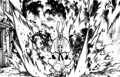
 vsbattles.fandom.com

Charon (Enen no Shouboutai)
Charon is a member of the White-Clad, that serves as the Second Pillar's bodyguard. Tier: At least 7-C, up to High 6-A with Absorption Name: Charon Origin: Enen no Shouboutai Gender: Male Age: 28 Classification: Second Generation Powers and Abilities:
- 7,136
- 3,888
Bump
- 8,485
- 8,937
Have you done this yet?but you need to crop away the overly large empty areas around the actual images before you can use them.
- 7,136
- 3,888
Done.Have you done this yet?
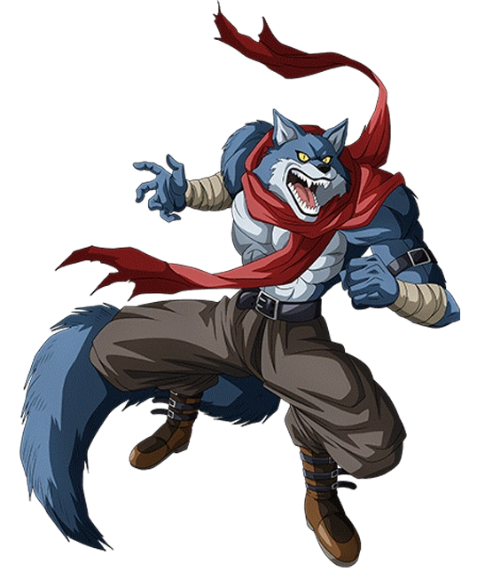
Bergamo
Bergamo is a member of the Trio of Danger, a gang of fighters from Universe 9. He is the eldest and strongest brother and is codenamed "Bergamo the Crusher". Tier: 2-C, far higher with Crusher Ability Name: Bergamo "The Crusher" Origin: Dragon Ball Super Gender: Male Age: Unknown Classification...
- 18,946
- 13,963
- 168,858
- 77,851
- Thread starter
- #2,397
Thank you. I think that they can be added now.Done.

Bergamo
Bergamo is a member of the Trio of Danger, a gang of fighters from Universe 9. He is the eldest and strongest brother and is codenamed "Bergamo the Crusher". Tier: 2-C, far higher with Crusher Ability Name: Bergamo "The Crusher" Origin: Dragon Ball Super Gender: Male Age: Unknown Classification...vsbattles.fandom.com
- 168,858
- 77,851
- Thread starter
- #2,398
Most of the above images seem fine to add.
However, the Aizen and Sui-Feng images have been stretched so they look unnatural, Shigekuni's original image posture fits better into our page format, and work better to show his personality, and Shunsui's current image also fits better into his page.
Thank you for helping out in any case.
- 7,136
- 3,888
DoneThank you. I think that they can be added now.
Similar threads
- Replies
- 175
- Views
- 10K
- Sticky
- Featured
- Replies
- 31
- Views
- 8K
- Replies
- 50
- Views
- 5K