- 168,861
- 77,882
- Thread starter
- #1,441
That seems fine to apply, yes.
Follow along with the video below to see how to install our site as a web app on your home screen.
Note: This feature may not be available in some browsers.
That seems fine to apply, yes.
To me all of the replacement images seem fine to apply.Changed to
Perona
Either be cute or get lost, I won't have ugly things working for me, horohorohorohoro!Perona to Kumashi Perona is the former "Wild Zombies" and "Surprise Zombies Commander" of Thriller Bark before the collapse of Gecko Moriah's zombie army. She can produce ghosts from her body through the powers...vsbattles.fandom.com

VS Battles Wiki
The VS Battles Wiki is the world's most comprehensive and popular index of statistics and powers for characters and items from all of popular fiction.
Changed to
Usopp
Usopp serves as the crew's sharpshooter and previously served as the (barely competent) repairman for the ship. He's the son of Yasopp, a sharpshooter serving under Shanks, and comes from the East Blue. Usopp had a reputation on his home island of being a serial liar who claimed that pirates...
VS Battles Wiki
The VS Battles Wiki is the world's most comprehensive and popular index of statistics and powers for characters and items from all of popular fiction.
Changed to
Gin (One Piece)
Gin the "Man-Demon" is a pirate and a member of the Krieg Pirates. Due to his actions, he can be considered the secondary antagonist of the Baratie Arc. Gin is a relatively thin man of average height with short, scruffy, hair, a scruffy beard, and a slight mustache. He has dark circles under his...
Changed to (Notable Attacks/Techniques)
Big Mom (Charlotte Linlin)
Charlotte Linlin, more widely known as ‘Big Mom’, is the Captain of the Big Mom Pirates and the only female member of the Yonko. A sixty-eight years old obese woman, who has both an enormous physique and an incredible capacity for destruction, Charlotte Linlin has been in the business of piracy...
Big Mom (Charlotte Linlin)
Charlotte Linlin, more widely known as ‘Big Mom’, is the Captain of the Big Mom Pirates and the only female member of the Yonko. A sixty-eight years old obese woman, who has both an enormous physique and an incredible capacity for destruction, Charlotte Linlin has been in the business of piracy...Big Mom (Charlotte Linlin)
Charlotte Linlin, more widely known as ‘Big Mom’, is the Captain of the Big Mom Pirates and the only female member of the Yonko. A sixty-eight years old obese woman, who has both an enormous physique and an incredible capacity for destruction, Charlotte Linlin has been in the business of piracy...
Changed to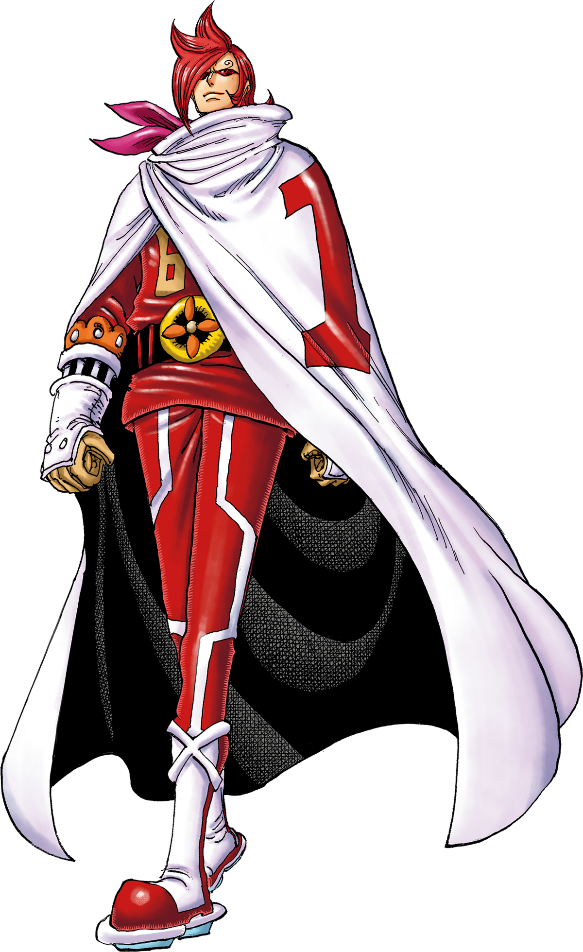
Vinsmoke Ichiji
"Sparking Red" Vinsmoke Ichiji is the eldest son of the Vinsmoke Famiy, making him both a prince of the Germa Kingdom and a commander in its military arm, Germa 66. Tier: High 6-C, higher with Sparkling Valkyrie Name: Vinsmoke Ichiji, epithet "Sparkling Red" Origin: One Piece Gender: Male Age...
VS Battles Wiki
The VS Battles Wiki is the world's most comprehensive and popular index of statistics and powers for characters and items from all of popular fiction.
Changed to
Vinsmoke Reiju
No! Don’t you dare take it that way! She was truly happy over how you turned out. She had no regrets with her decision! Of course you’re not a failure. Mother gave her life in resistance to protect you and the emotions you were born with. That’s what you stand for, Sanji!! It’s why you were born...
VS Battles Wiki
The VS Battles Wiki is the world's most comprehensive and popular index of statistics and powers for characters and items from all of popular fiction.
Changed to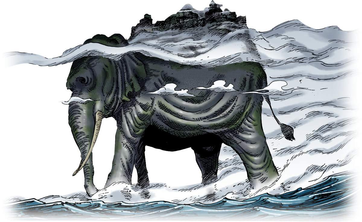
Zunesha
Zunesha is a colossal, sentient elephant that carries the entire country of Zou on its back. In the ancient past, Zunesha was sentenced to walk the seas for eternity and only act upon being ordered to do so for committing an unspecified crime. Since then, it has wandered the sea of the New World...
Changed to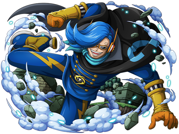
Vinsmoke Niji
Electric Blue Vinsmoke Niji is the 2nd son of the Vinsmoke Family. Like the rest of his family, he is proud of his royal status and does not care for his servants. Tier: High 6-C, higher with Dengeki Blue Name: Vinsmoke Niji, epithet "Electric Blue" Origin: One Piece Gender: Male Age: 21...
VS Battles Wiki
The VS Battles Wiki is the world's most comprehensive and popular index of statistics and powers for characters and items from all of popular fiction.
Changed to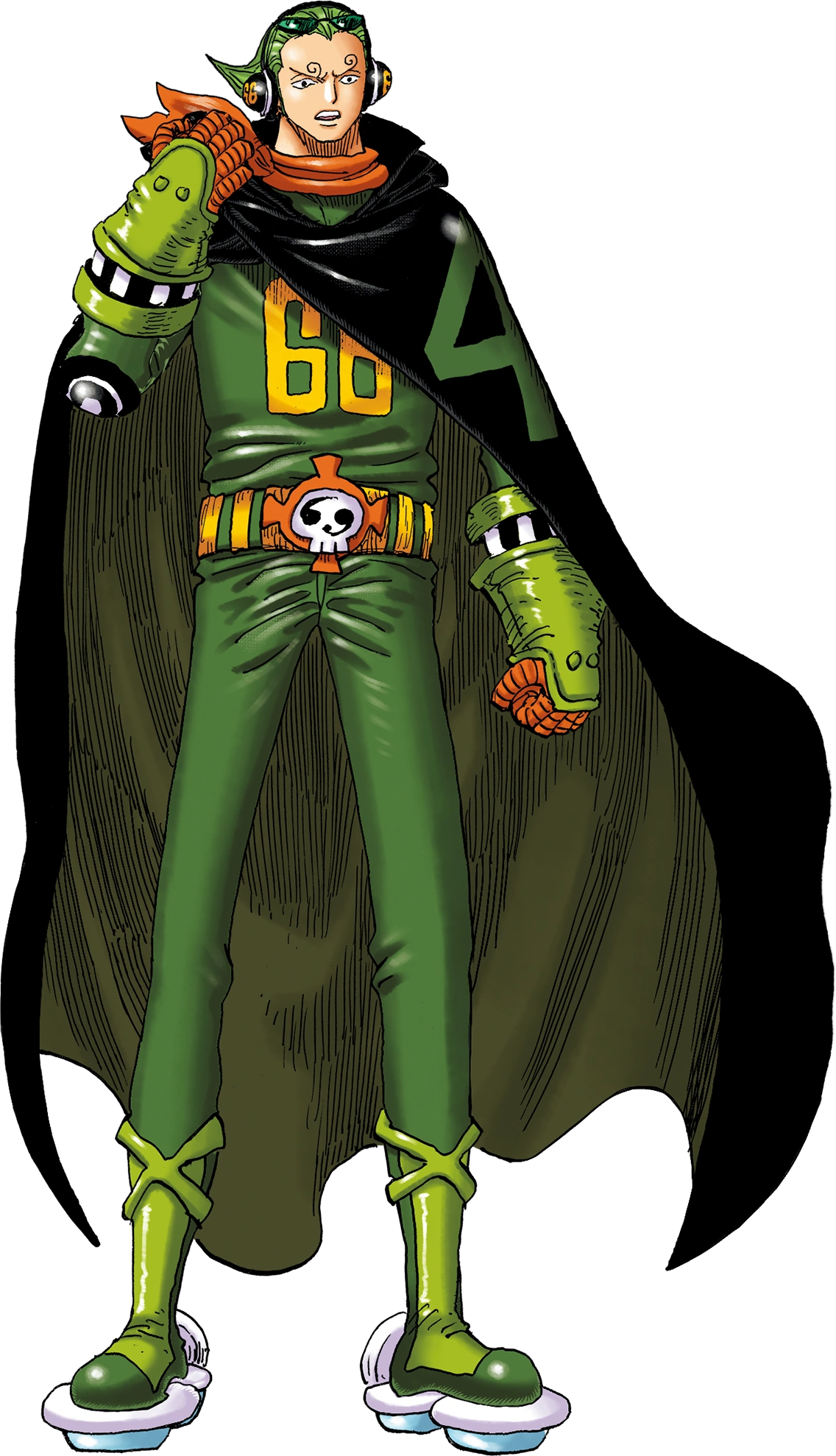
Vinsmoke Yonji
"Winch Green" Vinsmoke Yonji is the fourth son and youngest child of the Vinsmoke Family, making him both a prince of the Germa Kingdom and a commander in its military arm, Germa 66. Tier: High 6-C, higher with Winch Green Name: Vinsmoke Yonji, epithet "Winch Green" Origin: One Piece Gender...
VS Battles Wiki
The VS Battles Wiki is the world's most comprehensive and popular index of statistics and powers for characters and items from all of popular fiction.
Changed to
Vinsmoke Judge
Vinsmoke Judge, also known as Garuda, is the king of the Germa Kingdom, the supreme commander of the Germa 66, and the patriarch of the Vinsmoke Family. He is also a skilled scientist, and a former research partner to the leading World Government scientist Vegapunk. Tier: High 6-C, higher with...
Changed to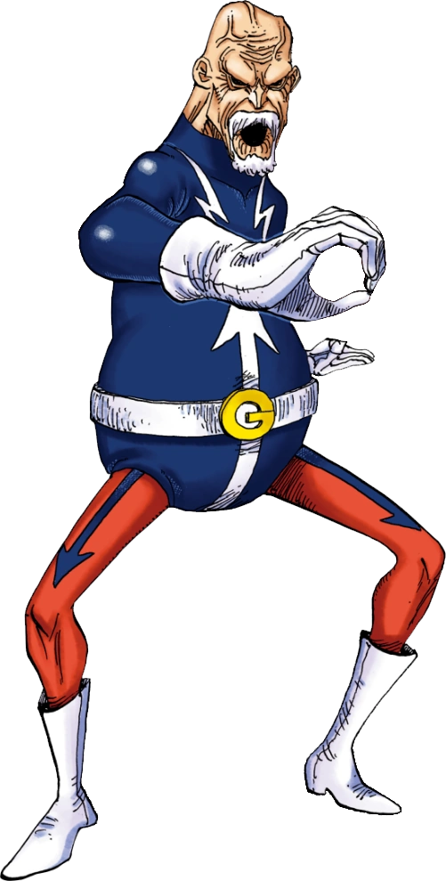
Lao G
Lao G is an officer of the Donquixote Pirates Diamante Army and a major antagonist in the Dressrosa Arc. He is the oldest member among the officers. Though he exhibits and experiences many frailties from becoming elderly that would suggest his vitality is dwindling, he is still a highly adept...
Changed to
Wyper
My name is… not something you may so casually use!!! For I am the descendants of the great warriors who fought to the death for their home eight hundred years ago, the warriors of Shandian!!! … Since that day… following the dying wish of the great warrior Kalgara… for four hundred years… we have...
VS Battles Wiki
The VS Battles Wiki is the world's most comprehensive and popular index of statistics and powers for characters and items from all of popular fiction.
Changed to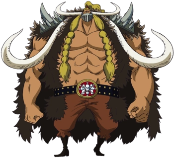
Jack (One Piece)
Let me add one more thing! I love to destroy.Jack Jack, also known by his epithet the Drought, is an All-Star of the Beast Pirates, one of the top three executives of the crew second only to the Emperor Kaido in terms of authority. Together with his comrades King and Queen, they are informally...
VS Battles Wiki
The VS Battles Wiki is the world's most comprehensive and popular index of statistics and powers for characters and items from all of popular fiction.
Changed to
KingTempest16/Sandbox11
VS Battles Wiki
The VS Battles Wiki is the world's most comprehensive and popular index of statistics and powers for characters and items from all of popular fiction.
Which one do you think is better for its base form?For its base form, we have a clear shot of it while contained, showing both the fish and the eyes.
If we want to show him when free, then I think we should use this.
AddedThat seems fine to apply, yes.

Personally 2nd, it would look good and cool transparented but without transparenting both look good but a little better with the tankWhich one do you think is better for its base form?
All added... I didn't implement the images the best so I think they need some size adjustmentsTo me all of the replacement images seem fine to apply.
Which one do you think is better for its base form?
The second image seems fine, yes.Personally 2nd, it would look good and cool transparented but without transparenting both look good but a little better with the tank
Please try to handle it as well as possible via a few comparison attempts. I do not have limitless free time to handle all of my tasks in this community.All added... I didn't implement the images the best so I think they need some size adjustments
Only Lao g, sogeking and jack I'm unsure aboutPlease try to handle it as well as possible via a few comparison attempts. I do not have limitless free time to handle all of my tasks in this community.
Well, I just try to fit the images into the pages in a manner that is neither too obscure, not takes too much room, via trial and error, but given that the images often have very different layout and proportions, it differs from case to case.Only Lao g, sogeking and jack I'm unsure about
Sure I'll try but what I think is what looks good isn't the same as yours, I'm trying to understand how you do it but it's difficult as you always change how you change size, kinda hard to explain
You kinda instinctively make the sizing and it's hard for me to understand what size you want me to make it but I'll try
Yee that's the problem, also the page itself at times makes it seem out if place but I do understand more how slim images should lookWell, I just try to fit the images into the pages in a manner that is neither too obscure, not takes too much room, via trial and error, but given that the images often have very different layout and proportions, it differs from case to case.
Thank you for helping out. You can shorten it down a bit to the more relevant parts if you wish.I resized them.
Usopp's summary is simply way too long to fit it nicely, someone should probably shorten it.
We don't need people's whole life stories I don't think.
Well, I mainly try to fit them into the standard computer and tablet layout, without using Fandom's complete widescreen option, but it is hard to make the images look as good as possible from every device in every viewing mode.Yee that's the problem, also the page itself at times makes it seem out if place but I do understand more how slim images should look
Yee I realized that... You want them to look good in wide and slim versions but isn't standard on wide?without using Fandom's complete widescreen option
Truebut it is hard to make the images look as good as possible from every device in every viewing mode.
I resized them.
Usopp's summary is simply way too long to fit it nicely, someone should probably shorten it.
We don't need people's whole life stories I don't think.
Isn't jack and sogeking to little?Thank you for helping out. You can shorten it down a bit to the more relevant parts if you wish.
Weren't small on my screen.Isn't jack and sogeking to little?
https://vsbattles.fandom.com/wiki/Usopp?so=search#Sogeking
https://vsbattles.fandom.com/wiki/Jack_(One_Piece)?so=search

I don't know anything about One Piece, the summary just seems to contain tons of useless plot information, and I'm already busy doing stuff for the Render Requests Board.Thank you for helping out. You can shorten it down a bit to the more relevant parts if you wish.
Trial and error is fine. It does not clutter the page that I patrol.Weren't small on my screen.
I see what Ant means now. Formatting these pages sucks, especially after Fandom decided to make their layout so ugly and cluttered, and the preview doesn't even line up with how it appears after I hit save. Trial and error is really the only way, which I know clutters the recent edits page that Ant patrols.
Yes.Old images look fine anyways.
Okay. No problem.I don't know anything about One Piece, the summary just seems to contain tons of useless plot information, and I'm already busy doing stuff for the Render Requests Board.
I'll see if any of the supporters want to take a look at it.
 vsbattles.fandom.com
 vsbattles.fandom.com
vsbattles.fandom.com
vsbattles.fandom.com
I’m just trying to help. I’m sorry if I did anything wrongI don't think you can just say that
Also I'm struggling to update Alibaba's FDEA render, can someone either teach me how to do it, or do it for me?I was wondering if this image could replace Alibaba's FDEA image.
Main reason why: the image I'm proposing is much closer to the "camera" so we can very clearly see his face and his body alot better than the original image.
While there could be an argument about the foot being cut out, funnily enough the same thing can be said about the same image, almost the whole leg is cut off/behind his body.
It's also far less cluttered as the original image has fire that isn't very pleasing to the eye/easy to look at compared to the image I'm proposing.