- 168,858
- 77,851
- Thread starter
- #1,121
Okay, but I am very busy.Can you add it since it's an important profile and you are better implementing images?
Follow along with the video below to see how to install our site as a web app on your home screen.
Note: This feature may not be available in some browsers.
Okay, but I am very busy.Can you add it since it's an important profile and you are better implementing images?
Okay, but I am very busy.
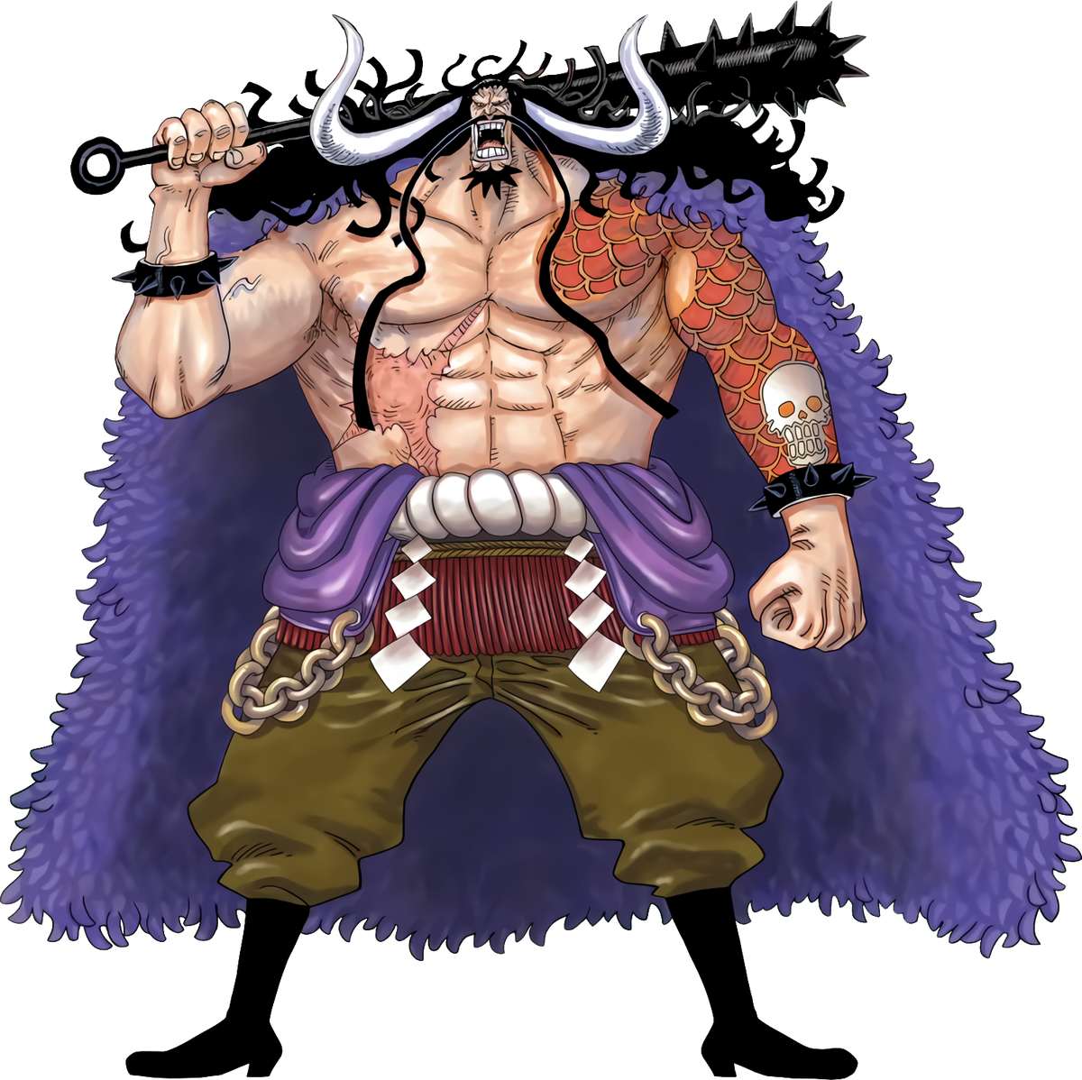
Only the ones that really need it.Question... Should I enhance every image or just the ones that really needs it? Or what should I do?



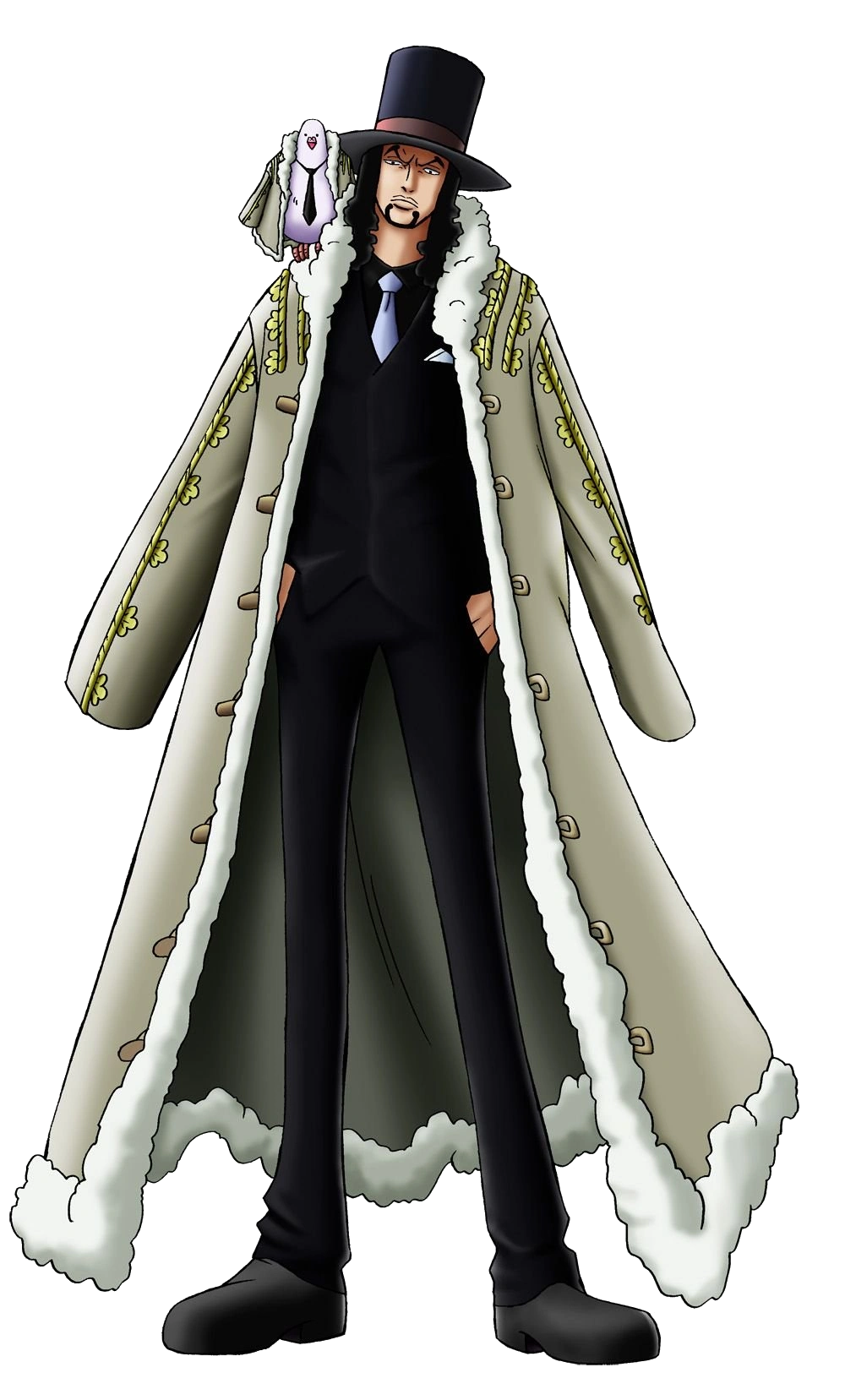

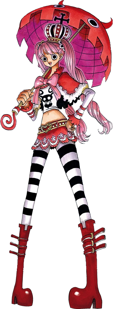

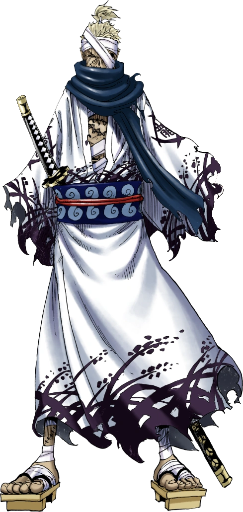

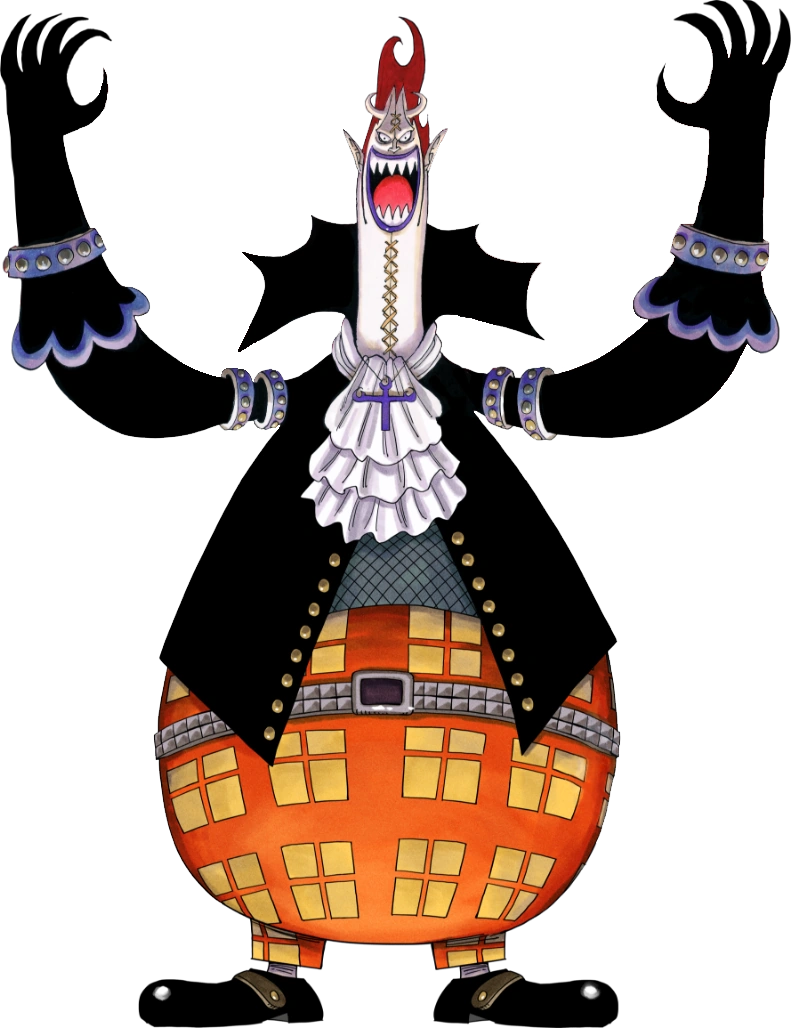


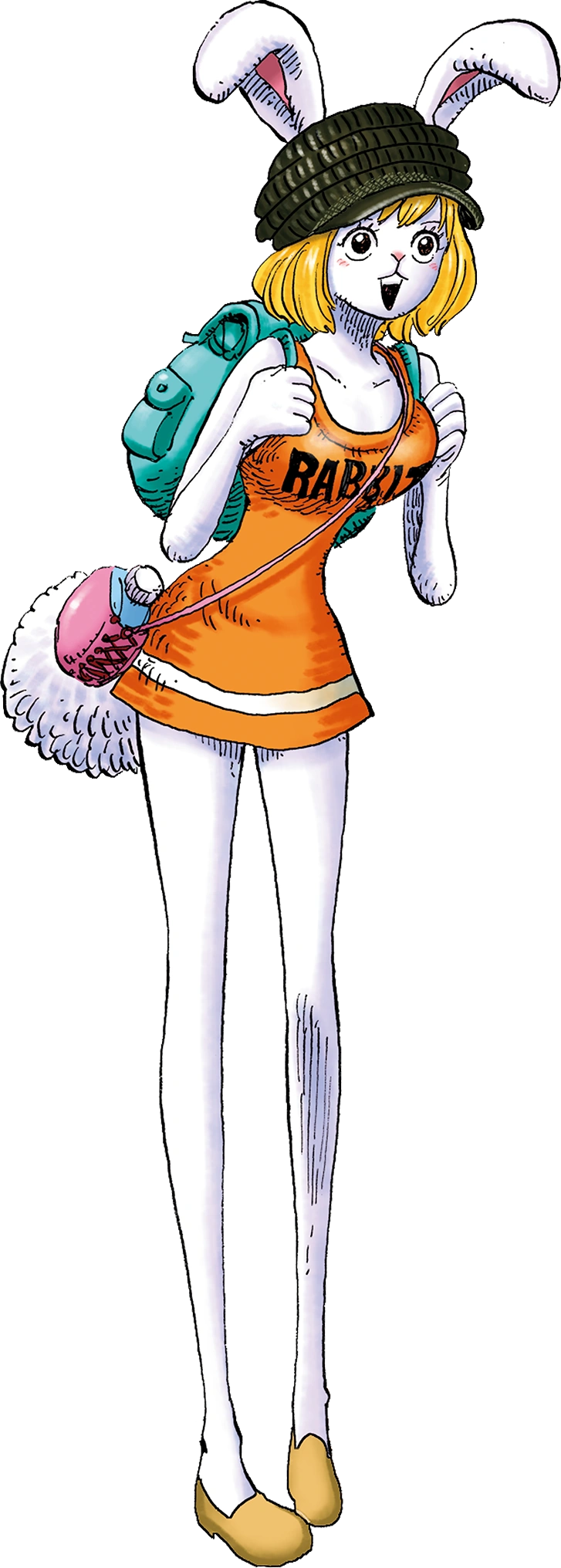
I’m not trying to replace them… I meant another image tab for their base that’s from the Whole Cake island Arcexcept for the Nami one. As for Carrot, I personally like the original better but it doesn't really matter to me
But Nami has a whole cake island arc key... I guess if we had more images of her keys it would be better to include the extra images. Right?The new images seem fine except for Nami and Carrot, yes. I don't think that extra images are necessary for them.
AddedChanged to Enhanced version
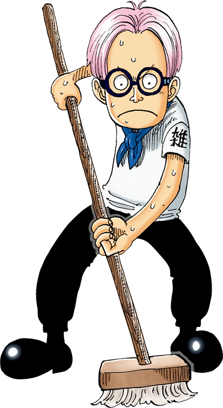
Koby
Koby is first introduced as a cowardly chore boy on board Alvida's ship. Through fear of being smashed by her Iron Mace, whenever she asked him who was the loveliest on the sea, he would reply, "You are, Miss Alvida". Eventually, with the help of Luffy, he found the courage to pursue his dream...vsbattles.fandom.com

VS Battles Wiki
The VS Battles Wiki is the world's most comprehensive and popular index of statistics and powers for characters and items from all of popular fiction.vsbattles.fandom.com
Changed to
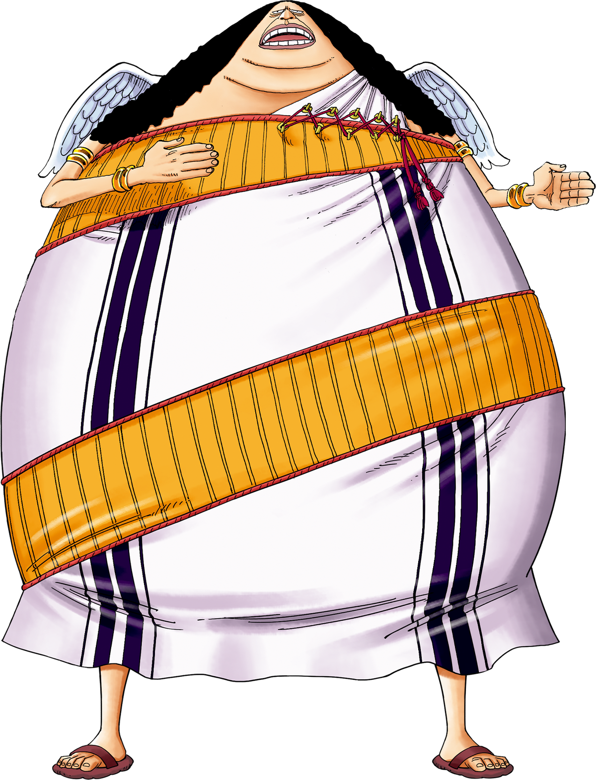
Yama (One Piece)
The Commander of Enel's Divine Soldiers who moves lightly despite his great size. Yama is fanatically loyal to Enel to the point he will even reprimand The Priests if he feels like they’re being disrespectful in his god’s presence. He also has no interest in the past. During his fight with...vsbattles.fandom.com

VS Battles Wiki
The VS Battles Wiki is the world's most comprehensive and popular index of statistics and powers for characters and items from all of popular fiction.vsbattles.fandom.com
Changed to
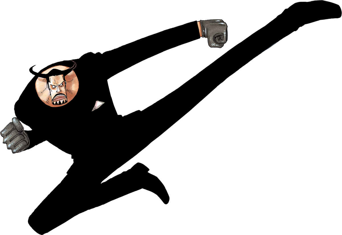
Blueno
Blueno is one of the members of CP9. Tier: 7-B, higher with Rokushiki Name: Blueno Origin: One Piece Gender: Male Age: 30 (Pre-Timeskip) | 32 (Post-Timeskip) Classification: Paramecia Devil Fruit user, CP9, Agent of the World Govenrment Powers and Abilities: Superhuman Physical Characteristics...vsbattles.fandom.com
Changed to
Rob Lucci
“The Murder Machine” Rob Lucci was the strongest member of Cipher Pol Number Nine, a top-secret group of eight assassins tasked with various undercover operations for the World Government. Lucci bases his outlook on justice on his personal philosophy that any person or thing that goes against...vsbattles.fandom.com

VS Battles Wiki
The VS Battles Wiki is the world's most comprehensive and popular index of statistics and powers for characters and items from all of popular fiction.vsbattles.fandom.com
Changed to
Perona
Perona is the former "Wild Zombies" and "Surprise Zombies Commander" of Thriller Bark before the collapse of Gecko Moriah's zombie army. She can produce ghosts from her body through the powers of the Horo Horo no Mi. She was defeated by Usopp who was the only able to properly fight back given...vsbattles.fandom.com

VS Battles Wiki
The VS Battles Wiki is the world's most comprehensive and popular index of statistics and powers for characters and items from all of popular fiction.vsbattles.fandom.com
Changed to
Ryuma
Monsters is a story about the young samurai Shimotsuki Ryuma (a Zoro prototype) who aims to be the strongest swordsman in the land, a mysterious knight and master fencer Cirano and a legendary horn which can summon a dragon. He was born in the Ringo region in Wano. Ryuma is a very powerful...vsbattles.fandom.com
Changed to
Gecko Moria
Gecko Moria is a villain from One Piece, and was a member of the Shichibukai. He resided on the largest ship in the world, Thriller Bark, and his Devil Fruit powers can manipulate shadows. His former bounty is 320,000,000 Beli. He is also the main antagonist of the Thriller Bark Arc who stole...vsbattles.fandom.com
The only reason for a change between arcs for Nami would be due to her climatact/Zeus but the proposed image doesn't show that.But Nami has a whole cake island arc key... I guess if we had more images of her keys it would be better to include the extra images. Right?
Also about blueno... He's image is quite wide... So I might have problems implementing it
Thank you. I will check.Added
This makes sense to me.The only reason for a change between arcs for Nami would be due to her climatact/Zeus but the proposed image doesn't show that.
well, i prefer the other, the drawings looks betternah, the current one is more cooler
I think that auraless looks better in that pic, also the shape of his body is really weird in the current pictureyea but that aura tho, and how gokus just looking down on us like he's a god
These are good… but the rest aren’t full body images
Ah, alright thanks fine. Thanks anyways.My apologies, but with the possible exception of a cropped version of the base Noelle image, I don't think that any of those images serve our purposes better than the ones that we currently use.
Yeah I like those too. They're full body images as well, and they look better than the current one imoThese are good… but the rest aren’t full body imagesbut I don’t know
The current ones are not very good, but the ones that you suggested are either not full-body images, or look even worse.Ah, alright thanks fine. Thanks anyways.
How about the Black Asta and Black Divider images? I really don't like how they look in the profiles, but if your response is still the same, then I understand.
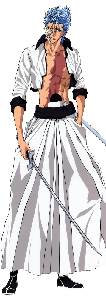


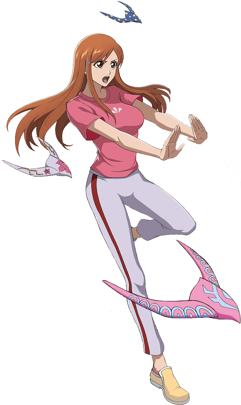

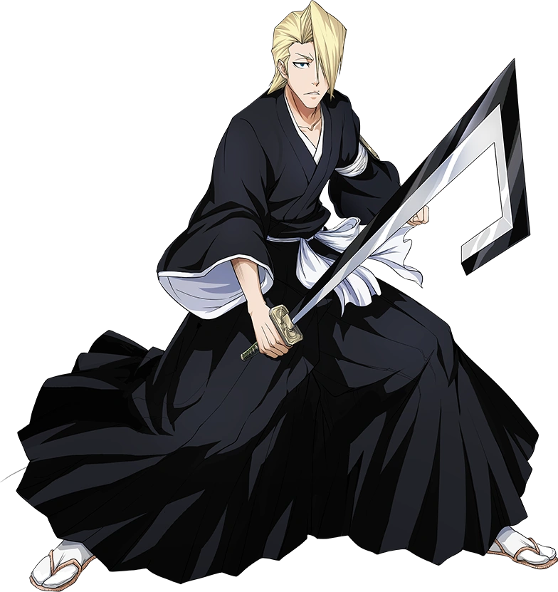

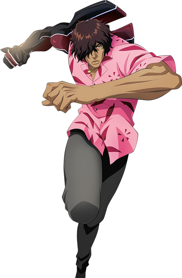

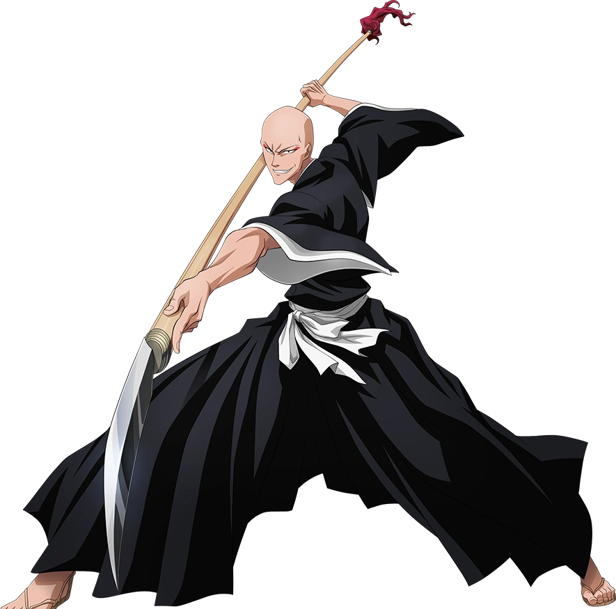

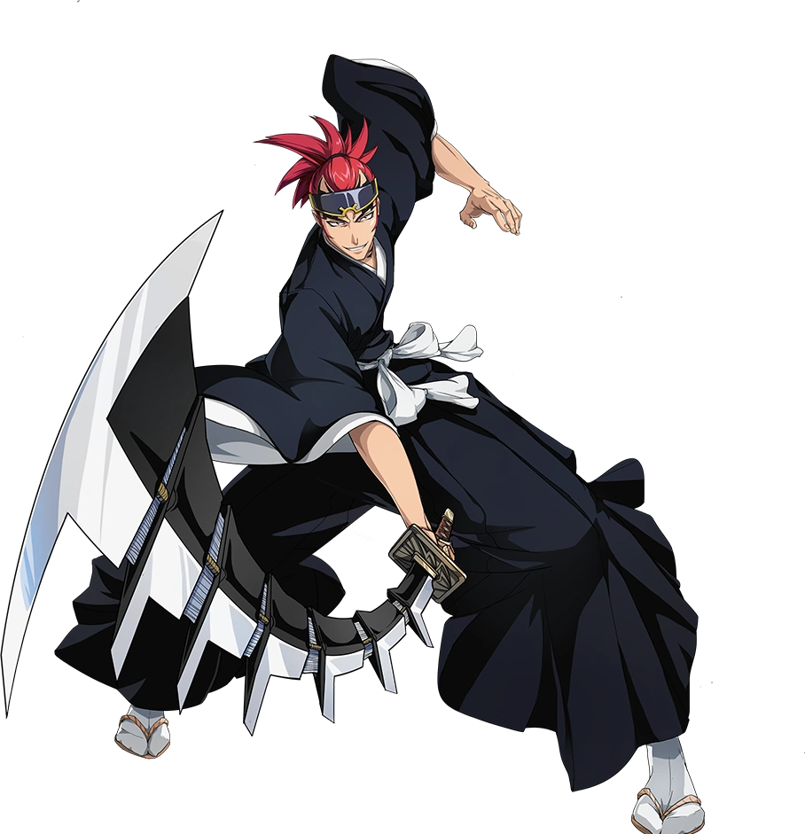

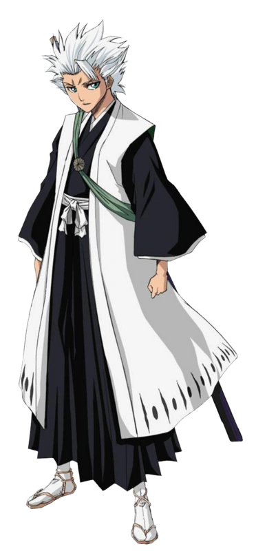
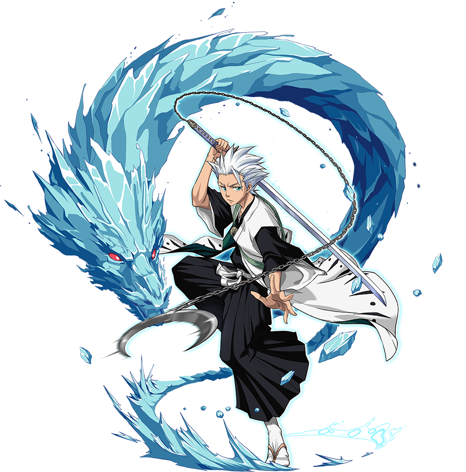
with the exception of Grimmjow.
All of your new images look better than the ones we currently use
Locked I thinkChanged to
Orihime Inoue
Orihime Inoue (井上 織姫, Inoue Orihime) is a Human living in Karakura Town. She is a student at Karakura High School, where she is in the same class as Ichigo Kurosaki and her best friend, Tatsuki Arisawa. At some point during the Epilogue, she and Ichigo fell in love and eventually started a...vsbattles.fandom.com

VS Battles Wiki
The VS Battles Wiki is the world's most comprehensive and popular index of statistics and powers for characters and items from all of popular fiction.vsbattles.fandom.com
What should I do with this?Add or change to? I'm not sure what version this is, Pre Timeskip?
Yasutora Sado (Chad)
Yasutora Sado (茶渡 泰虎, Sado Yasutora), also known as Chad (チャド, Chado) is a human teenager who lives in Karakura Town. He is a student at Karakura High School, where he is in the same class as Ichigo Kurosaki. Tier: 9-A | At most 7-B, possibly 6-B with Strongest Attacks | 6-B, higher with his...vsbattles.fandom.com
I have unlocked it.Locked I think
@Elizhaa @Damage3245 @ShadowbokunoheroWhat should I do with this?