Navigation
Install the app
How to install the app on iOS
Follow along with the video below to see how to install our site as a web app on your home screen.
Note: This feature may not be available in some browsers.
More options
-
This forum is strictly intended to be used by members of the VS Battles wiki. Please only register if you have an autoconfirmed account there, as otherwise your registration will be rejected. If you have already registered once, do not do so again, and contact Antvasima if you encounter any problems.
For instructions regarding the exact procedure to sign up to this forum, please click here. -
We need Patreon donations for this forum to have all of its running costs financially secured.
Community members who help us out will receive badges that give them several different benefits, including the removal of all advertisements in this forum, but donations from non-members are also extremely appreciated.
Please click here for further information, or here to directly visit our Patreon donations page. -
Please click here for information about a large petition to help children in need.
You are using an out of date browser. It may not display this or other websites correctly.
You should upgrade or use an alternative browser.
You should upgrade or use an alternative browser.
We are now a part of the official Fandom app
- Thread starter Antvasima
- Start date
-
- Tags
- vs battles wiki
- 2,463
- 928
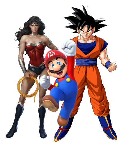
I will create several versions based on the recent ideas you've suggested. The current comic book Wonder Woman's render is kinda edgy because it has a bit of white edge, so maybe I'll have to rerender it. I wonder about where does the FANDOM staff takes the much-needed renders...
- 31,891
- 35,143
I think that one's great!
- 31,891
- 35,143
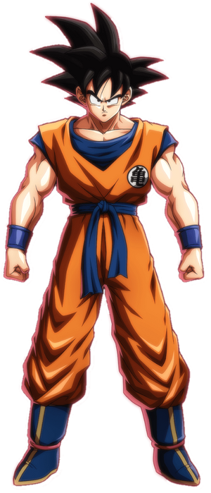
Out of all Goku images, I think that one does fit in best.
- 10,758
- 6,491
I also don't like the Goku image to be honest.
- 168,859
- 77,868
- Thread starter
- #303
- 10,758
- 6,491
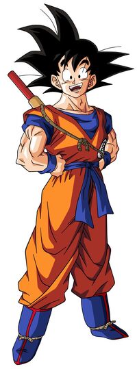
Maybe if he's in a more casual pose and is a little less...brighter? he would fit better.
- 168,859
- 77,868
- Thread starter
- #306
You can check here to see if you find any better mostly casual standing position images of high quality:
https://dragonball.fandom.com/wiki/Goku/Gallery
https://dragonball.fandom.com/wiki/Goku/Gallery
- 10,758
- 6,491
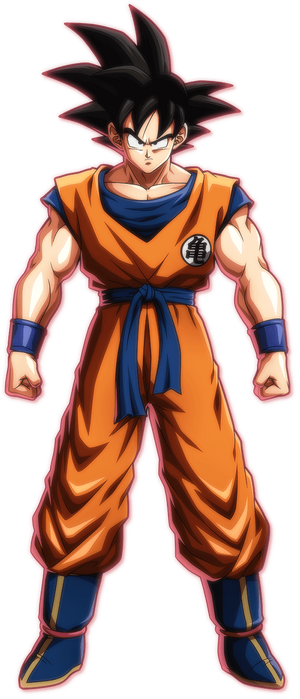
Yeah I think the lack of texture on Goku and his super serious expression are make him stand out compared to WW and M.
- 2,289
- 715
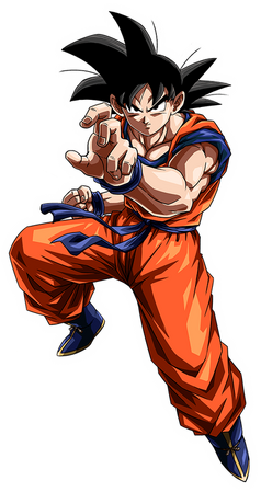
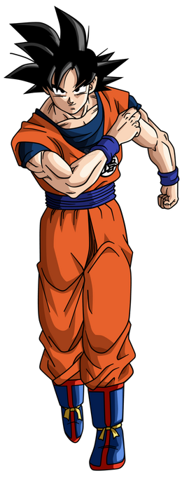
His legs look weird.Antvasima said:Here is another image, but it does not look as good i.m.h.o., as Goku looks angrily to the side, which also is not appropriate for the required composition.
- 168,859
- 77,868
- Thread starter
- #312
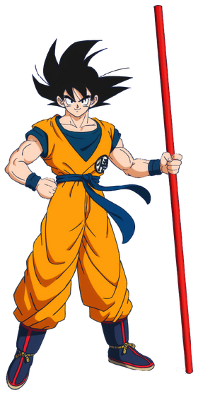
I suppose that one might work, but it depends on if it fits the intended proportions of the Fandom advertisement image.AKM sama said:Perhaps you can also try the new artstyle Goku.
- 10,758
- 6,491
- 168,859
- 77,868
- Thread starter
- #318
@AKM
It is a rather poor quality drawing. I don't like it.
@Therefir
Well, we can wait and see if Skalt711 thinks that it is fixable.
@All
What about the new art style image? I personally wouldn't mind if it is fit in the current position of the other Goku image, but it also depends on if the proportions of the whole image would fit the requirements.
What do you think Skalt?
- 168,859
- 77,868
- Thread starter
- #319
Maybe. I personally like the new art style image better. The body proportions look a bit weird in your image.Andytrenom said:
Similar threads
- Sticky
- Featured
- Replies
- 31
- Views
- 8K
- Sticky
- Featured
- Replies
- 19
- Views
- 10K
- Replies
- 192
- Views
- 19K
- Replies
- 36
- Views
- 3K
- Sticky
- Featured
- Replies
- 46
- Views
- 13K
