• This forum is strictly intended to be used by members of the VS Battles wiki. Please only register if you have an autoconfirmed account there, as otherwise your registration will be rejected. If you have already registered once, do not do so again, and contact Antvasima if you encounter any problems.

    For instructions regarding the exact procedure to sign up to this forum, please click here.
  • We need Patreon donations for this forum to have all of its running costs financially secured.

    Community members who help us out will receive badges that give them several different benefits, including the removal of all advertisements in this forum, but donations from non-members are also extremely appreciated.

    Please click here for further information, or here to directly visit our Patreon donations page.
  • Please click here for information about a large petition to help children in need.

We are now a part of the official Fandom app

@Therefir

That's because there are tons of options to choose from ;D

@Antvasima

The redline is fixable given enough time, but Therefir's suggestion doesn't work that well because it is way too detail for an anime image. The new artstyle Goku looks awesome!

@All

At this time I can't work on images as I'm in school.
 
@Skalt711

Okay. No problem. I suppose that we will try with the new artstyle image then.
 
@Skal711 If you are going to use the new artstyle image, don't forget that Wonder Woman is 1.82 m, while Goku is 1.75 m (Around 1.93 m including his spiky hair).
 
Skalt711 said:
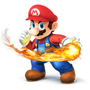
I gonna use Comic Book!Wonder Woman, Smash 4!Mario and new artstyle DBS!Goku for the new image.
Smash Ultimate!Mario would be better, as it's more relevant.
 
I think that the currently used Mario image is fine.
 
Fair then. Since that there are only 3 characters on the mobile logo, maybe DCEU!Wonder Woman would be fine?
 
The last one is awesome, although it may not fully fit in the Fandom app's layout.
 
My only complaint would be that Goku's expression is kinda hard to make out from a distance but apart from that it's good.

As for the other two, I think the image with happy goku gives a better "group dynamic" and seems like a more appropriate way to include Goku in a picture where everyone else is in a happy mood

The one with serious goku seems better visually tho, I'm not sure why but the overall colours and design seem to mesh well together.
 
@Skalt711

I think that Goku and Wonder Woman should be closer together, and Mario lower down, in the TFOG image, for it to fit in the required format.

Currently your own image looks better in terms of structure.

Perhaps you could create your own version instead?
 
Edit:

I posted before I saw TFOG's new post. Here are the two versions of his image:

Icon3
Icon3-v2
 
The second version looks better i.m.h.o., but Mario should preferably still be lower down, and Goku and WW a bit closer.
 
@Cal

Which image is that?
 
I suppose that image could work without a fireball.
 
The first one seems pretty good, but in the second one Mario probably needs to be placed a bit higher.
 
Given Mario's canonically like, 5'1" and half the size as the Saiyan and the Amazon, you could always make the image taller.
 
I think that he works better for the image composition at his current size.

Anyway, I also like the last image, but it might be even better if Mario was slightly higher up.
 
@TFOG

Okay. Never mind then.
 
@TFOG

I think that looks good.

@All

Would the rest of you be fine with if we submit that image as a representation for our wiki?
 
@Cal

Okay. Thank you for the input.
 
Think Goku and WW should still be a little closer because Goku's streched out arm makes the image a little wider.
 
Back
Top