• This forum is strictly intended to be used by members of the VS Battles wiki. Please only register if you have an autoconfirmed account there, as otherwise your registration will be rejected. If you have already registered once, do not do so again, and contact Antvasima if you encounter any problems.

    For instructions regarding the exact procedure to sign up to this forum, please click here.
  • We need Patreon donations for this forum to have all of its running costs financially secured.

    Community members who help us out will receive badges that give them several different benefits, including the removal of all advertisements in this forum, but donations from non-members are also extremely appreciated.

    Please click here for further information, or here to directly visit our Patreon donations page.
  • Please click here for information about a large petition to help children in need.

A front page layout update

Looks quite snazzy. The fact that all the info is stored in another tab also makes it much cleaner-looking (not gonna lie, always thought the old one was a bit of a mess with the information barrage it presented).

I very much like it.
 
Yes, that was my concern as well.
 
Swapping to the "members" side seems to remove the important info pages, which I'd personally keep available for both, but besides that I'd say it does a better job of not overwhelming new users.
 
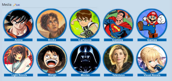
I made another small modification, so the images icons are now properly aligned in rows of five.
 
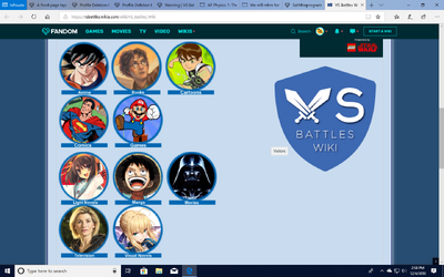
They don't seem to line up like that on the computer, though ik you said a while ago you use a tablet so it may just be different. It still looks good though.
 
Wokistan said:
They don't seem to line up like that on the computer, though ik you said a while ago you use a tablet so it may just be different. It still looks good though.
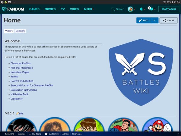
Here is what it should look like:

1543953233465
 
Screenshot (52213123)
It ends up looking like this on the computer, though I don't think there's a way to make it consistent across both platforms.
 
Anyway, I hope that this will bring in more casual visitors.
 
@Wokistan

Hmm. That is a big problem.

@All

Does somebody know how to edit it to turn more computer friendly?
 
@Celestial Pegasus

Okay. Thank you for the information.
 
This

Looks like a gud page

now if only Fandom can stop promoting Adam Ruins Everything the front page can be rid of that heresy
 
I would appreciate staff help with fixing the formatting, so it looks fine for Wokistan and the others.
 
Maybe it is a case of whether or not you have a program that blocks advertisements installed?
 
Well, it would be better if the page looks fine both with and without ads.
 
No, only Fandom can do that.
 
I could send them a message though.
 
I have now asked Fandom about the issue.
 
Back
Top