Navigation
Install the app
How to install the app on iOS
Follow along with the video below to see how to install our site as a web app on your home screen.
Note: This feature may not be available in some browsers.
More options
-
This forum is strictly intended to be used by members of the VS Battles wiki. Please only register if you have an autoconfirmed account there, as otherwise your registration will be rejected. If you have already registered once, do not do so again, and contact Antvasima if you encounter any problems.
For instructions regarding the exact procedure to sign up to this forum, please click here. -
We need Patreon donations for this forum to have all of its running costs financially secured.
Community members who help us out will receive badges that give them several different benefits, including the removal of all advertisements in this forum, but donations from non-members are also extremely appreciated.
Please click here for further information, or here to directly visit our Patreon donations page. -
Please click here for information about a large petition to help children in need.
You are using an out of date browser. It may not display this or other websites correctly.
You should upgrade or use an alternative browser.
You should upgrade or use an alternative browser.
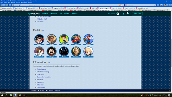
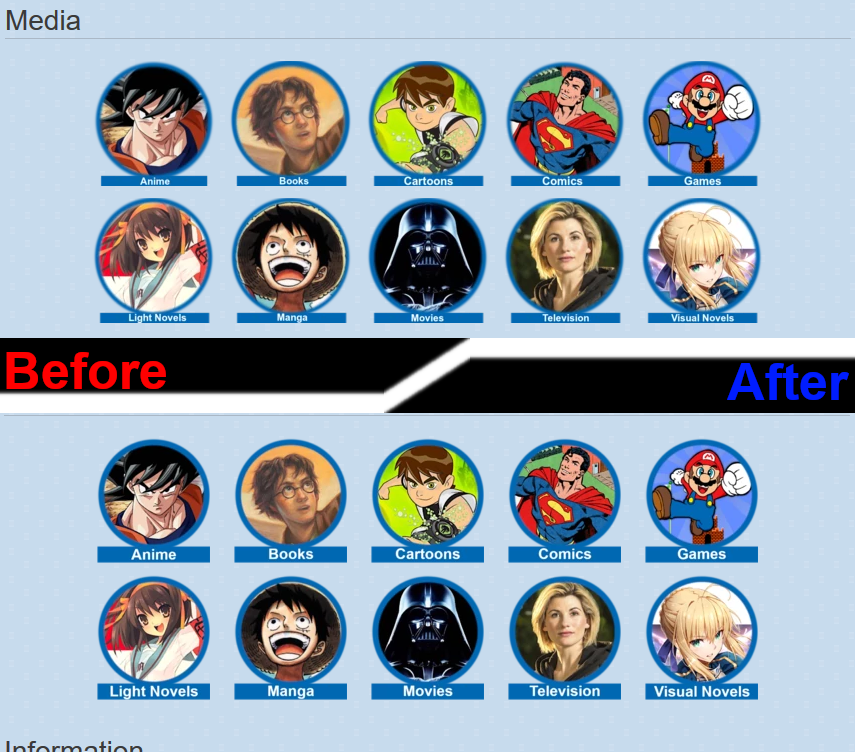
A front page layout update
- Thread starter Antvasima
- Start date
- 10,758
- 6,491
Legit cannot figure out the difference...
- 2,463
- 928
So, I'm very aware of small figures...Andytrenom said:Legit cannot figure out the difference...
- 10,758
- 6,491
Nah, it's my eyesight that is horrible.Skalt711 said:So, I'm very aware of small figures...
- 2,463
- 928
Do you accept the new pictures?Andytrenom said:Nah, it's my eyesight that is horrible.
- 11,099
- 4,323
I cannot figure out the difference too lol.
- 2,463
- 928
I'd do test drive of my pics, but I don't know how to setup sandbox.Antvasima said:I think they look good. Thanks again for all of your help.
- 10,758
- 6,491
Hey it does look better.
- 481
- 505
- 2,463
- 928
Any idea for Music icon? I'm voting for an SCP icon for Internet.Ogurtsow said:
- 481
- 505
@Skalt
Someone from Gorillaz could work here.
https://lastfm-img2.akamaized.net/i/u/770x0/3553c5a54eaf4facac0e555b7beb172b.jpg
Someone from Gorillaz could work here.
https://lastfm-img2.akamaized.net/i/u/770x0/3553c5a54eaf4facac0e555b7beb172b.jpg
- 10,064
- 5,291
Yeah, I was thinking SCP for Internet as well. As for music...uh...Steam Powered Giraffe?
- 31,411
- 34,222
Well, we don't have a lot of music character profiles, but Internet seems like another major medium. Especially considering some possible plans. I actually did talk to a few other staff members mentioning that a profile for the AVGN might actually be plausible. Matt said a version based on his two published games at least are alright, but there's also other things that warrant plausibility for a profile in general. Such as actually having a continuity and a notable publisher; meaning it's not some YouTube personality and what not.
- 10,064
- 5,291
So, universes such as RWBY, Rock Hard Gladiators or the Crypt TV Monster Universe, correct?
- 167,703
- 76,303
- Thread starter
- #107
I don't mind a 4x3 section, but don't know if the Music category is big enough to qualify.Ogurtsow said:
We might need Ryukama's help to create the same type of icons as previously though.
- 10,687
- 6,335
- 10,687
- 6,335
The icons are pretty easy to make, I can make a few really quick if you need.
- 2,463
- 928
Don't forget that the icons must have an equal style (ex.: my icons), but if really quick, then I think it's okay.Darkanine said:The icons are pretty easy to make, I can make a few really quick if you need.
- 10,687
- 6,335
It may actually just be a better idea to convert them to a template instead, that way they can be modified by other people by changing a few parameters rather than creating a brand new icon. I've made some templates on another wiki that could work here.
No offense to Ryu but the images are kind of low quality, with lots of visual artifacts and inconsistent coloring. I may be able to just make better versions of them, which would be easier than just editing them.
No offense to Ryu but the images are kind of low quality, with lots of visual artifacts and inconsistent coloring. I may be able to just make better versions of them, which would be easier than just editing them.
- 2,463
- 928
The template you have given is too unfitting to VSBW's nature.Darkanine said:I've made some templates on another wiki that could work here.
the images are kind of low quality, with lots of visual artifacts and inconsistent coloring. I may be able to just make better versions of them, which would be easier than just editing them.
I'd pick up better quality pictures, but I'm lazy.
- 10,687
- 6,335
@Skalt. It was just an example. They can be modified to look differently. It's just easier for everyone to use templates instead of image files, since image files are trickier to edit for people who don't have experience with it. But okay, I'll start working on icons after in a bit (gotta go for now).
- 2,463
- 928

The source is http://scpsandboxwiki.wikidot.com/bland:logo

The source is https://pixshark.com/gorillaz.htm
Similar threads
- Replies
- 50
- Views
- 4K
- Replies
- 31
- Views
- 5K
