Navigation
Install the app
How to install the app on iOS
Follow along with the video below to see how to install our site as a web app on your home screen.
Note: This feature may not be available in some browsers.
More options
-
This forum is strictly intended to be used by members of the VS Battles wiki. Please only register if you have an autoconfirmed account there, as otherwise your registration will be rejected. If you have already registered once, do not do so again, and contact Antvasima if you encounter any problems.
For instructions regarding the exact procedure to sign up to this forum, please click here. -
We need Patreon donations for this forum to have all of its running costs financially secured.
Community members who help us out will receive badges that give them several different benefits, including the removal of all advertisements in this forum, but donations from non-members are also extremely appreciated.
Please click here for further information, or here to directly visit our Patreon donations page. -
Please click here for information about a large petition to help children in need.
You are using an out of date browser. It may not display this or other websites correctly.
You should upgrade or use an alternative browser.
You should upgrade or use an alternative browser.
A front page layout update
- Thread starter Antvasima
- Start date
CinnabarManx421
He/Him- 5,805
- 3,703
Yeah it's definetly the ads. I saw the page right before an ad popped in and it was normal.
- 2,601
- 114
We could have a Christmas layout
- 10,758
- 6,491
I'd personally prefer if the tabber didn't contain the whole page but overall the change is nice.
- 167,703
- 76,303
- Thread starter
- #49
The Fandom staff were not able to help me with the tabbers, but directed me to the following page, where I left a request:
https://community.wikia.com/wiki/Community_Central_talk:Community_Development_Team/Requests#VS_Battles_wiki
https://community.wikia.com/wiki/Community_Central_talk:Community_Development_Team/Requests#VS_Battles_wiki
- 167,703
- 76,303
- Thread starter
- #50
I think that we used a Christmas version of the logo image previously. I will check if I can find it.The Archdemon said:We could have a Christmas layout
- 167,703
- 76,303
- Thread starter
- #51
I have updated the page to Ryukama's Christmas logo image:
https://vsbattles.fandom.com/index.php?title=VS_Battles_Wiki&diff=3648837&oldid=3648477
https://vsbattles.fandom.com/index.php?title=VS_Battles_Wiki&diff=3648837&oldid=3648477
- 3,464
- 891
I love the Christmas logo. And now I want candy canes.
- 10,758
- 6,491
The Christmas logo was more adorable than I expected...
- 31,411
- 34,222
It looks magnificent.
- 1,881
- 230
Cool and good.
- 2,601
- 114
Now, that's good
- 167,703
- 76,303
- Thread starter
- #59
After talking with the Fandom support, and trying different things to adjust the front page layout, the only workable solution that they eventually came up with was to make the media section images smaller, so they would line up in rows of 5 no matter the size of the screen, and despite the advertisement to the right pushing down our VS Battles logo image.
The problem is that small icons do not look quite as good, and I had to go from 190px to 118px scaling in order to make this work, so I would appreciate community input.
The problem is that small icons do not look quite as good, and I had to go from 190px to 118px scaling in order to make this work, so I would appreciate community input.
- 11,134
- 14,119
Small icons with even smaller fonts don't look quite as good as before, but at least they are aligned correctly now. I am neutral, both versions have their advantages and disadvantages and it's not that big a deal anyway.
- 167,703
- 76,303
- Thread starter
- #65
I have received another reply from Fandom:
"Hey again,
I'm sorry, but as I said before, the advertisement is a standard, unchangeable part of every wiki's main page design.
I don't know that I agree that what you have now looks worse than what was there before.
But I can see areas for possible improvement. It looks like you have the captions as a part of the design. That means that when you shrink the size of the icon, you're also shrinking the text. Were it my wiki, I'd certainly divorce the caption from the icon itself, create a gallery, and place actual captions underneath the images. That way, the images could be a bit bigger, and the captions would be legible. By using < gallery > code, you can also choose to position="center" the entire thing, which would make the gallery fit better on the page.
https://community.wikia.com/wiki/Help:Galleries,_Slideshows,_and_Sliders/wikitext
Almost every wiki updated in the last few years has a gallery on the front page, so take a look around Fandom for inspiration!"
Is this something that might be a good idea, and if so, would other staff members be willing to help out with modifying the icons?
- 167,703
- 76,303
- Thread starter
- #66
I have now changed the images to a gallery format:
https://vsbattles.fandom.com/index.php?title=VS_Battles_Wiki&diff=3654447&oldid=3653872
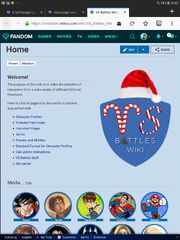
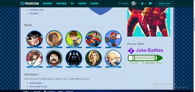
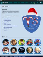
This is what is looks like without ads on a tablet, depending on the direction of the screen, respectively what it looks like with ads enabled.
I think that it seems less bad than previously at least.


https://vsbattles.fandom.com/index.php?title=VS_Battles_Wiki&diff=3654447&oldid=3653872
This is what is looks like without ads on a tablet, depending on the direction of the screen, respectively what it looks like with ads enabled.
I think that it seems less bad than previously at least.


- 167,703
- 76,303
- Thread starter
- #68
A fandom member modified the front page again:
https://vsbattles.com/vsbattles/2431287#4
Which version do you prefer?
https://vsbattles.com/vsbattles/2431287#4
Which version do you prefer?
- 6,698
- 2,496
I think it loos good.
- 167,703
- 76,303
- Thread starter
- #74
Well, the easiest way to do so with the current formatting is to remove the text boxes from the full size images, make sure that the blue circles around them are complete, and then edit the gallery coding so there is regular text below the images instead.
Alternately somebody could edit the images so the text boxes below them turns a bit larger, comparatively speaking. That would likely work better. However, I use a tablet, am not skilled with Photoshop, and am already very busy.
Alternately somebody could edit the images so the text boxes below them turns a bit larger, comparatively speaking. That would likely work better. However, I use a tablet, am not skilled with Photoshop, and am already very busy.
- 2,463
- 928
I can. Just tell me the font used in text boxes.Antvasima said:So is anybody willing to help out with editing the image text boxes in Photoshop so they turn a bit larger vertically?
Similar threads
- Replies
- 50
- Views
- 4K
- Replies
- 31
- Views
- 5K
