Navigation
Install the app
How to install the app on iOS
Follow along with the video below to see how to install our site as a web app on your home screen.
Note: This feature may not be available in some browsers.
More options
-
This forum is strictly intended to be used by members of the VS Battles wiki. Please only register if you have an autoconfirmed account there, as otherwise your registration will be rejected. If you have already registered once, do not do so again, and contact Antvasima if you encounter any problems.
For instructions regarding the exact procedure to sign up to this forum, please click here. -
We need Patreon donations for this forum to have all of its running costs financially secured.
Community members who help us out will receive badges that give them several different benefits, including the removal of all advertisements in this forum, but donations from non-members are also extremely appreciated.
Please click here for further information, or here to directly visit our Patreon donations page. -
Please click here for information about a large petition to help children in need.
You are using an out of date browser. It may not display this or other websites correctly.
You should upgrade or use an alternative browser.
You should upgrade or use an alternative browser.
Profile image additions or replacements requests
- Thread starter Antvasima
- Start date
- Status
- Not open for further replies.
- 10,687
- 6,336
I added the Pickle Rick render, but I kind of prefer the current Rick image.
- 1,855
- 292
I agree with Jinx. It's definitely cleaner and is a render of all things.
Here's my thing, Jaden Yuki with the Duel Links art. I'd do the others but for some reason their renders are with a black background and that's not even worth doing with how their lines are.
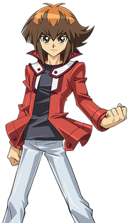
Here's my thing, Jaden Yuki with the Duel Links art. I'd do the others but for some reason their renders are with a black background and that's not even worth doing with how their lines are.

- 11,444
- 1,998
- 10,687
- 6,336
I still don't like the Rick image. It doesn't convey his personality as well and looks kind of ugly all around.
I also don't like the Morty image either, but that's for another time.
I also don't like the Morty image either, but that's for another time.
- 3,314
- 662
Its a render. Its looking at the camera. Its a popular page so it needs to look as proffessional as it can be, and images need to make sure they show what they look like rather than personality. Its a fighting profile, not really to showcase a personality. We have quotes for that if anything.
- 1,855
- 292
I don't recall that being a thing ever, nor for any instance of it being a "we" thing Rep. A lot of profiles on this site have things that aren't "in action", and a character model is something exactly needed for a page because it's just that. It's not meant to show something, that'd be a thing for a feat. It's a picture to show what the character looks like. I don't see the problem.
Getting heated over a picture of a cartoon scientist is the last thing I expected to do today.
Getting heated over a picture of a cartoon scientist is the last thing I expected to do today.
- 11,444
- 1,998
@Arigarmy
I never meant to get heated over this. Yes, renders are preferable, but we also want our profiles to be as aesthetically pleasing as possible. There are numerous profiles we don't bother rendering since it would just not be aesthetically pleasing to do so.
If you have a full body picture of Rick, I can try to make a render of it and we'll see how it goes from there.
- 11,444
- 1,998
- 3,314
- 662
Imo Renders are more pleasing than most. They work with some pages, but Ricks one just looks messy. It doesnt really show his character at all anyway, only that he "looks at machines" and grouchy.
We dont even get a full body shot.
We have quotes aswell, like i said, to show personality. Choose from one of Ricks lovable iconic cathphrases like "Dont eat Grass" or "Wubba Lubba Dub Dub"
I was honestly skeptical of this image, but its definitely better than the current image,
if not, we can add an image like

which is both a render and shows personality, but doesnt look professional
or someone could render this
https://memegenerator.net/img/images/600x600/71309624/rick-sanchez-stay-scientific.jpg
idk, but i feel like Ricks image has taken its toll. We need better images for our more popular pages.
We dont even get a full body shot.
We have quotes aswell, like i said, to show personality. Choose from one of Ricks lovable iconic cathphrases like "Dont eat Grass" or "Wubba Lubba Dub Dub"
I was honestly skeptical of this image, but its definitely better than the current image,
if not, we can add an image like

which is both a render and shows personality, but doesnt look professional
or someone could render this
https://memegenerator.net/img/images/600x600/71309624/rick-sanchez-stay-scientific.jpg
idk, but i feel like Ricks image has taken its toll. We need better images for our more popular pages.
- 407
- 19
oh shit, my bad, sorry, and i apreciate that, thanksReppuzan said:@Morkar
Note that this thread is primarily for main profile images, not galleries. However, I'll add those pictures for you.
- 11,135
- 14,120
I have a question that has been bothering me for quite some time.
Why did we remove the pic of regular base kaioken Goku? Is it because there are too many pics on his profile? If that's the case then can't we remove SSB kaioken Goku instead?
The reason I'm saying this is because there are already several pics of SSB kaioken, SSB kaiokenx10, SSB kaiokenx20. While I have nothing against having too many pics of similar looking forms, only x10 and x20 seem to have important information on his profile referring to them.
Plus, we have far more and important information about speed, AP, etc directly referring to Goku's normal kaioken which he used in the Saiyan saga and Frieza saga. And normal kaioken is much more iconic too.
- Status
- Not open for further replies.
Similar threads
- Replies
- 31
- Views
- 5K
- Replies
- 45
- Views
- 3K
