• This forum is strictly intended to be used by members of the VS Battles wiki. Please only register if you have an autoconfirmed account there, as otherwise your registration will be rejected. If you have already registered once, do not do so again, and contact Antvasima if you encounter any problems.

    For instructions regarding the exact procedure to sign up to this forum, please click here.
  • We need Patreon donations for this forum to have all of its running costs financially secured.

    Community members who help us out will receive badges that give them several different benefits, including the removal of all advertisements in this forum, but donations from non-members are also extremely appreciated.

    Please click here for further information, or here to directly visit our Patreon donations page.
  • Please click here for information about a large petition to help children in need.

Proposal for Official Use of the Border Template

Status
Not open for further replies.

Just_a_Random_Butler

Profile Enthusiast
VS Battles
Super Moderator
Administrator
2,033
3,262
Hello. I've been planning to make this way back then, but have only recently started working on it. And I was a bit lazy, so the posting of this thread was delayed several times.


As the title suggests, I will be introducing the Border template:

Just like the <div> tags people use, the Border template is designed to enhance the visual organization of your content by displaying it within a bordered line. This provides a clear visual indicator to separate sections on a page using a visible border feature. Additionally, the template is useful for conserving space on article pages, particularly when you have a lengthy list, which can be presented with a border + scroll feature. The goal of the template is that it should be easy to use and remember.

I created it to complement tabbers, offering clear visual distinctions between sections within the tabber and those outside of it. Using this template in conjunction with tabbers is highly recommended for effective organization and visual clarity.

It is easily customizable, allowing users to decide whether they want to include a scroll feature or make the border visible. I designed it with differing user preferences in mind.

My proposals are as follows:
  • Officially approve the usage of Template:Border for the separation of a page's content.
  • Replace the usage of border <div> tags with Template:Border.
By the way, I want to clarify that I'm not saying this template should be mandatory or should be used by everyone. My suggestion is that this template should be formally permitted, and users can choose to use it.

Reasons why I made this and why use this?

  • I created this template not only for the reasons outlined in the Concept section but also because many users use different <div> styles. This can cause problems when others copy these styles without realizing they were designed for specific profiles and might not work correctly elsewhere. For example, a scrolling <div> could hide tabbers if the tabber headers are placed underneath it.

    To be clear, I'm just highlighting pages with these issues and acknowledging that the mistakes I'm talking about are actually pretty common. The misuse of these styles is causing me frustration due to the constant need for corrections. Here are a few examples:
  • The template is much shorter than <div> tags and is highly customizable, this template is versatile and suitable for use in P&A sections, statistics sections, and intelligence sections. Instead of using this:
    Code:
    <div style="width:{{{width|100%}}}; -moz-border-radius-topleft:0.5em; border:1px solid #AAAAAA; background:transparent;">
    </div>
    or this:
    Code:
    <div class="scrollable" style="overflow:auto; max-height:600px; width:{{{width|100%}}}; -moz-border-radius-topleft:0.5em; border:1px solid #AAAAAA; padding-left:0.5em; background:transparent;">
    </div>

    You can just use this which does the same thing:
    Code:
    {{Border|Scroll=Yes|Visible=Yes|Content=
    }}

    However, please note that while this template is effective when used with tabbers for multiple keys, it should not be used to house multiple keys on its own.

  • Just like <div> tags, this template can be used in a statistics section with a tabber to clearly mark the boundary between tabber content and content outside the tabber. For instance, some pages have tabbers only for the Attack Potency section, while others extend them to include the Durability section, which can be confusing without using this template or <div> tags. This template can help address that issue by providing a clear visual separation, just like <div> tags do.

  • When using type 2 tabbers, nesting <div> tags can cause the borders to overlap, resulting in a darker appearance on some sections of the border. This template includes a parameter for controlling border visibility, ensuring that overlaps are not a problem. For example, see here, you can see the difference between the template border and the <div> tag border.

Template Usage / Usage Instructions

Parameters:
  • Scroll: [Yes/No] Enables the scroll feature of the template. Default value is No.
  • Visible: [Yes/No] Makes the line border visible. Default value is Yes.
  • Content: Refers to the content displayed by the template on the page. While the template has some failsafes to function without explicitly mentioning this parameter, it is recommended to include it in the template's usage for clarity, completeness and to avoid unexpected template behaviors.
Optional Parameter:
  • Padding: [Yes/No] The left and right padding is set to 0.5em when the value is Yes. If set to No, the padding becomes 0.0em. The default value is No, and this parameter can be omitted, in which case it will default to No, resulting in a 0.0em padding.
Code:
{{Border|Scroll=Yes|Visible=Yes|Content=This is a scrollable box with a visible border.}}
{{Border|Scroll=No|Visible=Yes|Content=This is a non-scrollable box with a visible border.}}
{{Border|Scroll=Yes|Visible=No|Content=This is a scrollable box with invisible border.}}

{{Border|Scroll=Yes|Visible=No|Padding=Yes|Content=This is a scrollable box with padding and invisible border.}}

Recommended:
  1. Scroll is recommended when there is a long list, like a long and bulleted P&A section.
  2. When there are several keys, separate the keys by tabbers, and then use the template on the contents of each keys. Do not use this template on multiple keys at once.
  3. Do not use scroll on statistic tabbers.
  4. Do not place a Border template with scrolling enabled above a tabber title (|-|Tabber Title 1=), as scrolling will also affect the title. This is not just the case for the template, but for scrollable div codes.
  5. Make sure to always include the Content= parameter whenever possible, as it's standard practice for most templates that have the content= parameter. Unexpected formatting, such as = sign in YouTube links, can cause templates to break if the content= parameter is not explicitly defined. For instance, even the {{Scroll box}} template can malfunction when written like this:
    Code:
    {{Scroll box|
    [https://www.youtube.com/watch?v=OLsdhC9GdXQ Hello]
    }}
Visual Examples (Here's what the template looks like when used):
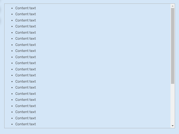
Border (With scroll and visible border)
Code:
Code:
{{Border|Scroll=Yes|Visible=Yes|Content=
Content text
}}

Result:
3110ace27d7e275ed808542ca8155482.png

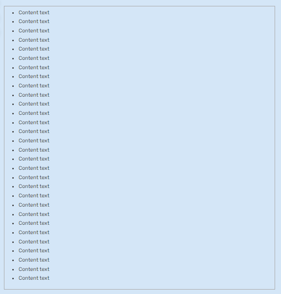
Border (Without scroll and visible border)
Code:
Code:
{{Border|Scroll=No|Visible=Yes|Content=
Content text
}}

Result:
594d4df26eb0fe2c1bed4215cf3eb176.png

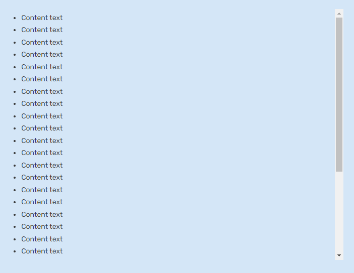
Border (With scroll and invisible border)
Code:
Code:
{{Border|Scroll=Yes|Visible=No|Content=
Content text
}}

Result:
8425b1248522384fba91b6de8fd4b699.png

Practical Usage Examples + Source codes

Examples:
P&A Tabber (Tabber Type 1)

P&A Tabber (Tabber Type 2)

Statistics Tabber (Tabber Type 1)

Intelligence

Intelligence Tabber (Tabber Type 1)

Source codes:
Tabber Type 1 source code

Tabber Type 2 source code

The Template
Here's the template page:

The template page itself includes instructions on its parameters, along with visual examples.

Here's the documentation:

This template is also compatible with VisualEditor and includes custom TemplateData to help new users.

Conclusion: I propose that we should make the use of this template official, and should replace the use of <div> tags that are meant to act as a border for content.
 
Last edited:
I'm neutral on it. Personally I feel like just good ol' proper spacing accomplishes the same thing, but that's a personal taste as far as I reckon.

I would be absolutely opposed if this were to ever be mandatory however, so let's set that goalpost in some good concrete.
 
I'm neutral on it. Personally I feel like just good ol' proper spacing accomplishes the same thing, but that's a personal taste as far as I reckon.

I would be absolutely opposed if this were to ever be mandatory however, so let's set that goalpost in some good concrete.
I have about the same take as this.
 
I'm neutral on it. Personally I feel like just good ol' proper spacing accomplishes the same thing, but that's a personal taste as far as I reckon.

I would be absolutely opposed if this were to ever be mandatory however, so let's set that goalpost in some good concrete.
No worries, this template is for those who like using <div> tags. If someone isn't into the bordered look, it's perfectly fine not to use it. I know many users have their own style when creating pages, so I'm not suggesting this to be mandatory. Honestly, I'd rather avoid that debate altogether. My main goal is to officially allow the usage of this template, and replace the usage of varying bordered <div> tags with this template. I don't quite understand what you mean by spacing, but thanks for the input!

I love it, seems to be working great, −186‎ bytes of space and with the same result.
Thank you for the feedback! I'm glad that it's working as intended, I made the template to be intentionally compact, user-friendly, and easily customizable, making it accessible for anyone who wants to use it.

I like it.
I am fine with the proposals.
Looks good to me.
I have about the same take as this.
I'm fine with it.
Thanks for the feedback! I appreciate it.

If I am required to put up a vote tally, this would be the current tally:
Agree: Therefir, ByAsura, Elizhaa, Planck69, Vzearr, Catzlaflame, Damage3245
Disagree:
Neutral: Crabwhale, DarkDragonMedeus, DontTalkDT? (Kudos'd Crab's message, so I assume he's on this side), AKM sama

Could use more feedback.
 
Last edited:
I'm neutral on it. Personally I feel like just good ol' proper spacing accomplishes the same thing, but that's a personal taste as far as I reckon.

I would be absolutely opposed if this were to ever be mandatory however, so let's set that goalpost in some good concrete.
Same.
 
I think that we would need to add easy to understand explanations for how to use this template to at least one of our currently existing official wiki instruction pages. Would somebody be willing to handle that if this suggestion is accepted? 🙏
 
I think that we would need to add easy to understand explanations for how to use this template to at least one of our currently existing official wiki instruction pages. Would somebody be willing to handle that if this suggestion is accepted? 🙏
If it gets accepted, sure. But how many approvals do I need in order to implement this?
 
Well, it seems to have sufficient approvals, but it is likely also best to wait a while for further input, given that this is a policy change affecting our entire wiki. 🙏
 
I think that we would need to add easy to understand explanations for how to use this template to at least one of our currently existing official wiki instruction pages. Would somebody be willing to handle that if this suggestion is accepted? 🙏
Would it be fine if it was an entirely new instruction page instead?

 
Last edited:
I think that seems like a good idea, but the key issue here seems to be if this new formatting for our tabber sections will be displayed in an improved manner on mobile phones, as most of our visitors use them.

I have been pestering Fandom staff members for years about that they needed to integrate the standard tabbers into the mobile viewing format, and do not want this change to cause negative effects for that project. 🙏
Tabbers still aren't visible in mobile view, right? The line borders like the <div> tags that people are currently using are also invisible in that view, same with the border template that I am proposing to replace the <div> tags. A lot of pages already use the tags, I'm just proposing that we use a simpler way, by replacing the tags with a simplified template. So, there's essentially zero changes in appearances (even more in mobile because they're just outright invisible along with tabbers), just makes the usage easier.

If that's what you're worried about, unless I misunderstood you. If the concern is different, then we most likely have to make a different thread for that.
 
Well, the key issue is that if Fandom eventually listens to me and makes regularly formatted tabbers visible in the mobile viewing format, and we have switched to a specialised template, that will likely cause problems for us due to our specialised new type of tabbers still remaining invisible in mobile viewing mode. 🙏
 
Well, the key issue is that if Fandom eventually listens to me and makes regularly formatted tabbers visible in the mobile viewing format, and we have switched to a specialised template, that will likely cause problems for us due to our specialised new type of tabbers still remaining invisible in mobile viewing mode. 🙏
Wait, we're not using specialized tabbers; we're still using the regular <tabber> tags, just alongside the border template, which adds a margin to show where the tabber content begins and ends.

So, if regular tabbers become visible on mobile, the border template will display the margin/line border on PC, but on mobile, it will remain unchanged or invisible while the tabber itself stays visible. In short, it's an improvement for PC (making things easier) and neutral for mobile, with no downside.

The way we'll use it ensures that the tabber will be visible assuming that they make regular tabbers visible in mobile view.
 
Hmm. It might look a little bit better, but it will also be very difficult to teach our entire community of a few thousand people to use a new and even more complicated formatting standard, and also continuously patrol for correct usage of it. 🙏
 
Hmm. It might look a little bit better, but it will also be very difficult to teach our entire community of a few thousand people to use a new and even more complicated formatting standard, and also continuously patrol for correct usage of it. 🙏
The template I'm proposing is simple.
Code:
{{Border|Scroll=Yes|Visible=Yes|Content=
Put your content here
}}

Scroll=Yes/No (Activates/Deactivates the scroll
Visible=Yes/No (Makes the line border visible)
Content= (The content that you will put inside the template)

Yes, the template is that straightforward. In fact, the instructions I included in the draft are shorter than the standard tabber instructions in our standard format. It's just that tabbers, especially when nested, tend to be lengthy by nature.

Compared to what people are currently using (which is why I proposed a replacement):
Code:
<div style="width:{{{width|100%}}}; -moz-border-radius-topleft:0.5em; border:1px solid #AAAAAA; background:transparent;">
</div>
Code:
<div class="scrollable" style="overflow:auto; max-height:600px; width:{{{width|100%}}}; -moz-border-radius-topleft:0.5em; border:1px solid #AAAAAA; padding-left:0.5em; background:transparent;">
</div>

^This is one of the reasons why I'm proposing the change, as said in the OP. Normally, I wouldn't mind copy-pasting, but it's become very inconsistent. Different people use their own tags, and others copy-paste them without realizing they're likely only compatible with a specific page. This has led to issues like scroll bars hiding tabbers, as seen here:
https://vsbattles.fandom.com/wiki/Andrius?oldid=8667549
https://vsbattles.fandom.com/wiki/Enerjak?oldid=8621324
https://vsbattles.fandom.com/wiki/Zenkaizer?oldid=8623667

Just to note, I designed the template to be simple and optional, so people can decide whether they want to use it to add line borders to the page or not. If this gets accepted, it won't mean everyone has to learn or use it; it's entirely up to them. Not every page has to use this, this is only for those that wants to add the line borders.
 
Last edited:
Okay. That seems very good then, as long as we keep this feature optional. Thanks a lot for helping out. 🙏🙂❤️
Alright, but to note: the border-related <div> tags currently used by people, such as those on this page (in the P&A section), may need to be replaced by our templates though (due to inconsistent usage). This replacement is only optional for pages that don't use these tags but necessary for pages that already do. Pages with only simplified tabbers don't need to adopt this change; it applies only to pages with border-related <div> tags.

Is the draft good though.
Would it be fine if it was an entirely new instruction page instead?

There is a note in the Guidelines section:
  • This template is only optional. Pages that don't already use tags for adding line borders aren't required to implement this, only those that do.
 
I think that seems perfectly reasonable, but how are we going to find all of the pages that use these tags? 🙏
There isn't a reliable way to search for pages with these tags.

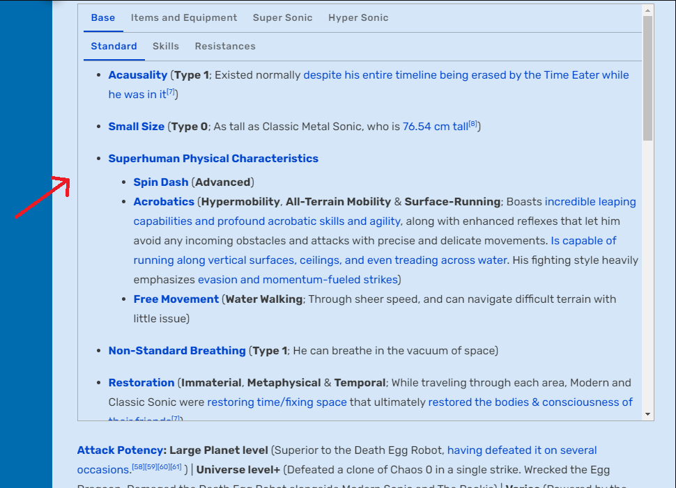
However, it's relatively straightforward to identify them. We can check pages if they have line borders, such as in this example, and review the source code to see if <div> tags are used for that purpose:

6a37ec7e0b6c0a98a5ebe0b3f610ce68.png


If you see this line, it's usually a sign to go check if it uses the tags or not.

Also, this isn't an urgent issue; it's more about gradually replacing these tags as you come across them on different pages. Typically, these tags are found on larger, longer pages, such as:

Other than that, they're not very widespread yet, although the number of pages using them is growing.
 
Okay. Understood. 🙏

Should we create a highlighted public news and announcements forum thread in order to inform our community about your new standard, after it has been applied? 🙏
 
Okay. Understood. 🙏

Should we create a highlighted public news and announcements forum thread in order to inform our community about your new standard, after it has been applied? 🙏
When I proposed this, I didn't initially consider making an announcement since only a few of our 30,000 pages use border/line tags at the moment. However, since it does somewhat add onto the new standard, I guess that announcing it wouldn't hurt.

Sorry to ask again, but are we good with the draft?
 
Okay. Noted. 🙏

I think that it seems good at least, if nobody else in our staff have any suggestions for improvements. 🙏
 
Given the lack of complaints, it seems like your suggestion here has been accepted. 🙏

Is it fine if I include information about this change in my upcoming highlighted thread with multiple important announcements within it? I would greatly appreciate if you write a brief information text that I can include in it in that case. 🙏
@Just_a_Random_Butler
 
Is it fine if I include information about this change in my upcoming highlighted thread with multiple important announcements within it? I would greatly appreciate if you write a brief information text that I can include in it in that case. 🙏
Sorry, got busy recently, I didn't get enough free time to do this.

I don't know how you want it written, but it should be something along the lines of:
New Template: Border

We're here to introduce a new template called Border, designed to replace the use of <div> tags for adding borders. From now on, please use the Border template when adding borders to any content. This is what we mean by bordered content.

This template streamlines the styling process, making it more efficient and user-friendly. It provides a cleaner, more customizable, and a more consistent experience across pages by eliminating the need for inline CSS, which can be cumbersome and inconsistent when used. With clear options for customization, it simplifies editing without complex code.

For instructions on how to use the template and its parameters, please visit this page.
If this text can still be improved and rewritten, please do so.
 
Thank you greatly for your help. I will include your information in my upcoming highlighted thread. 🙏❤️💖
 
The discussion has concluded, and the changes have already been implemented, so I'll be closing the thread now.

Thank you to those who provided their input.
 
Status
Not open for further replies.
Back
Top