- 11,807
- 7,373
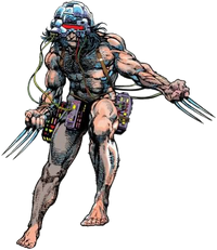
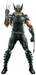
Slightly pointless, but I found these renders that can go onto an image tabber for Wolverine (Marvel Comics) page, Weapon X and X-Force respectively, both pretty iconic costumes I'd say:


Follow along with the video below to see how to install our site as a web app on your home screen.
Note: This feature may not be available in some browsers.


Gonna bump againDatOneWeeb said:I think Mario's images for his power-ups should get removed. Since there are so many that are left out and it's just unnecessary to have them. Similar for how Kirby has had his images for his copy abilities removed. What I think Mario should have is F.L.U.D.D., his doctor look, and his paper look.
In addition, I think that this image should be added for a new tab as "Shiny Paper Mario" as he had this form when using Kersti. So I feel like this form should be original enough at least. As well as his builder outfit from Super Mario Maker, since he wears it in a canon story mode and in Oydssey, I think it should be fine.
Now for that part, I am fine with this one being disagreed on. And that is that Mario's current base render should be changed into a Cappy tab. It just feels weird that his base form has Cappy, when you'll mostly see Mario not have it. So what I suggest for his actual base render, is either this as it is his current design and has him facing forward. This image from 3D World. Or his render from Smash Bros, because we all love the renders from Smash.


Zark2099 said:Slightly pointless, but I found these renders that can go onto an image tabber for Wolverine (Marvel Comics) page, Weapon X and X-Force respectively, both pretty iconic costumes I'd say:


BumpZackMoon1234 said:Not mine, but I implore the Image of the Profile of Jean Grey (Marvel Comics) to be replaced with this as it's clean compared to the current one



ChocomilkAlex said:The perspective makes his hand look fricking massive lmfao
