- 151
- 15
bump
Follow along with the video below to see how to install our site as a web app on your home screen.
Note: This feature may not be available in some browsers.
boompSharaku Jr. said:bump
Not in my opinion. I still prefer the first one we used. The new one takes more space, doesn't fit the page as good as the other did and it is lower quality when compared to the one we were using previously.Lollipop The King said:Why downgrade Goku Black's picture, that's way worse.

I agree. Except Pikachu's render.MrLuk2000 said:For some of the pokemon renders, I was wondering if we could use their renders from Pokken Tournament
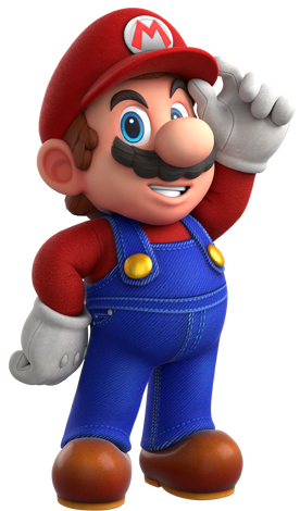
Anything for Mario?EMagoIorSouI said:
A possible new image for Mario? The current one on his profile is fine but it's kind of dated since it's promotional art from an older title in the series, this one fits the style of the newest main title in the franchise, being Super Mario Odyssey. It as well has a similar appeal and style to Luigi's. Since it's a vector that highly resembles the original product, it should be allowed.
The vector was made by Sonicjeremy.
Imma bump this again. No one really gave me their opinions on itMrLuk2000 said: