- 18,393
- 14,323
At present, this is the approach I am taking (or at least the concept I have in mind), but it still requires significant refinement and improvement.


Follow along with the video below to see how to install our site as a web app on your home screen.
Note: This feature may not be available in some browsers.

I would prefer if we simply change the header image of our instruction page for how to write character profile pages, along with moving the "Key" section upwards in the instruction text.At present, this is the approach I am taking (or at least the concept I have in mind), but it still requires significant refinement and improvement.

No it is not. Please elaborate.I assume it's too late to say I am opposed to this?
Would you mind providing more details about what you have in mind? Your previous statement was rather vague, and I would appreciate a more thorough explanation.I would prefer if we simply change the header image of our instruction page for how to write character profile pages, along with moving the "Key" section upwards in the instruction text.

Seems weirder to me to place it on top instead of below the Tiers, but I digress.I was going to suggest placing it above where it says "tier" so it'd look like this.
Key: Base | 2nd Form | 3rd Form
Tier 8-C | 8-A | 7-A
Name: Firstname Lastname
Looks weird having the tier first then the key imho.
Nah brother, that's AP and HDE related. Also, derailing.is it a good idea to have a dimensionality key for a profile
dimensionality: 5D
tier: Low 1-C
or smth
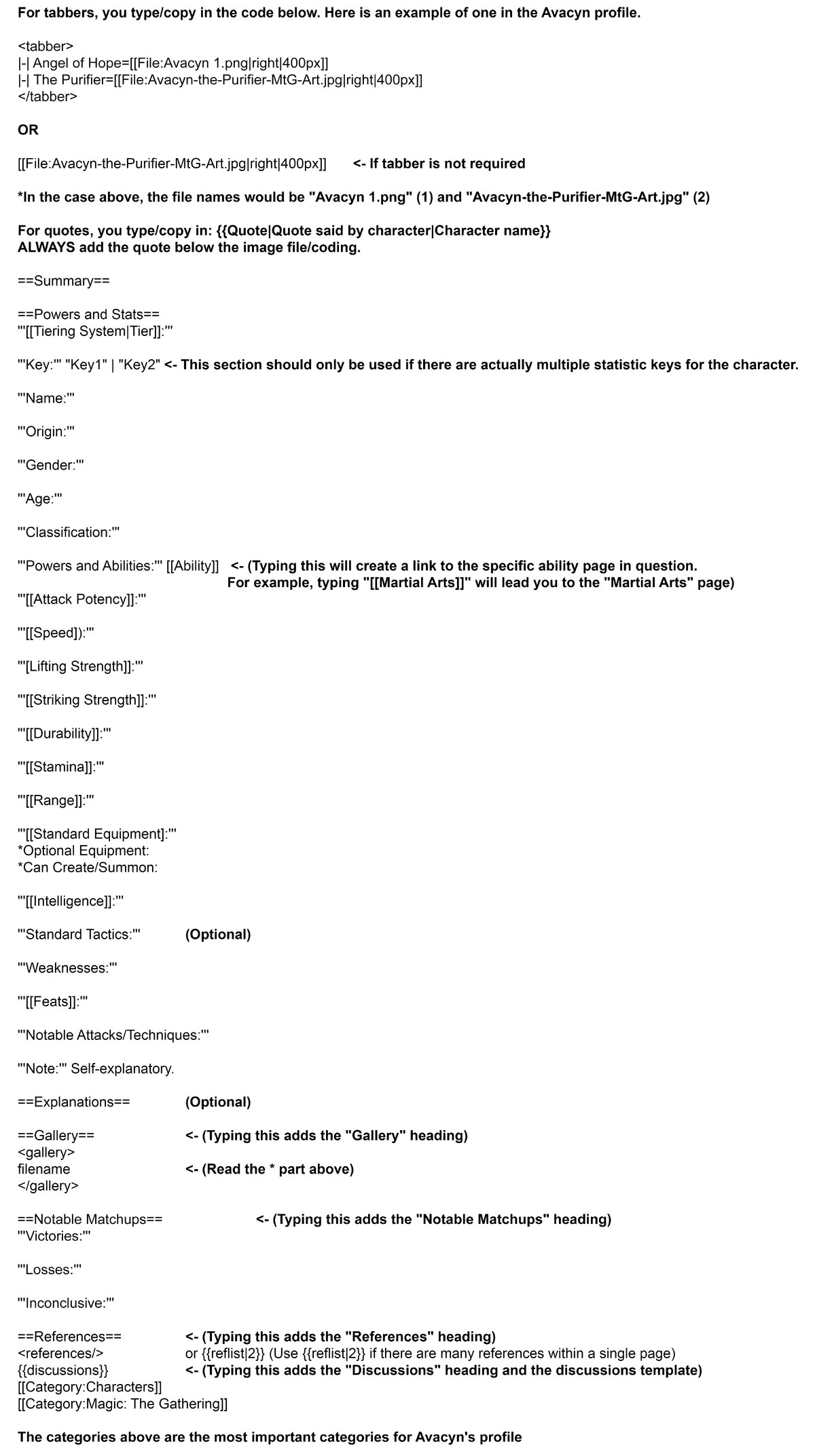
Basically, the following overview image just needs to be updated with the new information:Thank you for trying to help out, but I much prefer an updated version of our current image that shows what the code looks like in Fandom's source editor, as that is what our members are required to use according to our rules in order to avoid lots of formatting errors that other members have to clean up afterwards.
For what it's worth, if Promestein is busy with IRL stuff I am willing to help out too. I may not be staff, but I can start small with staff supervision to ensure it's applied properly, because I believe it would help immensely with readability of profiles.Well, if we do not get this project properly organised it will likely not be applied, and it is technically not a big problem to keep our keys where they are, especially as we will likely try to initiate our infobox-adding project relatively soon, which will require a lot of resources.
Who made the current image?I said I was ready to go then. I was waiting for people to wrap things up and say I can start.
Oh, I apologize for misunderstanding. I think we should be okay to start but Ant would know better than me.I said I was ready to go then. I was waiting for people to wrap things up and say I can start.


Okay. I am just worried about that something will go wrong and mess up lots of pages. I am a rather worried type in general as you already know.
Thanks a lot for helping out in any case.
@The_Divine_Phoenix @Colonel_Krukov @Zaratthustra @ZackMoon1234 @Dark-Carioca @MistaClean @MonkeyOfLife @FinePoint @Propellus
Would any of you be willing to help out with designing a slightly updated explanation image for the top of the following page please?

Standard Format for Character Profiles
When there are multiple versions of a character that are distinct enough to be split into several profiles, whether it is due to the length and complexity of the page or versions from different mediums, then the multiple pages that are created as a result of this have to be linked by a tabber...vsbattles.fandom.com
Umm, is there a copy of that text?Okay. I am just worried about that something will go wrong and mess up lots of pages. I am a rather worried type in general as you already know.
Thanks a lot for helping out in any case.
@The_Divine_Phoenix @Colonel_Krukov @Zaratthustra @ZackMoon1234 @Dark-Carioca @MistaClean @MonkeyOfLife @FinePoint @Propellus
Would any of you be willing to help out with designing a slightly updated explanation image for the top of the following page please?

Standard Format for Character Profiles
When there are multiple versions of a character that are distinct enough to be split into several profiles, whether it is due to the length and complexity of the page or versions from different mediums, then the multiple pages that are created as a result of this have to be linked by a tabber...vsbattles.fandom.com

Well that's what I'm saying. Updating that page is a separate thing entirely. So I don't thing we should hitch them together and make her wait until we update the image. We should give her the go ahead to try it on small batches, increasing in size slowly over time as we check the pages.but after that Promestein can continue if she is certain that the code that she currently uses will work properly for this mass-editing task.
I concur with thisWhile I do like this new suggestion for easier view in the regards to formatting, it shouldn't be mandatory
Well, the issue is that we first need a slightly updated structure overview header image in the following page.

Standard Format for Character Profiles
When there are multiple versions of a character that are distinct enough to be split into several profiles, whether it is due to the length and complexity of the page or versions from different mediums, then the multiple pages that are created as a result of this have to be linked by a tabber...vsbattles.fandom.com
And then we need to do a small test run with Promestein's Bot account that can easily be reverted in case something goes wrong, in order to confirm that the code works the way that it should.
Well, we at least need a confirmation that any of our image helpers are willing to update our page structure explanation image, and preferably that somebody is willing to update the structure of the page that I linked to above somewhat, but after that Promestein can continue if she is certain that the code that she currently uses will work properly for this mass-editing task.
@Damage3245 @Starter_Pack @Elizhaa @Abstractions @Colonel_Krukov @Shadowbokunohero @Crazylatin77 @Zaratthustra @Just_a_Random_Butler @ElixirBlue @Tllmbrg @Nehz_XZX @Dereck03Okay. I am fine with that solution then. But somebody also really needs to update our explanation/illustration image for proper character page structures, and write a sandbox with slightly updated contents for our character profiles explanation page, as soon as possible.
