Navigation
Install the app
How to install the app on iOS
Follow along with the video below to see how to install our site as a web app on your home screen.
Note: This feature may not be available in some browsers.
More options
-
This forum is strictly intended to be used by members of the VS Battles wiki. Please only register if you have an autoconfirmed account there, as otherwise your registration will be rejected. If you have already registered once, do not do so again, and contact Antvasima if you encounter any problems.
For instructions regarding the exact procedure to sign up to this forum, please click here. -
We need Patreon donations for this forum to have all of its running costs financially secured.
Community members who help us out will receive badges that give them several different benefits, including the removal of all advertisements in this forum, but donations from non-members are also extremely appreciated.
Please click here for further information, or here to directly visit our Patreon donations page. -
Please click here for information about a large petition to help children in need.
You are using an out of date browser. It may not display this or other websites correctly.
You should upgrade or use an alternative browser.
You should upgrade or use an alternative browser.
Profile image additions or replacements requests - 3
- Thread starter Antvasima
- Start date
- Status
- Not open for further replies.
- 628
- 209
@LazyHunter
Theses images are indeed better.
@Skalt711
Ant seems to have allowed us to do the replacements so i think you can.
Theses images are indeed better.
@Skalt711
Ant seems to have allowed us to do the replacements so i think you can.
- 11,807
- 7,373
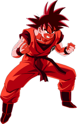
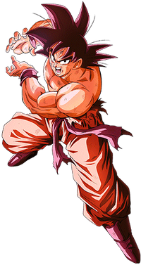
Found these two sweetums that might do the job.Antvasima said:Can somebody try to find a better image for Son Goku (Dragon Ball Z) in Kaio-ken?
- 11,807
- 7,373
The main contention is with the pose of the current image being... risky, so I tried to find new, less exploitable poses
- 2,463
- 928
Okay then. I think that I'll recommend the left image for the replacement.Zark2099 said:The main contention is with the pose of the current image being... risky, so I tried to find new, less exploitable poses
- 628
- 209
I would have recommended the right image if i didn't found this image
- 2,463
- 928
The pose and the artstyle are slightly not consistent with the other DBZ Son Goku pictures.The Foolish Omniscient Guy said:I would have recommended the right image if i didn't found this image
More input would be appreciated.
- 168,861
- 77,877
- Thread starter
- #130
I used the second image, after first trying with the other two. The first one still looks a bit like a toilet visit, and the third has a too old art style. It is a bit too small though. If you have a larger version, that would be appreciated.
- 2,463
- 928
I've tried to upscale it (2 times the linear size), but a couple of artifacts got left. It'll take a while to do manual editing.Antvasima said:If you have a larger version, that would be appreciated.
- 2,463
- 928
I didn't found the higher resolution, so I'm doing upscale.Antvasima said:I meant higher resolution, not just expanding the small version.
- 2,463
- 928
As I said, to help the upscale be properly done, I'm doing manual editing.Antvasima said:Hmm. I am not sure if that will help much, but okay.
The upscale is done within Waifu2X sites, who can do the AI-based upscale of the artwork-styled images. The remaining artifacts are fixable by manual editing.
- 10,118
- 9,434
I have a multitude of possible image replacements:
Hal Jorda - New One
Captain Atom-New One
Kyle Rayner-New One
Green Arrow-New One
Deathstroke-New One
Hal Jorda - New One
Captain Atom-New One
Kyle Rayner-New One
Green Arrow-New One
Deathstroke-New One
- 2,304
- 2,734
Yes. The page is unlocked too
- 168,861
- 77,877
- Thread starter
- #140
@Skalt711
Okay. Thanks.
@Peter
The ones for Hal Jordan and Kyle Rayner look good, but need to be cropped. The one for Captain Atom looks good and can be used, the one for Green Arrow does not sport his classic beard, and the one for Deathstrike features a weird pose.
@Mexicino
The currently used image shows her full body. It looks better than what you suggest. Sorry.
- 168,861
- 77,877
- Thread starter
- #144
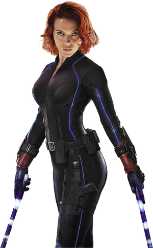
The new Black widow image looks fine. Feel free to add it.
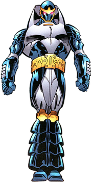
I will add Monarch to the Captain Atom page.
I will add Monarch to the Captain Atom page.
- 1,812
- 317
Thanks to you both.
- 11,149
- 14,220
Donezo.Antvasima said:The new Black widow image looks fine. Feel free to add it.
- 2,304
- 2,734
- 11,807
- 7,373
Banner one's fine IMO, but I'd assume it's much more preferable to have full body renders for Tony and Rhodey.
EDIT: I found this render on DeviantArt which looks legit enough for Tony Stark. Personal note: never browse DeviantArt
Also, for clarity, the current Captain America Mjolnir image in his profile is a somewhat edit of this render, which itself is a better render for Endgame Cap.
EDIT: I found this render on DeviantArt which looks legit enough for Tony Stark. Personal note: never browse DeviantArt
Also, for clarity, the current Captain America Mjolnir image in his profile is a somewhat edit of this render, which itself is a better render for Endgame Cap.
- 2,304
- 2,734
They hardly have phots like that where you can render their full bodiesZark2099 said:Banner one's fine IMO, but I'd assume it's much more preferable to have full body renders for Tony and Rhodey
- 2,304
- 2,734
Yes. Your render looks legit
- 2,304
- 2,734
- 11,807
- 7,373
Isn't that the Hot Toys one again?
- 2,304
- 2,734
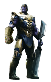
Yes. But better. Also Thanos wore the Gauntlet on his right hand whereas our page's render has it on the left. It should be mirrored
- 24,183
- 3,938
- 556
- 176
- 2,304
- 2,734
- 2,304
- 2,734
- 2,304
- 2,734
- Status
- Not open for further replies.
Similar threads
- Sticky
- Featured
- Replies
- 31
- Views
- 8K
- Replies
- 45
- Views
- 3K
