• This forum is strictly intended to be used by members of the VS Battles wiki. Please only register if you have an autoconfirmed account there, as otherwise your registration will be rejected. If you have already registered once, do not do so again, and contact Antvasima if you encounter any problems.

    For instructions regarding the exact procedure to sign up to this forum, please click here.
  • We need Patreon donations for this forum to have all of its running costs financially secured.

    Community members who help us out will receive badges that give them several different benefits, including the removal of all advertisements in this forum, but donations from non-members are also extremely appreciated.

    Please click here for further information, or here to directly visit our Patreon donations page.
  • Please click here for information about a large petition to help children in need.

Let me rate your banners

6,016
5,928
Similar to the Let me rate your avatar thread, here is Let me rate your banners a totally original idea that I came up with

"Note: none of my ratings truly matter, it is your choice to have a pfp of any kind, and I am just going to express my opinion." A quote from Arceus0x

Comment if you want your banner rated and i'll reply
 
YBhGsWv.png

 
Boy do I love me some dopamine for my superior taste
The quality is nice the colors are vibrant and the art itself is very good.
8/10
Art style is perfect, colors match the quality of the banner and I personally would use it myself
9.5/10
A banner of some wood? Lazy but it gets the job done and it’s somewhat original
6/10
Bruce banner
Art is good the quality of the picture it’s self looks a little off tho but it doesn’t matter because CSM is peak anyway overall nice
7/10
Recognizable from the start art looks good quality could be a little better the background fits the pictures I like it
8/10
No you don't
Very popular character also recognizable from the start obviously quality is good art is good the banner is in a perfect fit overall really good bro
9/10
The art is very dark and gloomy it fits the theme of the banner art is nice the quality is good. It sets the tone of the banner perfectly I love it.
10/10
My shit is ass.
I have to agree no offense bro but it looks like if pro create was available on the 3ds. Quality is bad and the disrespect to tatsumaki is unforgivable lol
3/10
I love the flowers on the banner the colors are beautiful and vibrant and the person in the middle completes the banner.
9/10
Quandale Dingle
I like the POV/Depth of field on the banner art looks good quality is ok. Not recognizable from what I can tell but the banner is still good regardless.
6.5/10
Perfect color, quality it’s vibrant and obviously it is recognizable from the start good choice of characters too perfect banner from a perfect series.
10/10
 
Mines the best.
Nice style, I like the throwback to metal Slug if that's what it is overall looks good
7/10
The detail on the dragon is scary good but everything else looks' pale in comparison to the dragon I do like the background tho it reminded me of How to Train Your Dragon, the best DreamWorks movie btw
7.5/10
The OP one is sick bro.
Man yours is amazing holy shit the colors are crazy good and the vibrancy on it is superb the tree in the banner makes me want to jump into the picture and just admire its beauty and just sit down and watch the sunset as I eat peaches and ginger ale. Yours is honesty the best one here, perfect.
11/10
Go for it! My previous banner & my current one:
qxK7ExN.png
luffy_robin_franky_brook_sea_freak_poster_by_weissdrum_d9ixeph-pre.jpg
The first one I don't know where it's from, but I like the goofy art style, for some reason it reminds me of classic sonic and Mario in their respective old TV shows.\
8/10
The second one, I love the picture itself, but the banner sunk in quality unfortunately and its kinds ruins it. But regardless it still looks amazing, especially the design and art style I like it
8/10
I expected nothing less from goat clover, the panel of all the captains surpassing their limits and taking the fight to Lucifero was amazing the colors are the best part of the banner.
9/10
Everything is really bright but in a good way, it matches the theme and tone of the banner the apples in the left corner are a bit unnecessary IMO but overall this one is fantastic, especially the art style itself whoever drew that did an amazing job.
9.5/10
It looks like a stranger thing's trailer with the red mystery background lol and the ups truck is a big L we all know FedEx is better but the banner overall is alright
6/10
I like the creativity of the banner it looks good, I like the colors and art. It reminds me of adventure time for some reason, which means this banner is peak.
9.7/10
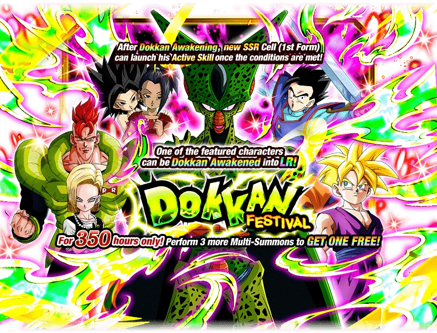
The muscles on these guys are crazy, the one with the red shorts looks like if Chris Redfield overdosed on steroids, overall I like it nice job
7/10
I win, as I tend to naturally do.
Well, A for effort I guess'
A+/10
Big Chungus
I'm liking the creativity on this one, I've never seen an animated banner the quality is good, and the character is recognizable who wouldn't know Sora the goat from Kingdom Hearts, overall I love it.
9/10
 
Back
Top