Navigation
Install the app
How to install the app on iOS
Follow along with the video below to see how to install our site as a web app on your home screen.
Note: This feature may not be available in some browsers.
More options
-
This forum is strictly intended to be used by members of the VS Battles wiki. Please only register if you have an autoconfirmed account there, as otherwise your registration will be rejected. If you have already registered once, do not do so again, and contact Antvasima if you encounter any problems.
For instructions regarding the exact procedure to sign up to this forum, please click here. -
We need Patreon donations for this forum to have all of its running costs financially secured.
Community members who help us out will receive badges that give them several different benefits, including the removal of all advertisements in this forum, but donations from non-members are also extremely appreciated.
Please click here for further information, or here to directly visit our Patreon donations page. -
Please click here for information about a large petition to help children in need.
You are using an out of date browser. It may not display this or other websites correctly.
You should upgrade or use an alternative browser.
You should upgrade or use an alternative browser.
Let me rate your avatars
- Thread starter Arceus0x
- Start date
- 20,738
- 16,586
- Thread starter
- #242
quality's a 2Me thinking about when it would be the right time to write another quirky comment about amogus on Arceus' wall.
Colors are perfect, a 3
Works amazingly as a pfp, 4
I love it, 1
10/10, perfect score
- 20,738
- 16,586
- Thread starter
- #243
quality's mid, its a good edit but it isn't that super HD as the others here, so 1.
Colors are black and white generally but work well enough, 3 points.
Works ironically well as a pfp, very recognizable, 4 points.
I am mixed on it cause i feel like a man of your talents could have sth more than a troll face so 0.5
Overall: 8.5/10 really good
- 20,738
- 16,586
- Thread starter
- #244
Quality's wonky so 0Go ahead (I might change mine later)
Colors are mix damn well, 3 points
Works badly as a pfp since it is impossible to recognize, though i'll give it a 1 for being pleasant to look at
Not a fan of it. 0.
4/10, sub-par
- 20,738
- 16,586
- Thread starter
- #245
Quality's good, 2Yeet
Colors mix well, 3
Works as a pfp, relatively recognizable, 4
I don't like it, it kinda looks weird, 0.
Overall: 9/10, extremely good
- 20,738
- 16,586
- Thread starter
- #246
Quality's a solid 2New pfp and new banner, nowratiorate my pfp once again
Colors mix well, not a fan but they mix well enough, 3
Works nicely as a pfp but is a bit bust and its hard to see whats behind er, 3 points
I like it, 1
Overall: 9/10, extremely good
- 25,631
- 15,977
What about mine Arceus?
- 3,395
- 3,809
sup
- 20,738
- 16,586
- Thread starter
- #249
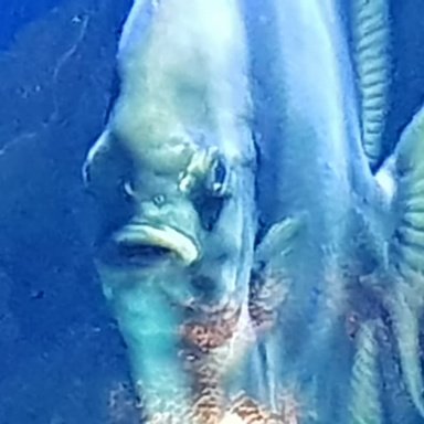
Quality's good, nice one, 2fish.
Colors mix well enough though the blank background ruins it, 2
Works ok as a pfp, not hard to recognize, though it is only partially visible, 3 points
Not the biggest fan of your current pfp simply because its cut off, 0.5 points, i cut the other half for ya
Overall: 7.5/10, good
Quality's seen better days but there is...some quality there...0.5Rate the supermeowth prime i drew years ago (i might change it to a OC later though)
Color is non-existen basically, 0
Doesn't work well as a pfp and you need to look closely to see what it is, 0
I think its kinda funny cause supermeowth prime is a good name, 1
Overall: 2/10, very bad
Quality's good, a solid 2Dunno
Color's are okay, no real problems here, 3 points
Hard to recognize, but not annoying, kinda works as a face, 2.5
I like it, 1 point
Overall: 8.5/10, real good
Quality's good, 2im a 0/10
Color's are nice, no true problems here, 3
Works real well as a pfp, 4
I like it well enough, 1
Overall: 10/10, perfect
Quality's good, 2Im the best
Color's are well off, 3
Looks good as a pfp, 4
I like it, 1
Overall: 10/10, perfect
idk about the kumoko pic anymore since you changed it but i'll deal with gurawhat about my new one?
aka my human kumoko picture from i'm a spider so what.
Quality's good, 2
Color's are perfect, 3
Good as a pfp, a tiny bit busy but good, 4
I like it, 1
Overall: 10/10, perfect
- 3,395
- 3,809
me?
- 20,738
- 16,586
- Thread starter
- #251
bruh i've like 50 people lined up, wait yo damn turn, -100 points to slytherin
- 25,631
- 15,977
+100 points to Ravenceus0xbruh i've like 50 people lined up, wait yo damn turn, -100 points to slytherin
- 20,738
- 16,586
- Thread starter
- #254
Quality's good, 2I am back for your soul Arceus0x
Colors a' perfect, 3
Works damn well as a pfp, 4
I love it, 1
Overall: 10/10, perfect
Quality's good enough, 2Damn alot of people are foing this, guess ill give it a go lol
Colors are good as well, 3
It has the issue of being partially cut off and its hard to recognize from a distance, 2.5
I like it, 1
Overall: 8.5/10, real good
Quality's good enough, 2Skibi-dee-mm-dada
Colors are also good enough, 3
Doesn't work well as a pfp, looks wonk and you need to look closer to try and understand what you're looking at, could theoretically work as a pfp, 1
I kinda like it since i like colossal creatures, 1
Overall: 7/10, ok
Quality's good, 2Let's go.
Colors are neat, 3
Works damn well as a pfp but annoying because of reason in the point below, 4 points
I'm giving you a 0 here because i am pissed off at the laser covering a part of his face making it look like ass
Overall: 9/10, really good if it wasn't for that damned laser
Quality's good, 2

Colors are warm. Background's lazy but eh, 3
Good as a pfp, not much else to say, 4
I like it, 1 point
Overall: 10/10 points, perfect

ahem
Quality's good, 2 points
Colors are swell, 3 points
Doesn't really work as a face unless you want your face to be abs and boobs, still a 3 though cause its recognizable and it at least has a face there
2 horny 4 me, so 0
Overall: 8/10, too horny (though 9/10 if we account for everyone else's opinion)
Quality's bad, 1
Color's are good, 3
Ironically works well as a pfp, 4
I like it, its hilarious, 1
Overall: 10/10, perfect
- 20,738
- 16,586
- Thread starter
- #255
ironically enough, when i went through multiple official and unofficial personality tests for my house in Gryffindor, i got Ravenclaw+100 points to Ravenceus0x
- 25,631
- 15,977
Holy shit I managed to make a pun sort of and guess arceus’s at the same timeironically enough, when i went through multiple official and unofficial personality tests for my house in Gryffindor, i got Ravenclaw
Lou_change
He/Him- 11,220
- 5,801
I can’t believe Pepsiman made Arceus deduce 100 points from slytherin actually I wouldn’t be surprised if that actually happened.
Kflare63
He/Him- 1,538
- 633
fair enough, was getting bored of this one anywayQuality's wonky so 0
Colors are mix damn well, 3 points
Works badly as a pfp since it is impossible to recognize, though i'll give it a 1 for being pleasant to look at
Not a fan of it. 0.
4/10, sub-par
- 20,738
- 16,586
- Thread starter
- #259
Quality's good, 2Lay it on me.
Color's work well enough, 3
Works real well as a pfp, 4
I like it, 1
Overall: 10/10, perfect
Quality's rather grainy, 1.5

Colors kinda mix together unpleasantly but well enough, 2.5
Works as a pfp, 4
You too, 0
8/10, could've been better
Quality's good, 2How this?
Colors - pleasant - 3
Two faces at the same time isn't my fave thing since it doesn't work as well as a face of yours, a good 3.5
I like it, 1
Overall: 9.5/10, near perfect
Quality's good, 2Never posted on this one. Give your opinion :the rock eyebrow raise:
Colors are done well, 3
Works amazingly as a pfp, 4
I like it, 1
Overall: 10/10, perfect
Quality's good, 2Tell me about my PFP
Colors are perfect, 3
Too busy, but recognizable enough, 3
I like it a lot, 1
Overall: 9/10, really good
Quality's solid, 2Nice thread we got going here...
Colors are well off, 3
Works as a pfp real well, 4
I like it, 1
Overall: 10/10, perfect
- 20,738
- 16,586
- Thread starter
- #260
Quality's godly, 2
Colors are nice, 3
Too busy, but possible to recognize, 2
I love it, 1
Overall: 8/10, real good
i don't do ones that are too realistic, aka just straight up photos, not even profile photosTake a good long look
Quality's good, 2
Colors are pleasant, 3
A bit too busy, hard to recognize immediately, 3.5
I like it, 1
Overall: 9.5/10, near perfect
Idk if you want the current pfp you have or this image...
Hello everyone.
So imma just do you current pfp.
Quality's uhhh good, 2
Colors are solid...except for the empty fake png background, 2
Works well as a pfp, 4
I don't like the fact that it's not even cropped properly, 0
Overall: 8/10, real good
EnderLord8
Any/All- 4,323
- 1,692
Rate my photo too baby
- 20,738
- 16,586
- Thread starter
- #264
Quality's good, 2Present, and ready for rating!
Colors, despite being gray, are good enough, 3
Face is in the upper right corner and so the attention goes to the busy background, 2.5
I like it, 1
Overall: 8.5/10, real good
Quality's good, 2Rate my photo too baby
Color's are good, 3
A bit busy and hard to recognize from peripheral pov, but it is good enough, 2.5
I like it, 1
Overall: 8.5/10, real good
- 9,348
- 6,721
- 20,738
- 16,586
Lou_change
He/Him- 11,220
- 5,801
I would like 1.
- 20,738
- 16,586
- Thread starter
- #268
Quality's good, 2I would like 1.
Colors are good, 3
Too busy, but is recognizable enough, 3 points
I like it, 1
Overall: 9/10, really good
- 9,348
- 6,721
I don't like it for uhhh personal reasons, 0

- 20,738
- 16,586
- Thread starter
- #270
I've been robbed! Understandable though
Crowman123
He/Him- 359
- 505
Rate the flag of mine.
- 7,504
- 2,921
Was expecting a 9 but I can live with this.8/10
- 2,619
- 544
????i don't do ones that are too realistic, aka just straight up photos, not even profile photos
- 8,874
- 5,709
Quality bad is what makes it good. It's quality is such because it's actually a real photo that I took myself with 10x zoom.Quality's bad, 1
Color's are good, 3
Ironically works well as a pfp, 4
I like it, its hilarious, 1
Overall: 10/10, perfect
- 367
- 293
Thoughts?
- 2,680
- 2,475
Yay!10/10
https://cdn.**********.com/attachments/889305857689538590/978480198972506122/JeanneYay.gif
- 40,967
- 16,397
- 20,738
- 16,586
- Thread starter
- #280
I was supposed to write 9/10 but wrote 10/10... I guess you get an extra point for FESHQuality bad is what makes it good. It's quality is such because it's actually a real photo that I took myself with 10x zoom.
Similar threads
- Replies
- 231
- Views
- 13K
- Replies
- 18
- Views
- 2K