- 178,554
- 91,999
Hello.
Here are some recent or relatively recent Fandom blogs that detail soon-to-be wiki system changes that you all may wish to read to not get any unwelcome surprises later on.
 community.fandom.com
community.fandom.com
 community.fandom.com
 community.fandom.com
 community.fandom.com
Here are some recent or relatively recent Fandom blogs that detail soon-to-be wiki system changes that you all may wish to read to not get any unwelcome surprises later on.
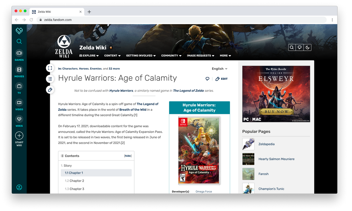
Introducing FandomDesktop, the new look and feel for desktop users
community.fandom.com
A deeper look at Article Pages on FandomDesktop
community.fandom.com
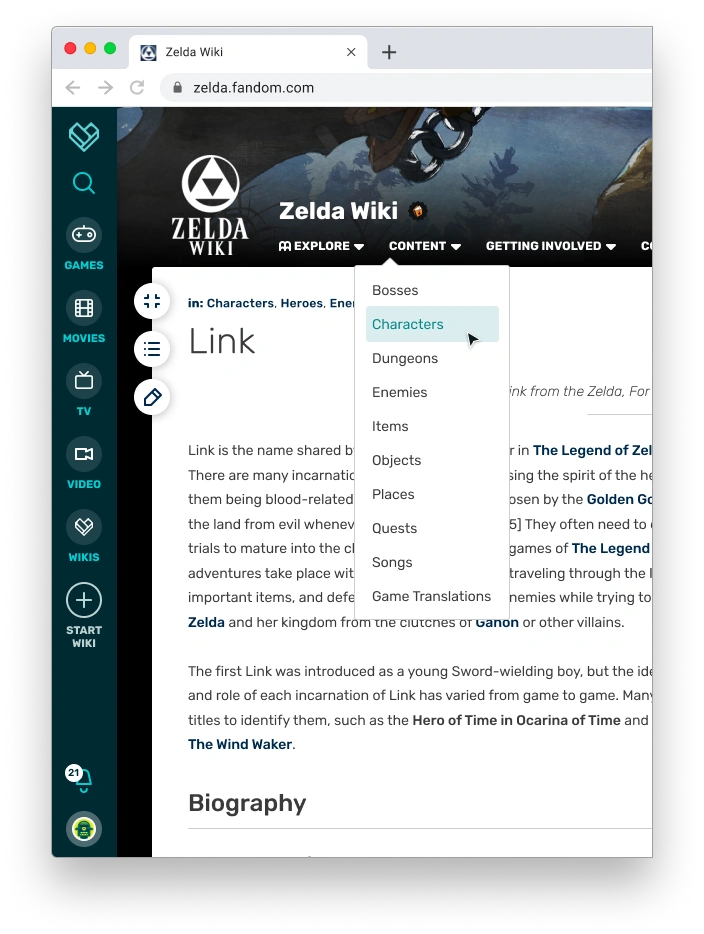
A deeper look at Navigation on FandomDesktop
community.fandom.com
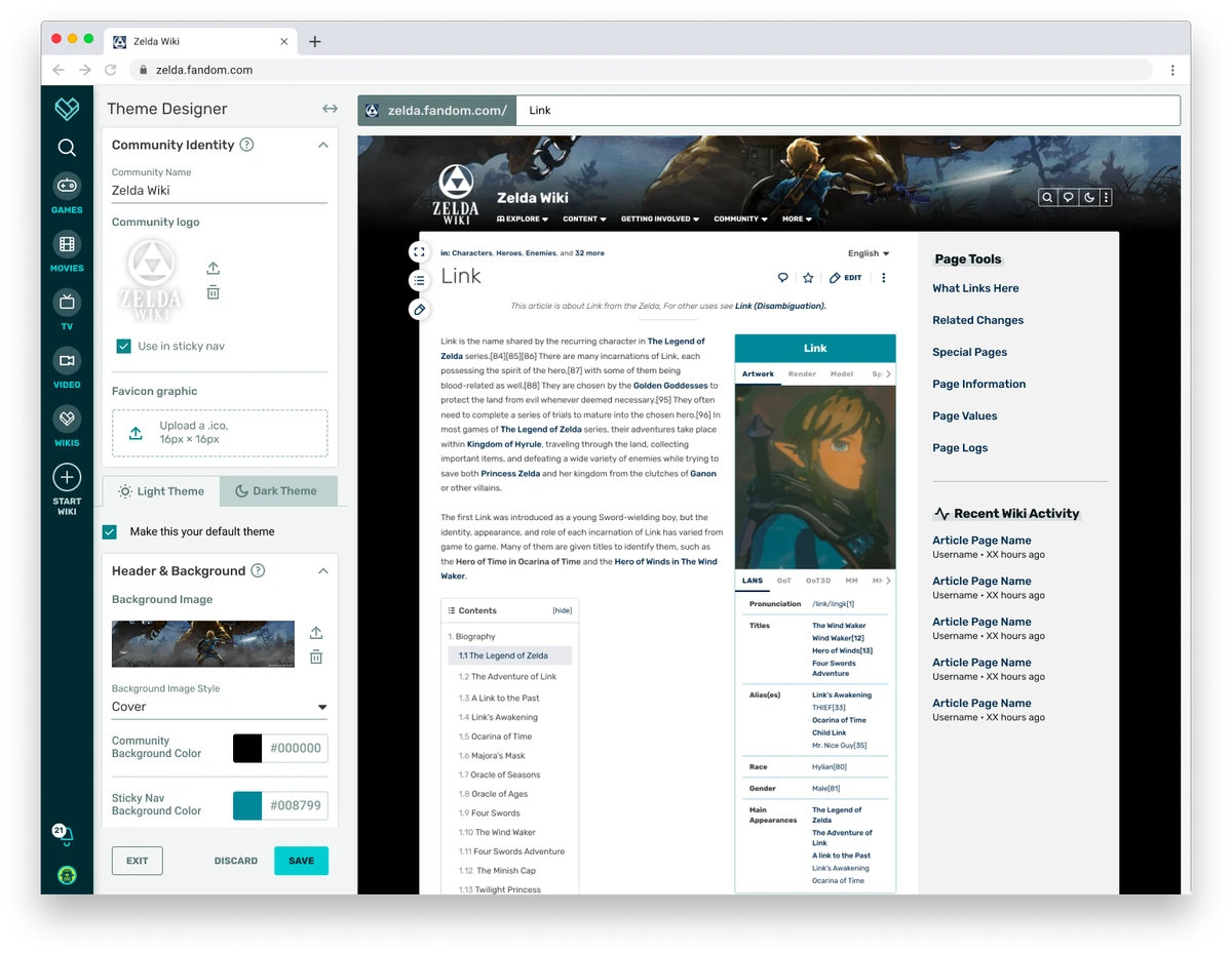
A Deeper Look at Theme Designer on FandomDesktop
community.fandom.com
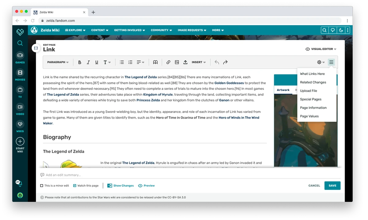
A Deeper Look at Creator Tools and What's Next
community.fandom.com
Last edited:

