- 4,652
- 1,328
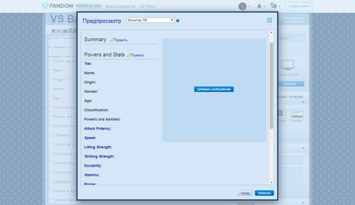
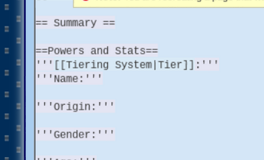
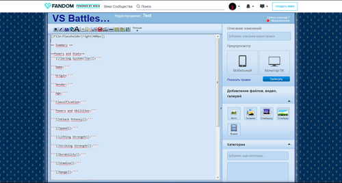
The standard format has an issue with the top line.
In source mode, the name line and the tier line aren't properly spaced apart, making both of them appear on the same line in visual mode, thus making it like that upon being published. It's a little thing, but many people seem to forget to separate them and when people do so, it looks bad.
It's tiny, but it would shave a tiny little bit of work off of a few people if we could properly space the name and tier line apart.


