• This forum is strictly intended to be used by members of the VS Battles wiki. Please only register if you have an autoconfirmed account there, as otherwise your registration will be rejected. If you have already registered once, do not do so again, and contact Antvasima if you encounter any problems.

    For instructions regarding the exact procedure to sign up to this forum, please click here.
  • We need Patreon donations for this forum to have all of its running costs financially secured.

    Community members who help us out will receive badges that give them several different benefits, including the removal of all advertisements in this forum, but donations from non-members are also extremely appreciated.

    Please click here for further information, or here to directly visit our Patreon donations page.
  • Please click here for information about a large petition to help children in need.

A change in our wiki's colour theme

Antvasima

Maintenance worker
He/Him
VS Battles
Head Bureaucrat
Bureaucrat
Administrator
167,676
76,256
Hello.

Fandom recently decided to make some system changes to our wiki's layout, as well as all those of other wikis to make it easier for colourblind people to read and participate in fan wikis.

Essentially, all links require a minimum contrast of 3:1 with the VS Battle wiki's regular text, in order to avoid that all links get automatically underlined.


This is not as unreasonable as you might think, as colourblindness is very common, especially among men.


#151b8d was our previous link colour, but it resulted in all links in our pages being underlined instead, which looks ugly and harder to read in my view.

However, DontTalk and AKM sama experimented with other colours with a sufficiently high contrast to fulfill the requirement to avoid that our wiki links are underlined, and AKM's suggestion of using the colour #0246ce was eventually accepted by both our bureaucrats and the rest of our staff, as it seems like the least intrusive and significant available layout theme change option that we have available.

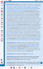
Here are examples images of what our wiki looked like before the change and what it looks like after the change.
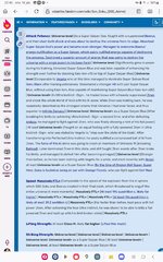
VSBW colour theme - Option 1.jpg

VSBW colour theme - Option 4.jpg
 
Tip: It would be more appropriate to present the thread in a professional and academic manner by utilizing a platform such as Imgur to insert a link for improved readability for PC users.

Additionally, it is understandable that Fandom made this change to accommodate individuals with colorblindness. However, it would be beneficial to have the option to enable or disable this feature, rather than making it mandatory.
 
I am not able to use Imgur as I do not want to make my account there public knowledge due to security reasons, but I think that the above images are likely generally easy to overview for our members.
 
Yes, the contrast between our old link colour and our black regular wiki text was not high enough.
 
I am not complaining, but this is how it looks like in PC format. Additionally, for account creation in Imgur, you can upload pictures without creating an account.
Well, it is much more convenient for me to post screencaptures directly to our forum, but I think that there are size control options that I haven't had the time and focus to learn properly yet.

Thank you for the Imgur information though. 🙏🙏🙏🙏🙏🙏🙏
 
I don't dislike the change though, I can actually tolerate the color because it's close to the original (even if it's noticeable). Any color that isn't too different or distracting is fine with me. And also, no more underlines, which I like.
Was a darker color not possible?

I find it weird that we agreed to a a color that made the contrast harder on the eye
This was unfortunately the most dark blue option that we could come up with that filfilled the requirements of having an at least 3:1 difference with the black regular text.
 
Last edited:
Is it maybe possible to allow people to choose the old color scheme? Or maybe introduce a it as a new light mode and call make it high contrast? I really dont like our Wikis Dark mode but I can barely read our current light mode...
 
Well, they mean well, and around 12.5% of all men are colour-blind.
 
Thanks Fandom I guess...
Witchy when the blue gets less blue:
agony.gif


I do get it though.
 
Well, I was initially upset as well, but then I learned that far more people are colour-blind than I thought, and we also found a link colour that I consider much more acceptable than the initial suggested option.
 
Well, the only available alternative for us would be a much greater colour layout overhaul, and I wanted our wiki to keep looking as familiar as possible, and to fit with our blue shield icon as well.
 
I understand this change and am glad that Fandom is trying something to help out the Colorblind community. As my own Father is Colorblind (Though I quite thankfully am not), I've seen a bit firsthand on how common it is and how certain colors are difficult to tell between for him. That said, I have seen many Games and services that accommodate for this have the option to turn it on and off to help with those not colorblind, which I think Fandom should have considered allowing.
 
fandom uses too much blue. is all i can say. How come we don't use the colors of the lil fire logo? or have some other colors.
 
fandom uses too much blue. is all i can say. How come we don't use the colors of the lil fire logo? or have some other colors.
I want to stick with our traditional iconic colour theme. It is much more familiar and easy to work with to most people including myself, and I do not want to experiment with changing what already works. Also, if we drastically change our colour theme, it won't fit with our wiki's signature shield image.
Blue is a very nice colour
 
I want to stick with our traditional iconic colour theme. It is much more familiar and easy to work with
I don't know why but my absent brain interpreted that as saying "much more familiar and sexy to work with", and I imagined Ant making tender love to the wiki's main page.

I am now going to shove my head into a rebar. Hopefully the piercing of my cranium by reinforced steel will be enough to rid me of this agony.
 
Back
Top