• This forum is strictly intended to be used by members of the VS Battles wiki. Please only register if you have an autoconfirmed account there, as otherwise your registration will be rejected. If you have already registered once, do not do so again, and contact Antvasima if you encounter any problems.

    For instructions regarding the exact procedure to sign up to this forum, please click here.
  • We need Patreon donations for this forum to have all of its running costs financially secured.

    Community members who help us out will receive badges that give them several different benefits, including the removal of all advertisements in this forum, but donations from non-members are also extremely appreciated.

    Please click here for further information, or here to directly visit our Patreon donations page.
  • Please click here for information about a large petition to help children in need.

Updating Wikia Content (also known as U.W.C)

CrossverseCrisis

VS Battles
FC/OC VS Battles
Retired
11,582
549
Hello, everyone. Cross here. I know I was supposed to be off for some time but I managed to recover much much faster than expected due to some emergency I had over the break...I wish I did. Gives me a lot of freedom to be away from things, and for good reason too.

But I'm not here to talk about myself of this...yes really, I'm trying not to.

What I'm here for is that I think and feel the Wikia here is in need of some improvements on it's contents. By that, I mean things like the pictures on the front page along with this Wikia's rules because those are really outdated ones, or at least some of them are, that I and another user we had long ago that helped me improve it back some years ago that I feel either needs to be changed, add or simply be taken off. Other things also go for stuff on the Nav bar at the top. Specifically, though not as serious as the front page content, it's on things of the featured and useful menu buttons that probably needs something changed or edited (maybe change up the blog posts on there by adding on important ones to know, for instance?).

This is probably going to be some big revisions that we don't have to do altogether right away as we can just do it gradually. For now, the only ones that I think are in need of editing on is the contents of the front page as I noted earlier above (rules, pictures, etc.), and the Nav Bar. However, anyone one of y'all that think something else could be added or changed or taken off of, that is allowed too for any form of updating/improvement for the Wikia.

With, I'll start off with the main thing I have as of right now to get it out of the way and that is the front page on the pictures. A long while back, I added pictures for a slide show on the front page in a style done on several others like the Naruto, Bleach and Superpowers/Power listing Wikia's. But now, I kind of feel like maybe they are in need of some change up just like how we;re in the (very slow) process of changing up the Featured Characters gallery links and pics. Just on this one for now as I try to list out what could potentially be changed up, does anyone have any good ideas as to what kinds of images should we change to represent the characters, powers and weapons? And if there are suggestions to add more, what kind would you all want to add onto the Wikia's front page slide show?

In other words, this thread will serve as a place of general content updates that we probably should get to doing if only to get rid or change up any and all outdated stuff. Any and all suggestions you guys make, you can list them out here and we can try and see if it'll work from there.
 
Is this just for front page revisions? Cause the versus thread rules came to mind. (adding some of the rules from VBW, such as the type 8 gets auto restricted if it's higher dimensional)

Also, rule #2 says "Creating a profile that does not a proper page format". It should have the word "have" in between "not" and "a". Just a minor typo I saw.
 
That's just for now. It's not the only one as I intend for this thread to be for a wiki-wide revision of any of the contents we have.

Front page revisions are just one of the startings I feel needs to be done first, with some more other potential wikia changes can be talked about during or after said revisions.
 
Short bump here.

To reiterate myself, by U.W.C I mean for contents such as the front page on stuff like the pictures of the slideshow to that of the rules themselves. Of course, as I have said this a few times now, this is just one of the many things I'd like to try and handle off while this Wikia and I (and many others of our commute by extension) are still active. For pictures, and no not the featured characters one as I know that's still in progress...for whatever reason that nobody has either continued it nor notified me as to who is to be put on there by now still, it's of the slideshow itself. Like what kind of picture should there be to represent the characters of the Wikia? What sort of weapon pic or art would be nice to show we can make pages off of them? Should there be an addition for one on Vehicle profiles? Does the powers pic or art needs to be changed to represent it better or is it fine as is? Those are the kinds of questions I'm asking for everyone (if they truly bother with highlighted threads that is, but it's technically optional to do these kinds of things and more of their own interest even then but still...) on what should we do with it now.

Same for the rules pages content. While we should have things like not giving out personal information on the web to others and not to say or do really sketchy shit like mentions of suicide or whatever crap people would do on the...web should stay on here for any reasons, stuff pertaining to what we do here on the Wikia should probably be updated on them either by changing, adding or taking off stuff of the rules regarding this Wikia.

Edit: Should probably jsut put a pin link of this on the Discord chat to let everyone know.
 
Noted. I also agree that we should take our time on this.
 
The Alignment page has links to several deleted characters. It's free for editing, so I'll get rid of them myself, but replacements aught to be worked out.
 
...why is Astryloth of all characters in the "Popular Characters" bar at the top? Like, I'm fine with having a rep up there, but that's like...

My worst page. By quite a bit, in fact. Lol.
 
Because they're extremely visited for some reason.
 
Less visited than Tessera's page... it's certainly not in the Top 6-7 pages visited, that's for sure. So I think there might be another reason it's there in the bar.
 
Sry for the late reply, everyone. Been getting lapses of being tired and busy and also trying to deal with some residual crap I had since last week and now this week (sort of) but I got enough to answer here.

@Sera: Yup, that's another point of this thread that should be handled as I like for everyone to help out with anything we need to update this Wikia on overtime while we all are active here as well as the Wikia itself...or it's just us that keeps it active? Eh, idk.

@DMUA: Ah right, thanks for taking the time to take the red links off. Several of them were mines I took off a little while back as do others so I thank you for helping out on checking any other sort of pages around here for them. :)

@Perp: For that? Yeah I keep forgetting we have that but the reason it's like that is just...idk. I think it's automatic that way much like VSBW's or any other kind of Wikia who put up the Characters menu on the Nav Bar above. I did try to see if I can customize it a year or two back but it didn't work in the css so I just left it as is. If I were to choose between that or the featured characters on our front page, I'd go with the latter when it comes to looking at particular characters. But the link to going to all others should still be up there since...y'know.
 
Well, if he can't be changed from that point, I'll just have to make his page better. Simple as that.
 
It's however you can do with it, yeah. I could try to look into it and see what I did wrong or didn't really do right but still, yeah.
 
@Monarch: Was going to do that when I first made it but my head was not fully right at the time.

I'll get right back to that next time later so as to better point out to everyone here what I'm trying to say, yes.
 
Back again.

So following up what Monarch pointing out on what I probably should have given myself some time to do, here are the current problems I feel and think we should try to handle first atm:

-Front Page:

  • Gallery slideshow
  • Featured Characters (technically of another thread and in progress albeit slowly, but considering it's also front page related, it can at least be mentioned here again to remind everyone)
  • Wikia rules if there's any that's needed to be updated in any way whether it's in general or interaction with others and so on.
...Think that's it for now? IDK, I may have mentioned another thing on there that I missed or have not due to thinking it but not having actually saying it onto here yet.

For future ones that we either could do also now or later, up to everyone, is: -NavBar (specifically some of the stuff on the featured, popular, and useful dropdown menus) -The side message that one sees when they go into the activity part of the Wikia (I may or may not consider just taking it off of here...once I figure out how to edit that out of here, that is) -Potential new Wikia design? Probably not if you all like the Pencil design considering what we mainly do here but in the off chance you guys do, we can try to figure this one out later... -New Wikia Color Scheme? TBF to everyone, I originally picked out what you see here then and now still because green is one of my favorite colors along with the blue in the middle to represent it. This one will be easier for us to change up through this Wikias Theme Designer tool so if anyone has something that maybe would be good to have instead now, you can speak up of it at anytime. If not and everyone is still cool here with the green background and blue middle, that's cool too~

Again as this is largely for just about anything of here, more suggestions and ideas as to what we could try to change up here are perfectly fine and we can be able to try and figure out from there asWikiahat we can do to try and improve the WIkia out here.

@Wither: It depends how it affects here but sure, what do you have in mind?
 
In my opinon, the links are very hard to read due to their dark blue colour; my suggestion was to change them to a brighter colour, like orange for example.
 
@Wither: Oh that's not a bad suggestion. That can go along with the Wikia Theme change. But it also depends how it would look. Then again, perhaps when I first changed this Wikia's theme up those years back (it's only been about 3 years for me being on the network here), I kind of went blue and blue here to keep the theme up? A lighter color that doesn't conflict with everything, assuming we keep everything the same but just change the links color, is not a bad idea.

@All: Once you all finish what I tried to convey as to what we could improve on, what do you think of Wither's idea for link color change?
 
@Cross: I've got the links on orange and bold in my personal CSS; I can send a screenshot on your wall if that's good, to show you what it looks like.
 
@Wither: Great idea! This way, the others (or at least those that actually commented here so far) can see what it would look like in comparison to our current color link use.
 
While the current links aren't hard to read at least for me (this is coming from a gal that uses mobile 99% of the time), the theme could be updated if that's fine with the management. Orange links don't sound good with a blue/green color scheme. Green links make far more sense.
 
We should probably make the default editor the classic one, as it has less room for mistakes from newcomers.
 
So green on blue with green background still? Not bad. Although I would like to ask a complementary question to all if any of you wanted to see what a different theme of the wikia would look like? Then again if no one really minded and some or so of you actually liked it, then that's aite in that case.

@DMUA: You mean like make the source editor the default editor, yes?
 
It's a really good plan to shift to that from classic/visual (?) since one can actually know how the bolding or linking and picture size things work.

I can see that being something we can try to note somewhere here on to do for newcomers.
 
A new theme would be nice, it's just gotta look good (that's what themes are about after all :p). Not that I mind the current color scheme/theme or the background.

I should mention that the green links would have to be legible enough for the forums. As the OP is a green box, a dark green but still green. So the links would need to be light enough to see, which I don't know how that would fare to be honest unless it was tested out.
 
I can try something out with the Theme Designer again with that. It has been some time since I last used it.
 
Okay so I just tried the Theme again. Good to see I have more awareness and reading on how it works and how to use different colors beyond the default ones the Network gives to all others.

Thing is, trying it out with a green-ish default color, it changes not only the links of pages but also that of usernames and whatnot so...unless I do it on another form of CSS editing, that is what happens as you all can see~

Edit: HOWEVER! There IS a place where you can view all kinds of colors of CSS that the Wikia Network can enable for anyone on any Wikia they run. Here. If any of y'all here can give a better suggestion as to what link color is best for everyone, that would be appreciative as I would rather not surprise anyone by doing this alone and instead ask in a commute-wise thread as to what would anyone would like that would not throw anyone off here.
 
Pink obviously.

In all seriousness. You think black will do. If not maybe a light grey or a lighter green?
 
I think Wither's suggestion of some color like Orange would have been better. Though like I just mentioned not too long ago, this actually affects EVERYONE'S username link as well along with page links to our pages and such.

Basically, it affects all links in general. So it would have to be something where everyone would not get bothered by it, especially speaking of it on a long term basis.
 
No, that's an exclusive color I put to represent myself as this places Owner and Head Bureaucrat. Put a good laugh though for it lol.

So lighter green, huh? I can try that for now, then test a little later on Dragon's and see what that looks like real quick after.
 
@Drag: If it can help bring us back to the other issues I'd like for us to get to, yeah go ahead.
 
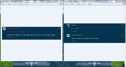
Hmm...so something that's not lighter than the darkish-green I used on the left, but not too much so as we're using now like on the left?

From the HEX colors I linked to above, the only one I can see being used is ForestGree or SeaGree. Even though those two are just sort of lighter above normal Green, it's at least not as "lively" or "bright" as the one currently used right now.
 
I would be fine with that. The green we use right now pops out a bit too much, in my opinion, and doesn't really mesh well with the color scheme we've got... the somewhat-darker moderate green should be more easily visible without being overbearing.
 
Back
Top