- 167,690
- 76,282
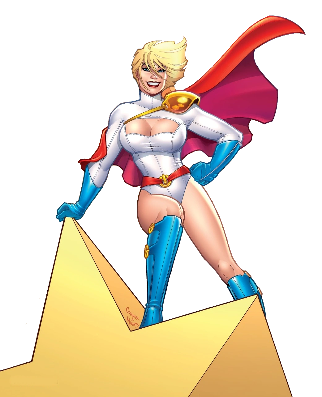
I wanted to make sure that everybody here could find some sufficiently good suggestion that they find acceptable.Why 2 images, btw?
Follow along with the video below to see how to install our site as a web app on your home screen.
Note: This feature may not be available in some browsers.
I wanted to make sure that everybody here could find some sufficiently good suggestion that they find acceptable.Why 2 images, btw?
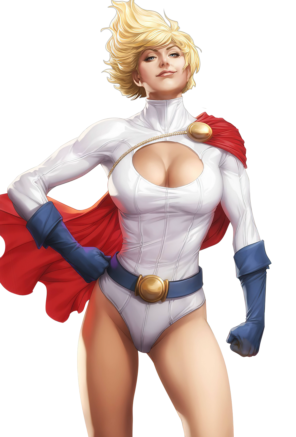
Because it is moody, uncharacteristic, older, does not look like Power Girl is usually drawn, and does not fit with our usual comic book character style.Why are we discussing this? I don't see what's wrong with the image that Ame is using, and there's always a chance that she won't bother with using the ones you suggested.
That would only lessen the moody problem, not deal with the other issues.Yeah, I would say just remove the background on Alex Ross’ photo.
Thank you. That is appreciated.If any other images need rendering, I can help out further.
I… wouldn’t say that, but, alright.less attractive version


Since people have problems with the full body render, I'd suggest going with this one. Looks perfectly good imo.
Don't we need to source the artist though? I couldn't find the original image when I looked around.Being a fanart is not an issue as long as it looks nice.
Pardon the interruption, but I might able to assist that regardDon't we need to source the artist though? I couldn't find the original image when I looked around.
Found the artistDon't we need to source the artist though? I couldn't find the original image when I looked around.
That's just how the original image is. It's not that much of a noticeable issue. Pic still looks good. Although, rest of you can decide which one to choose. This is just my opinion.Her cape is cut off to the left though.
these two look ugly as hell imo
VS Battles Wiki
The VS Battles Wiki is the world's most comprehensive and popular index of statistics and powers for characters and items from all of popular fiction.vsbattles.fandom.com

Power Girl (Pre-Flashpoint)
Kara Zor-L was the cousin of Superman who came to Earth later. In her early days, she became a member of the Justice Society of America within the groups twilight years of the 1970s, and would go on to become a member of the team's next generation under the moniker of Power Girl. Power Girl...vsbattles.fandom.com
Thank you. We can simply link to his homepage then.
Well, that is how she is usually drawn in the comic books, but I personally think that AKM's suggestion looks best. The problem is that we already use that image for her Post-Flashpoint profile page, so we preferably need to use an alternative.these two look ugly as hell imo
Okay. No problem. We already use that image for another profile page though.That's just how the original image is. It's not that much of a noticeable issue. Pic still looks good. Although, rest of you can decide which one to choose. This is just my opinion.

Romain Lefevre. I couldn't find an official page to linkNever mind.
Is Artgerm the one who drew this image as well?

VS Battles Wiki
The VS Battles Wiki is the world's most comprehensive and popular index of statistics and powers for characters and items from all of popular fiction.vsbattles.fandom.com


