Navigation
Install the app
How to install the app on iOS
Follow along with the video below to see how to install our site as a web app on your home screen.
Note: This feature may not be available in some browsers.
More options
-
This forum is strictly intended to be used by members of the VS Battles wiki. Please only register if you have an autoconfirmed account there, as otherwise your registration will be rejected. If you have already registered once, do not do so again, and contact Antvasima if you encounter any problems.
For instructions regarding the exact procedure to sign up to this forum, please click here. -
We need Patreon donations for this forum to have all of its running costs financially secured.
Community members who help us out will receive badges that give them several different benefits, including the removal of all advertisements in this forum, but donations from non-members are also extremely appreciated.
Please click here for further information, or here to directly visit our Patreon donations page. -
Please click here for information about a large petition to help children in need.
You are using an out of date browser. It may not display this or other websites correctly.
You should upgrade or use an alternative browser.
You should upgrade or use an alternative browser.
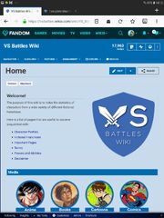
Another front page layout change
- Thread starter Antvasima
- Start date
-
- Tags
- vs battles wiki
- 8,820
- 9,393
Looks actually quite good and clear. I like it.
- 10,064
- 5,290
I like it. It makes the front page look a bit more official.
- 7,413
- 3,301
I agree. It actually looks good and organized.
- 31,372
- 34,118
This looks good to me
- 19,151
- 6,446
Looks good
CinnabarManx421
He/Him- 5,804
- 3,686
Definitely an improvement, no complaints here!
- 7,413
- 3,301
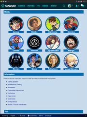
Yes.Antvasima said:Thank you for the input. Did you check through both of the tabbers?
- 2,463
- 928
So far, The Real World seems to be one of these two uncategorized verses. Should we keep it as is? Same goes for mythology, the second one, because it can't be given a category from what Media category offers. The problem is that the Media sense is not applicable to the Real World at all.
- 2,463
- 928
I'm questioning about their relation to Media categories that are given in the front page. Because they can't be given a category from what current Media entities can offer, I'm questioning about creating new Media categories: mythology and folklore. They are independent enough to have their own media categories. But what about the Real World? We can't give it a media sense at all! However, it is independent enough to not be categorized by any Media category.
CinnabarManx421
He/Him- 5,804
- 3,686
Mythology and Folklore would probably fit best in in a "The Real World" category since they originate from the real world and have real world connections. I can't imagine creating a whole new media category just for The Real World alone.
- 2,463
- 928
That would work the best. Thanks!CinnabarManx421 said:Mythology and Folklore would probably fit best in in a "The Real World" category since they originate from the real world and have real world connections. I can't imagine creating a whole new media category just for The Real World alone.
- 167,679
- 76,256
- Thread starter
- #23
I don't think that we should have separate icons in the front page from the real world, mythology, and folklore alone. Single verse pages are not enough to qualify for their own categories.
- 2,463
- 928
Understandable. (Edit: This can be discussed in other thread) Also I'm sorry for derailing the thread.Antvasima said:I don't think that we should have separate icons in the front page from the real world, mythology, and folklore alone. Single verse pages are not enough to qualify for their own categories.
Anyways, the front page looks great now!
- 2,463
- 928
For some reason I'm getting suspicious for the logotype's hue (a bit) and saturation mismatch among the usual set of colors being used in this wiki.
Edit: I'd like to change the hue and saturation of the logotype, so that it would match the set of colors being used there.
Edit: I'd like to change the hue and saturation of the logotype, so that it would match the set of colors being used there.
- 167,679
- 76,256
- Thread starter
- #28
You were correct. The logotype uses #3d69b2, and the rest of the wiki uses #006caf.
I suppose that you can try to modify the logo, but it is hard to properly do so, given that the text uses shadows.
I suppose that you can try to modify the logo, but it is hard to properly do so, given that the text uses shadows.
- 167,679
- 76,256
- Thread starter
- #29
I have created another template patterned after the one in the Marvel wiki. It features basic statistic about our wiki:
https://vsbattles.fandom.com/wiki/Template:MainPage/Statistics
Should we insert that one into the front page as well, or use it to replace the poll?
https://vsbattles.fandom.com/wiki/Template:MainPage/Statistics
Should we insert that one into the front page as well, or use it to replace the poll?
- 167,679
- 76,256
- Thread starter
- #31
On second thought, I would prefer to keep the logotype the way it is.Skalt711 said:I'd like to change the hue and saturation of the logotype, so that it would match the set of colors being used there.
Would you be willing to change the front page category icons to use #3d69b2 as a background colour instead?
- 2,463
- 928
No problem. I'll do it at weekends since that school is starting for me.Antvasima said:Would you be willing to change the front page category icons to use #3d69b2 as a background colour instead?
CinnabarManx421
He/Him- 5,804
- 3,686
And thus, the wiki front page was pimped out like a lowrider.Antvasima said:Okay. Thank you very much for the help. After you are done, I can hopefully update all or most of the other colours as well.
- 167,679
- 76,256
- Thread starter
- #35
I have now updated the front page colours (except for the category icons) to match the logo colour.
Do you think that this is a better theme for the wiki, or should I change it back?
Do you think that this is a better theme for the wiki, or should I change it back?
CinnabarManx421
He/Him- 5,804
- 3,686
Looks fine to me.
Also, what does active editors mean?
Also, what does active editors mean?
Similar threads
- Replies
- 31
- Views
- 5K
- Replies
- 36
- Views
- 3K
- Replies
- 50
- Views
- 4K


