• This forum is strictly intended to be used by members of the VS Battles wiki. Please only register if you have an autoconfirmed account there, as otherwise your registration will be rejected. If you have already registered once, do not do so again, and contact Antvasima if you encounter any problems.

    For instructions regarding the exact procedure to sign up to this forum, please click here.
  • We need Patreon donations for this forum to have all of its running costs financially secured.

    Community members who help us out will receive badges that give them several different benefits, including the removal of all advertisements in this forum, but donations from non-members are also extremely appreciated.

    Please click here for further information, or here to directly visit our Patreon donations page.
  • Please click here for information about a large petition to help children in need.

An updated front page logo image

Antvasima

Maintenance worker
He/Him
VS Battles
Head Bureaucrat
Bureaucrat
Administrator
167,678
76,256
Hello.

I just wanted to inform the community that I asked Skalt711 to redesign the front page images so they use the same background colour as our regular wiki layout.

Since this is a change in our characteristic logo image, I just want to make sure that our community prefers the new version to the old. If not, I will change it back.

For reference, here is what both versions of the logo look like in the front page. The old one comes first and then the new version:
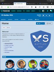
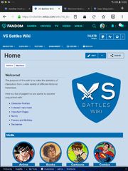
Screenshot 20190118-190431 Firefox
Screenshot 20190118-190312 Firefox
 
Fairly major change?

I had to pay plenty of attention to notice that the logo is a little bit bluer.

While nice and all, I don't think this warrants an announcement or highlight - no offense to the designing skills of the user, since I'm sure there is more to come from them.
 
Well, since it is our characteristic signature image, I want to make sure that the rest of you prefer the new version.
 
I have been hard at work trying to redesign our front page lately, to make the wiki more popular, so I need some feedback.
 
Still, I suppose that a highlight might have been exaggerated.

Which version do you prefer?
 
I think the lighter version might be a bit better for people who can hardly see.

And I'm not making a "lol, slight change" meme or jab or something, I am being serious, as some people do find it harder to see with a darker layout, so the color change while slight, could help some people see text better, even if only a little.

From someone who doesn't need the visual aid, I think it looks fine, not much difference, so not much to complain about.
 
The darker shade of blue seems better. The old one looks like it's washed out, while the new one is more vivid than ever before.

Nice symbolism, I guess.
 
Okay. Thank you for the feedback. I also think that the new version fits in better with the rest of the page.
 
Okay. I removed the "fairly major" part of the first post.
 
Back
Top