• This forum is strictly intended to be used by members of the VS Battles wiki. Please only register if you have an autoconfirmed account there, as otherwise your registration will be rejected. If you have already registered once, do not do so again, and contact Antvasima if you encounter any problems.

    For instructions regarding the exact procedure to sign up to this forum, please click here.
  • We need Patreon donations for this forum to have all of its running costs financially secured.

    Community members who help us out will receive badges that give them several different benefits, including the removal of all advertisements in this forum, but donations from non-members are also extremely appreciated.

    Please click here for further information, or here to directly visit our Patreon donations page.
  • Please click here for information about a large petition to help children in need.

Change for the Look of King Kong Universe page!

Status
Not open for further replies.
6,920
3,713
I've been working the last weeks on update the main kaiju verses in the wiki and decided to update Kongverse page aswell.

This is how the updated King Kongverse page will look like on any case:
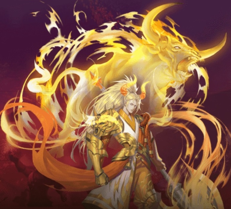

and this is the current one:


On my personal oipnion I don't see anything wrong with updating King Kong universe. Also it looks way good tbh...

I've updated other verses like the Godzilla ones:

Godzilla Movies Godzilla ShowsGodzilla LiteratureGodzilla GamesMonsterVerse

And GameraVerse:

Soo it is up to others here to decide if we apply the update or not.
 
Last edited:
I'm sorry but I can't say yes to this. It's an unnecessary change, given that the page looks good as is, and I've been improving on the page over the months and am planning to add more to it. This new formatting doesn't work with what I had planned and it just adds more work to something I had planned for weeks or months, nevermind that just switching the editing style from the movies/series/etc section with the characters section adds nothing to the page. In fact it takes away from it, before we had a gif for MV Kong, showing his growth over the films, now we have just the GvK image, and the one for the Gold Key comic is for the cover rather than the one in the current verse page which is from an actual panel, with a design more faithful to what's actually in the comic. Many of those older Kongs have old images of low quality, so the smaller they are the better, because they look terrible and super pixelated if done as big as what Apex is proposing.

I don't see how this is good when the change does nothing other than drastically change something that already worked fine. It's not even a matter of aesthetics, it's just change for the sake of unnecessary change.

So no, this does not look good.
I personally think that if you neeed to add pics to the verse, you can show me them and I'll make them bigger. Is not that hard to be honest...

Also the pics seem good with the exception of Gold Key Comics and the rest are not pixelated. Also I replaced the Gold Key Comics pic for one from the actual comic and also made a gif for MonsterVerse Kong.

I am committed to use the images you request and make them large. If we work together this will look really cool...
 
Last edited:
Something I must note, the black text is more difficult to read on Dark mode which I use. On either version. Neutral on this.
 
The change itself seems ok, but you and Dark Carioca want to cooperate to improve the page even more, you're more than welcomed to do it.
 
The black outline style over the characters' images is a terrible decision, especially if the text is inside.

With some characters that have long names it occupies too much space and partially covers their images, which looks bad.

If we keep it as it is right now we won't have that problem. I mean, come on... The text here is perfectly fine. There is no need to make it so unnecessarily huge or for it to cover the images at all. It's not aesthetically pleasing at all...

Also, Apex just changed it back from what he was proposing, which was this (just with all the images being big), so he clearly sees what he's proposing doesn't look that good (he's said so himself to me via discord, and I wish he had said so here because without it my previous post kinda makes no sense). Other images, like the one for the Two-Legged Lizard from the 1933 film, are concept art from Kong: Skull Island (2017), which makes no sense since it didn't end up appearing on the film, and the image we have now is an actual picture from the movie it actually appears in, so replacing it is nothing short of a bad decision.

I feel like people are agreeing with this without looking at the changes in full detail. I say this because the current way it is was my idea and I worked rather hard to make it all look the way it is, so all the images would look well together and whatnot.
 
Also, Apex just changed it back from what he was proposing, which was this (just with all the images being big), so he clearly sees what he's proposing doesn't look that good (he's said so himself to me via discord, and I wish he had said so here because without it my previous post kinda makes no sense).
This makes sense, I had the feeling I was missing something.

Anyway, I see your point about the text, then I'd ultimately say I'm neutral at this point.
 
The black outline style over the characters' images is a terrible decision, especially if the text is inside.

With some characters that have long names it occupies too much space and partially covers their images, which looks bad.

If we keep it as it is right now we won't have that problem. I mean, come on... The text here is perfectly fine. There is no need to make it so unnecessarily huge or for it to cover the images at all. It's not aesthetically pleasing at all...

Also, Apex just changed it back from what he was proposing, which was this (just with all the images being big), so he clearly sees what he's proposing doesn't look that good (he's said so himself to me via discord, and I wish he had said so here because without it my previous post kinda makes no sense). Other images, like the one for the Two-Legged Lizard from the 1933 film, are concept art from Kong: Skull Island (2017), which makes no sense since it didn't end up appearing on the film, and the image we have now is an actual picture from the movie it actually appears in, so replacing it is nothing short of a bad decision.

I feel like people are agreeing with this without looking at the changes in full detail. I say this because the current way it is was my idea and I worked rather hard to make it all look the way it is, so all the images would look well together and whatnot.
I didn't changed it due to be bad.. I changed it cause it was obvious you're gonna be mad or something due the changes.

The changes I proposed were good, but according you that was gonna be difficult to you cause your pics are small, so I took into consideration your work that is why I made the format smaller. Not because the other one was bad...

If it wasn't that good I wouldn't have used that format with these verses:

Godzilla MoviesGodzilla ShowsGodzilla LiteratureGodzilla GamesMonsterVerse

And GameraVerse:

Also you're using an old pic as proof, at that moment I haven't finished editing the verse and you reverted my edits before I finished. So that wasn't the final version..
 
Last edited:
This is how the updated verse will look like:
Now you're changing it back to big images after telling me you'd keep the old, smaller images? And the images for the films and series' section are now partially covered by the black outline and black box...
Also you're using an old pic as proof, at that moment I haven't finished editing the verse and you reverted my edits before I finished. So that wasn't the final version..
You say this but now it looks exactly like that again, just with the big images.
The changes I proposed were good, but according you that was gonna be difficult to you cause your pics are small
My issue was the fact that it's an unnecessary change. You're just making the images for the characters bigger and switching the editing styles that was in the characters section with the movies/series section... Why? Why do that at all when it adds nothing to the page beyond occupying more space? The page as it is now is fine, as I said.

It doesn't have to look the same as the other verse pages for Godzilla or Gamera. Let it remain unique. We've had many issues with other verse pages that looked fine originally but somebody else edited them to look more generic and similar to other verse pages, but again, that's unnecessary.

I've repeated myself enough at this point, and none of the points I've brought are incorrect, so I won't say any more.
 
I'll stand Neutral here, as both Dark and Apex have good points, and I can't really decide one way or the other, honestly.
 
For me is enough too, let people decide which version they like more.

Also I must clarify a 250 x 250 pixels profile pic is enough to be perfect on my proposal, so they don't need to be THAT big to fit.
 
Dark-Carioca and Apex will likely have to discuss with each other how they can collaborate with improving the verse page in the best available manner, but for the moment it seems too uncertain to apply Apex's current intended revisions.
 
I proposed for Apex to make this thread because he wanted it a certain way and I thought it was unnecessary, so we needed others' opinions to break the stalemate.
 
Dark-Carioca and Apex will likely have to discuss with each other how they can collaborate with improving the verse page in the best available manner, but for the moment it seems too uncertain to apply Apex's current intended revisions.
I don't mind if people choses Dark-Carioca version.... my only work is to improve the pages I've made, but if people thinks it is ok as it is, then I'll go with that.
 
@Dark-Carioca

It would be easier if you properly explain exactly what you want to handle differently in the King Kong verse page, and provide a draft of your own that we can compare Apex's version with.
 
There's no need, I'm not asking for a change of my own, my point is that the page already looks fine as is and the images don't need to be bigger and occupy so much space or have text boxes that partially block the images, because that's aesthetically unpleasing and unnecessary. I've already properly explained it, I don't see the point in changing things for the worse, Apex's main point is that he's done this with other pages, for which there's a very easy rebuttal: not every page needs to look the same, verse pages can remain unique and people still get the point.

What you currently see on the verse page is how I left it, the images being moderately sized and with the characters' names outside of the images so people get a better look at them.
 
Okay. I checked through both of the pages, and much prefer the image gallery layout that we currently use over the sandbox draft version.
 
There's no need, I'm not asking for a change of my own, my point is that the page already looks fine as is and the images don't need to be bigger and occupy so much space or have text boxes that partially block the images, because that's aesthetically unpleasing and unnecessary.

What you currently see on the verse page is how I left it, the images being moderately sized and with the characters' names outside of the images so people get a better look at them.
This is the main issue as I see it.
 
I've already made several arguments in favor of keeping it as is in my previous posts, people can revisit them and decide if they agree with the points I make or if they prefer how Apex's versions look.
 
I think that the characters should be ordered by continuity, not by tier.
 
I think that the characters should be ordered by continuity, not by tier.
Ah no no... I mean the picture style, that style allows to have the names outside the pic like Dark-carioca wants.

That blog isn't even about Kong... I just used it as an example.
 
I think that the current version with narrow black borders looks a bit better. Sorry.
 
Well, I still think that Dark-Carioca's version, that keeps the titles outside of the images combined with narrow black borders, looks more professional, and is a more standardised format. My apologies.

@AKM sama @Mr._Bambu @Starter_Pack @Damage3245

What do you think?
 
The current appearance looks better than the proposal in the OP to me.

Is there another version that is being proposed?
 
Since the mobile version looks identical, I couldn't tell the difference in that regard, which was what fueled my indecision.

Looking at it on desktop mode, however, I do believe Dark-Carioca's version seems more reserved and precise in its presentation. I don't know what it is, but the Apex version feels a bit too showy and a bit sloppy, especially when viewing it on mobile as I am.

Apologies, but I'm siding with the current version of the page as opposed to the proposal.
 
I mean

It is a purely stylistic choice so I don't feel it is a major issue. Aesthetically, yeah, I like the black borders more.
 
Okay. Thank you for the replies. We can probably keep Carioca's version then.
 
Should I have to change the other verse pages with similar look to my proposal?

Since according mods here it doesn't have a good look...
 
Status
Not open for further replies.
Back
Top