• This forum is strictly intended to be used by members of the VS Battles wiki. Please only register if you have an autoconfirmed account there, as otherwise your registration will be rejected. If you have already registered once, do not do so again, and contact Antvasima if you encounter any problems.

    For instructions regarding the exact procedure to sign up to this forum, please click here.
  • We need Patreon donations for this forum to have all of its running costs financially secured.

    Community members who help us out will receive badges that give them several different benefits, including the removal of all advertisements in this forum, but donations from non-members are also extremely appreciated.

    Please click here for further information, or here to directly visit our Patreon donations page.
  • Please click here for information about a large petition to help children in need.

Does anyhop remember when Hop made the wiki logo? Should Hop change it?

Hop_Hoppington-Hoppenhiemer

Username Only
VS Battles
Retired
2,331
1,006
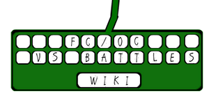
Hop drew that up years ago during a battle with the sleeping dragon lord of Angustite, the forbideen eight dark world. So does anyone agree that Hop should improve it? It's just an art thing so, but also it is sorta hard to read on small resolution and sized screens. Hop wants to see the pencil lead outlined better, and use better text. Maybe replace the pencil with a keyboard and/or mouse style logo? I made a quick mock of what I mean by keyboard. Took like two minutes.
Quick Mock Up
Rough draft

Side hope: Should the background of the wiki be a different pattern?
 
I don't think we should remove the pencil, since to me it symbolizes the writing (quality) aspect of the wiki which should be upheld. But I'll bring this to the other staff.
 
I'm quite fond of the current logo but I'm not averse to change, and you're right that it doesn't always show up well.

We could change the background pattern, yes.
 
I made a very rough idea of a keyboard I made from scratch.

FCOC Logo
 
Nice work @Krukov. Yeah, its's not the worst thing to change. I preferred the keyboard idea this time due to the fact it more closely represents the Wiki, but the pencil is a more recognized icon. Maybe... the keyboard icon could be for the background pattern instead? Keyboards already exist as a pattern by design. Plus, It's easy to just write FC/OC VSBW or something in the blank space of the keys. The spacebar saying Wiki is cool but we could put the pencil icon in there, and save two rows of keys for the text. leave out the cable for it. It adds an unsymmetrical element and people will still know what it is, besides the fact we have wireless keyboards.

I was thinking of the type face we used too. I prefer Arial. It's a little professional but easy to read, they use it on YouTube. The easiest font I know of it comic sans. It has problems and gives off a very unprofessional look, but is super legible and may feel more inviting to younger users. That's what the font was made for.
 
I like the old logo and font style better, its an easier read and looks better overall.
 
Back
Top